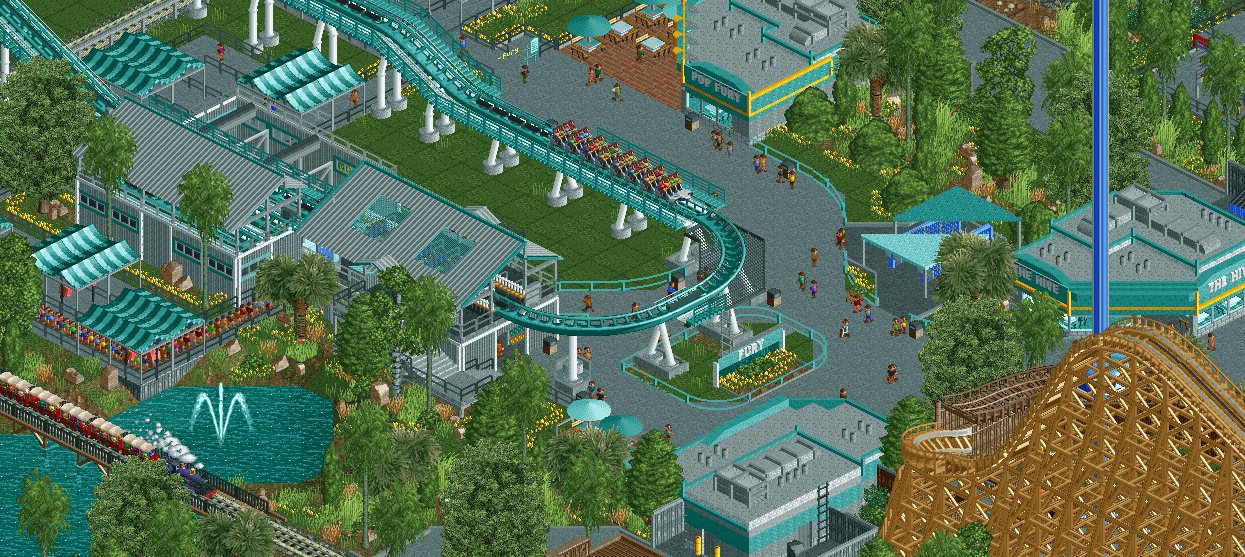
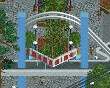
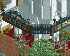
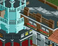
The curve is too sharp around the sign. Just use gee's extended curve like you did higher up on the screen and it'll look nicer in my opinion [especially because you don't have support for the rail where it actually curves - it doesn't make sense].
Decent screen. I love the foliage. But I have seen this a hundred times before. Road line fences, grey steel roofs, grey pathing. Even the layout and coaster colours looks exactly like the most recent design on this site. It's technically not a bad screen but where is the originality. Where is the creativity?
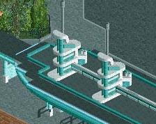
I can't really tell what's the most overpowering thing here - all the grey, or all the concrete and flat roof textures. I'd use some more different textures and colours. Some black roofs would look good and a few different paths would be cool too.
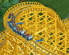
As Louis! said, it's a bit dull with all the teal and gray, try to add in some accent colors somewhere. Also, while the transfer would work, it's not a B&M style transfer. If you're going for 100% realism please fix it
Like everyone else said, lots of grey and teal. I do think the teal is a beautiful RCT-colour but it makes your screen pretty monotone. O think the answer is either changing all the teal that isn't the coaster or doing the opposite and recoloring the coaster.
H2H has really helped you develop as a player, well done! Clearly everyone thinks the colors are an issue, and I do tend to agree. Here's some options I would personally consider:
Change every grey roof to black.
Change the concrete path to the red brick path you've used in that little eating area up top.
Use more of the yellow as an accent color you started with.
Actually, I would do all of those things. Just me though. Either way this is good stuff.
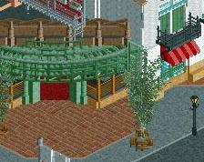
Please make a round path object so it fits with the round 1 tile fence.
Looks great, Russel, would love to see this ingame when its ready.
Thanks guys.
The curve is too sharp around the sign. Just use gee's extended curve like you did higher up on the screen and it'll look nicer in my opinion [especially because you don't have support for the rail where it actually curves - it doesn't make sense].
Rest looks good.
Done
Decent screen. I love the foliage. But I have seen this a hundred times before. Road line fences, grey steel roofs, grey pathing. Even the layout and coaster colours looks exactly like the most recent design on this site. It's technically not a bad screen but where is the originality. Where is the creativity?
I dont really think I am a strong enough player at the moment to really develop my own style in for foliage that actually looks good. As for the coaster... that's the way realism is for chain parks, but sure its a similar coaster and area, but its definitely not the same an is my own take on the ride. And really, I'm not building to be creative, just focusing on making a good looking park.
I can't really tell what's the most overpowering thing here - all the grey, or all the concrete and flat roof textures. I'd use some more different textures and colours. Some black roofs would look good and a few different paths would be cool too.
It's very grey and teal. The colours definitely need a little bit of work, its dull atm.
The real is such a muted color that it doesn't add too much to this screen, especially in the huge quantity it's in.
Like everyone else said, lots of grey and teal. I do think the teal is a beautiful RCT-colour but it makes your screen pretty monotone. O think the answer is either changing all the teal that isn't the coaster or doing the opposite and recoloring the coaster.
Check the new screen at the bottom of the next post.
As Louis! said, it's a bit dull with all the teal and gray, try to add in some accent colors somewhere. Also, while the transfer would work, it's not a B&M style transfer. If you're going for 100% realism please fix it
I'd love it if this ride was actually huge and not the safe - NE style of tiny "hypercoasters". Please do this right like you did with Magnum.
I know I'm in the minority with that but whatever, lol.
Oh, and the transfer still needs a little work. All 3 tracks wouldn't slide, one would slide and the trains would push forward into a storage area,
Overall though I love this.
Yea I realized the transfer was wrong shortly after building it, 98% sure I'm going to change it at this point. Thanks as well.
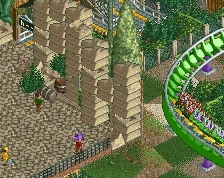
pretty solid foliage work. Maybe a touch too dense?
Thanks, really tried to focus on it as my previous work had sub par foliage. It is probably a little two dense as well, something I'll have to work on in the future.
H2H has really helped you develop as a player, well done! Clearly everyone thinks the colors are an issue, and I do tend to agree. Here's some options I would personally consider:
Change every grey roof to black.
Change the concrete path to the red brick path you've used in that little eating area up top.
Use more of the yellow as an accent color you started with.
Actually, I would do all of those things. Just me though. Either way this is good stuff.
Thanks, and I guess I would agree. I really didn't build much during H2H, probably the team aspect of it has helped me more than anything in game. Talking with Zach, Kyle, Justin, and even Darren have really helped me improve and grow in the past 3 months or so.
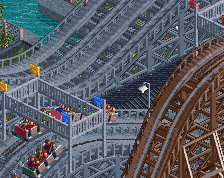
Thanks for the suggestions as well, here's a new screen:
I'm not 100% sold on the brick paths yet, I might just keep the gray. It kind of looks weird having both the grey and brick next to each other near the entrance to Fury as well. Might have to break it up a bit with some road line objects or flowers or something if I do keep it. Definitely want to keep the black roofs though, adds a lot more pop and contrast.
Thanks everyone for their comments and suggestions. Progress on this park is relatively slow at the moment, but I would like to have this done by the end of the year. Like I said in the park progress topic is about 20% currently, assuming I dont re-do large portions of the park, which is always a possibility.
I prefer the bricks. For originality's sake, I would suggest a different colour from the teal. Also maybe the queue should be changed to something not grey?
 25-July 15
A huge step up from your other screens.
Please make a round path object so it fits with the round 1 tile fence.
Looks great, Russel, would love to see this ingame when its ready.
The curve is too sharp around the sign. Just use gee's extended curve like you did higher up on the screen and it'll look nicer in my opinion [especially because you don't have support for the rail where it actually curves - it doesn't make sense].
Rest looks good.
I can't really tell what's the most overpowering thing here - all the grey, or all the concrete and flat roof textures. I'd use some more different textures and colours. Some black roofs would look good and a few different paths would be cool too.
It's very grey and teal. The colours definitely need a little bit of work, its dull atm.
As Louis! said, it's a bit dull with all the teal and gray, try to add in some accent colors somewhere. Also, while the transfer would work, it's not a B&M style transfer. If you're going for 100% realism please fix it
I'd love it if this ride was actually huge and not the safe - NE style of tiny "hypercoasters". Please do this right like you did with Magnum.
I know I'm in the minority with that but whatever, lol.
Oh, and the transfer still needs a little work. All 3 tracks wouldn't slide, one would slide and the trains would push forward into a storage area,
Overall though I love this.
pretty solid foliage work. Maybe a touch too dense?
H2H has really helped you develop as a player, well done! Clearly everyone thinks the colors are an issue, and I do tend to agree. Here's some options I would personally consider:
Change every grey roof to black.
Change the concrete path to the red brick path you've used in that little eating area up top.
Use more of the yellow as an accent color you started with.
Actually, I would do all of those things. Just me though. Either way this is good stuff.
Done
I dont really think I am a strong enough player at the moment to really develop my own style in for foliage that actually looks good. As for the coaster... that's the way realism is for chain parks, but sure its a similar coaster and area, but its definitely not the same an is my own take on the ride. And really, I'm not building to be creative, just focusing on making a good looking park.
Check the new screen at the bottom of the next post.
Yea I realized the transfer was wrong shortly after building it, 98% sure I'm going to change it at this point. Thanks as well.
Thanks, really tried to focus on it as my previous work had sub par foliage. It is probably a little two dense as well, something I'll have to work on in the future.
Thanks, and I guess I would agree. I really didn't build much during H2H, probably the team aspect of it has helped me more than anything in game. Talking with Zach, Kyle, Justin, and even Darren have really helped me improve and grow in the past 3 months or so.
Thanks for the suggestions as well, here's a new screen:
I'm not 100% sold on the brick paths yet, I might just keep the gray. It kind of looks weird having both the grey and brick next to each other near the entrance to Fury as well. Might have to break it up a bit with some road line objects or flowers or something if I do keep it. Definitely want to keep the black roofs though, adds a lot more pop and contrast.
Thanks everyone for their comments and suggestions. Progress on this park is relatively slow at the moment, but I would like to have this done by the end of the year. Like I said in the park progress topic is about 20% currently, assuming I dont re-do large portions of the park, which is always a possibility.
I prefer the bricks. For originality's sake, I would suggest a different colour from the teal. Also maybe the queue should be changed to something not grey?
That is so much better! The brick path adds a lot to the screen! A great improvement, well done for actually listening to people!
The brick path warms up the atmosphere so much. And the black roofs make things pop, agreed!