- Empty land behind the big building is not a good backdrop - Don't forget to rotate your trees - I don't like how the path bends off to the right behind that building (left side of screen), breaks the optic flow too much. Bend it to the left, make the path wider, or go for something more diagonal looking. - The fences don't fit, make it look very rural. And are you sure you want that seating area fenced off? - Pines, cacti and deciduous trees? That doesn't help in defining a theme or setting.
 03-December 15
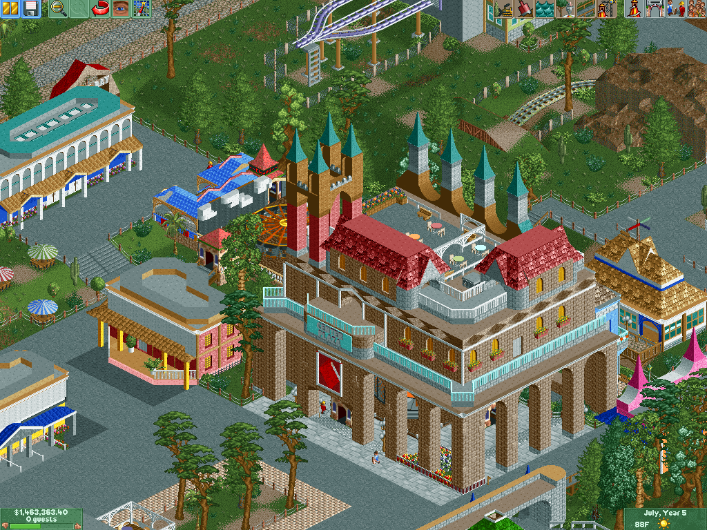
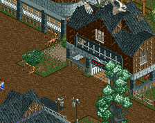
its all a bit random and disjointed but definitely shows creativity.
the big building seems medieval but the rest doesn't really reflect that
Definitely a bit convoluted but I'm liking it. The path colors seem a bit off to me.
- Empty land behind the big building is not a good backdrop
- Don't forget to rotate your trees
- I don't like how the path bends off to the right behind that building (left side of screen), breaks the optic flow too much. Bend it to the left, make the path wider, or go for something more diagonal looking.
- The fences don't fit, make it look very rural. And are you sure you want that seating area fenced off?
- Pines, cacti and deciduous trees? That doesn't help in defining a theme or setting.
math Offline
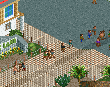
Thank you guys. I'll take a lock about the comments. Ok Liampie, I'm not trying to kill my visitors, I forgot to put that fence =P.
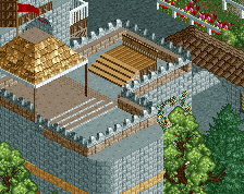
What about the back side?