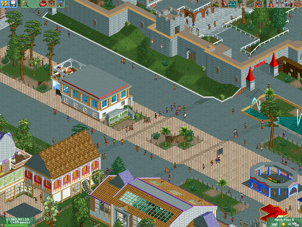
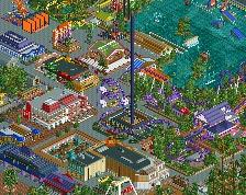
I think you could put a little more effort into the foliage, seems super bare and lazy right now. Buildings generally look nice, although I'm not a huge fan of all the white.
Maybe just make the center tile path a bit more organic with some diagonals too to make it ebb and flow a bit more. Too straight. Everything else looks nice and clean.
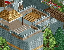
I think the castle wall could do with some more detailing, particularly at the top. Perhaps more battlements, flags and something that continues the red colour scheme going on at its entrance. At the moment, I think that colour stands out too much. I do like the central building you have though. Despite being rectangular, you've added plenty of details to keep it from looking boxy.
 14-December 15
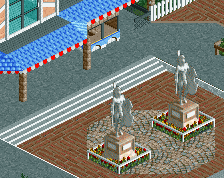

I think you could put a little more effort into the foliage, seems super bare and lazy right now. Buildings generally look nice, although I'm not a huge fan of all the white.
math Offline
Thanks G, I'll try another colors to replace the white and spend a little time at the foliage.
Maybe just make the center tile path a bit more organic with some diagonals too to make it ebb and flow a bit more. Too straight. Everything else looks nice and clean.
I think the castle wall could do with some more detailing, particularly at the top. Perhaps more battlements, flags and something that continues the red colour scheme going on at its entrance. At the moment, I think that colour stands out too much. I do like the central building you have though. Despite being rectangular, you've added plenty of details to keep it from looking boxy.