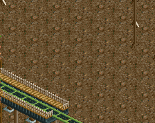
Screenshot / Bloody Supports!
-
 26-February 16
-
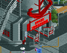
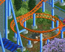
Firestorm
-
14 of 17
- Views 2,005
- Fans 0
- Comments 9
-
Description
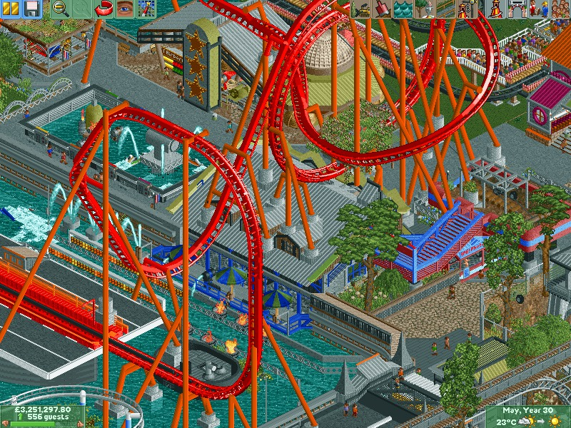
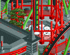
Hey Peeps,
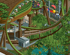
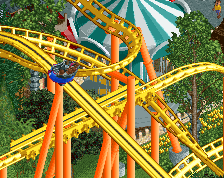
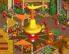
so getting there just gotta finish of 101st airborne attack, so check out its entrance to get a flavour. supported the final bits of firestorm and added spashview restaurant and RC battleboats. you can even see the landing spot for xscape zip line. assuming peeps dont smack the supports on the way down.
anyway nearly there
sorry about the none finished bit but its late -
Full-Size
-
No fans of this screenshot
-
Tags
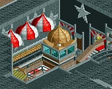
I really like your building with the park maps and stuff, guessing thats a guest shop. Alot goin on in one pic lol
This reminds me of eyeamthu1 - in that its gaudy with lots of ideas, but no coherence or harmony.
I think there is a little too much going on in this screen.
There is a lot of gray and then little spurts of almost every other color in the rct2 spectrum. I think if it were more evened out with a set few colors it would look a lot better.
Some great ideas, but I have no idea where to look. I can't really focus on anything in this screen.
Perhaps this wasn't the best angle to release a screenshot, it looks a little convoluted, but as a whole this design is looking pretty sweet! Love your work man!
Very chaotic from this view. And a lot of mismatched colors, the grey + puke green + bright blue and red really doesn't mesh well. Also, is it normal to have footers sticking out of a roof like that? It looks strange.
But the coaster does look interesting, as is the theme. From the other pictures of this project it looks like a promising design, I'm looking forward to seeing the finished product!