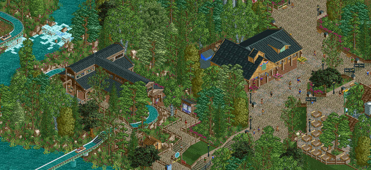
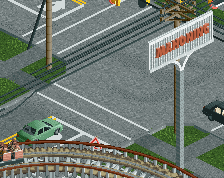
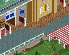
Screenshot / Loggers Run & Patriots Landing
-
 27-March 16
-
G Force's Worlds of Fun
-
7 of 13
- Views 2,979
- Fans 2
- Comments 21
Community Forum Software by IP.Board
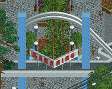
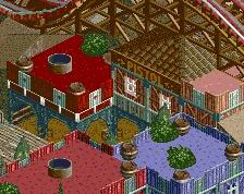
The dense foliage works a lot better in this context. I'm pretty sure there's a 1/4tile rounded flower object which would fit those pots better I think (if you've got the object space of course).
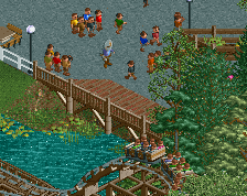
I personally don't think that black/white table tops would fit here, maybe umbrellas(?)
Yes bitch! This screen is so good!
. . . other than that, it looks great!
Great stuff! I've said it before, your work feels like you could just imagine yourself walking through it.
Nice
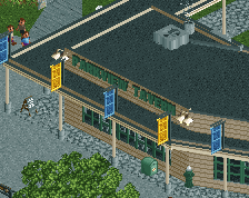
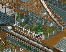
Station is superb. You've managed to make all the wooden beams look convincingly solid. Too much trees in the top half to really make this an interesting or exciting screen though.
Really lovely screen. One of my favourites from you.
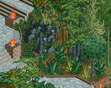
My only concern is the amount of foliage. I love it in places, I love how dense it is and the tree types used, I just think it could possibly be cut down in some places. Not so you lose the feel of what you are going for, but to enhance it, make it better.
Example:
Imagine standing/sitting at the tables on the left and looking across towards the station of the log flume. Currently, you would see nothing but trees. If you cut some of them away, made it a bit more gappy, then people sitting/standing there would be able to see through the trees and catch glimpses of the log flume. That is good parkmaking, and what sets people apart from the rest.
Its easy to spam heavy foliage over the place (I know you've taken care with it, I dont mean that), but its more difficult to create foliage that is more personal to certain areas of a park.
Consider it, it would elevate your parkmaking abilities ten fold.
I like this. It's clean, well thought out and atmosperic.
However, looking at each aspect of the screen individually, I can't help but get the feeling I've seen all of this somewhere else in a different park.
That doesn't mean that this is not turning into a great park though! For your next screen I want to see more of the rides!
Louis brings up an excellent point. You have the spacing you need to create some really interesting moments in the landscaping, and I like that it's not cluttered and has room to breathe, but some editing or omissions in places will really help solidify your intentions and allow for the truly special work, like the log flume's station, to really stand out.
Your work is of such high quality but it reads as rather bland to me. The station is beautifully done, the foliage is on point, the pathing looks great, etc. I think I'm just not so into the theme you're working with.
But keep going at it, you're definitely building quality work here.
Agree with Avanine, this screen seems lacking in life and vibrancy for me. I get that it's a Cedar Fair-style wooded area of the park, but I'm itching for some bright colors or excitement. Even changing the color of the tables or adding some umbrellas could help your composition.
I guess I'm one of the few who has no problem with the foliage at all. I really do like the dense atmosphere this park has, adding mystery to every single ride and area.
Great screen. I think the foliage is fine, but I guess Louis and whoever else has a point about it.
One suggestion I have is about the roofs. The steep pirate roof texture is fine but then you have the Spanish tile and then Kumba's and then the other one on the flume station. I think sticking to one of the three would clean things up a little, and I would lose maybe a few of the trims on the restaurant -- unnecessary details.
Also, I would consider a name change for Patriot's Landing. Typically a landing is found directly on water, even if you do have water close by. So I guess this is just extremely nitpick-y.
I love the density of it, its fantastic and really well done. Its just in specific key spaces it could be thinned out to really accentuate key views and certain areas.
Its a very picky comment, just you are at the stage now where picky comments are the only comments on how to improve
In one hand it's sad to see these beautiful buildings being clouded by the trees. On the other hand I love how the trees around the buildings create a very warm and nice atmosphere. I like this a lot.