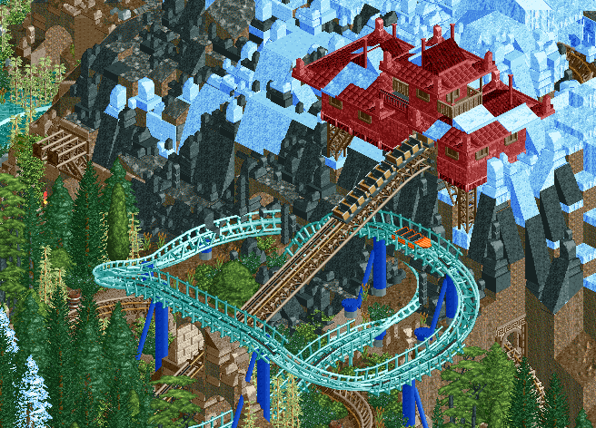
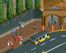
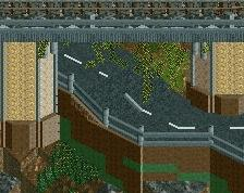
Screenshot / Expedition Everest Polar Express Interaction
-
 17-May 16
-
Reddit Contest [Expedition Everest]
-
4 of 5
- Views 3,466
- Fans 8
- Comments 18
Community Forum Software by IP.Board
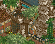
I'd work on the transition from black rock to brown rocks a bit.
Wow, this is really good. Love the colours
Edit: I agree with Alex though that the building walls should probably be a different colour, maybe grey or brown with red accents. Other than that it looks really good.
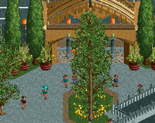
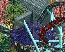
I love the landscaping. I'm not sure about the all red building... I see what you're going for but I think at least the roof trim or the base should be a different colour. Also maybe find a way of making the snow on the roof look a bit more blended - you could use the tiled roof with different colour tiles (and set one to ice blue) if you have it on the bench.
The rock and snow work is great.
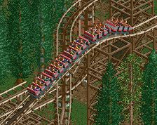
Don't know how I feel about the orange boat, the rest is perfect.
This looks great! Don't sell yourself short with your landscaping, you're articulating your vision very well I feel here.
For me, I aproach rock landscaping like I would architecture- find a real life example that embodies what you want to do then recreate it as best you can. Rebuild that small sample as many times as you need to get the feel that you want, then replicate that.
Keep it up, looking forward to seeing the final product!
Do you even realize how good this is? I mean god damn...
Love the Expedition Everest inspiration here! Only thing that is striking me a bit odd are the two snow-covered trees in the back nowhere near the mountain", unless I'm missing something obvious there.
The landscaping's a bit rough but the rest is so lovely and clean.
Foliage is great, coasters are awesome, composition is good, colours less so. I know the black is a change from the usual brown, and brown is overused for 1k ruins, but the black might be just a bit too overpowering here.
Awesome
http://all-geo.org/m...-mount-everest/
I think the black represents Himalayan Metamorphic Rock well. Looking at pictures the rock above 6000m definitely looks more black than brown or grey.
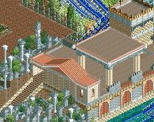
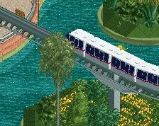
The composition of the coaster in this screen is fantastic, I love the wrap-around teal water coaster track that the lift hill goes through, and the colors are vibrant and a nice change of pace. I think the scale of that red building looks a bit strange though.
The landscape could use some smoothing out but it's not really all that bad. Great work!
I might have to disagree with you there, the black ruin makes this really pop with ice. And if you think about it, most mountains that do have ice on top usually have grey/blackish rock right? I can be mistaken though.
But Stoksy really nice with the creativity, thats what I like to see! only thing I would change is the opening from the red building, looks too small for the heads, Like if they would get chopped off lol.
The composition is both good and bad: I agree with the wraparound the lift, but I also see where posix is coming from. I think individual elements are good and I like how stacked everything is, with details and subjects all over eachother, but In know that if this were built with effective viewpoints in mind you could have really staged something awesome (think back to the real EE ride, where the main drop is; it's a fantastic viewpoint for spectators).
I'm sure there may be something offscreen that makes this better, but with the overabundance of foliage and how things are staged, I can't help but feel like there's no 'real' focus, no main focal point that we are naturally drawn to.
Posix's comment is basically what I thought when posting this screen. The combination of 1k ruins and steep slants (especially in such a large area) become really messy, annoying to look at, and less smooth than I'd like after a while haha. But clearly a lot of people feel differently so thank you!
Kyle, there is an EE-style view of the lift + wraparound off-screen - this area is perhaps a lot higher than you might expect. But the point about viewing areas is quite relevant and may result in some reworked ground-level foliage in other areas. My main focus was to try and take the mountain setting of EE and integrate it with a water coaster that makes use of the same setting.
This made pop! Luvs it. The orange boat is ugly though.