Screenshot / The journey of a lifetime
-
 12-December 16
-
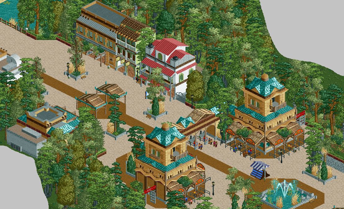
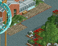
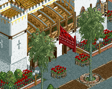
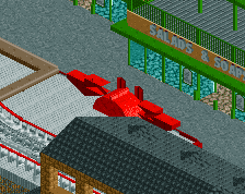
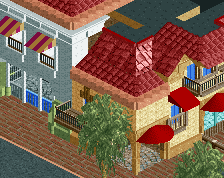
Jappy's Wildland Adventure Kingdom
-
1 of 14
- Views 3,490
- Fans 5
- Comments 23
Community Forum Software by IP.Board
Better?
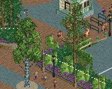
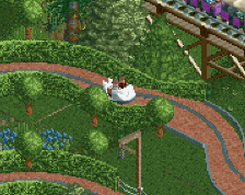
Yeah, but still looks very dense, try removing a tree or two every other tile. Also a little too much of that greyish green shade, try colouring the larches their default green.
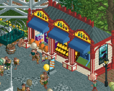
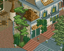
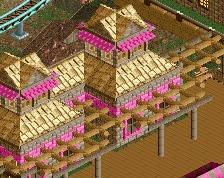
I don't think there are too many textures at all in the architecture, but maybe there could've been some more buildings matching the style of the entrance pavillions. That would be easily added later on though, don't change the lovely little street you have there now!
Try to add in some larger trees, the ones consisting of multiple tiles. They will add some more depth and space to breathe.in your foliage.
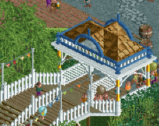
to be honest, as a foliage schtickler, i don't really see what people are complaining about. the foliage was fulfilling its duty. It also looks good now, but it also did before. archy looks really good, but it all seems to be on one layer. a bit of staggering/ making it slightly more 3d will help a tonne. colours/textures look really good.