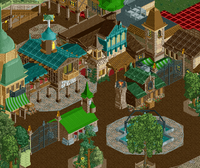
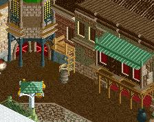
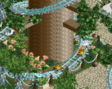
Great architecture here! I love the blue facade, a lot.
Some things bug me though:
- Why have two fence gates when there's a giant gap inbetween?
- The path mix is not working here, it's too organized compared to the chaotic architecture. Moreover I don't think the two textures blend well, and the roadlines are almost invisible and therefore useless. I think this area would look better with crazy paving (colourable, brown) with quartertile detailing.
- The fountain, including the path circle around it, appears way too big. And it unfortunately aligns with the tree in front. This whole fountain area is very underdetailed, again in comparison to the top area. Have you considered adorning the trees with lanterns (or something else)? Perhaps even a treehouse...
- Lastly, and I'm not sure about this, but the building on the left might be too light. The dark colours is what I love about the architecture here.
Yeah, like I said before this is awesome. Hopefully the fountain isn't covered from the other angles though? It'd be a shame to cover it up by trees on all sides.
I also think the green-topped building in the center is a bit out of place, it just doesn't match the style of anything else and looks a bit rushed. Other than that this all looks fantastic, just listen to some of the points that Liam brought up.
Quite a departure from what you usually do. Where'd the ultra smooth BG landscaping and foliage go? The buildings stick in those paths razor sharp. The colour contrast is at 120% and above. It's not bad, you've obviously improved over the last few months since you picked the game back up, but it feels like you're ignoring a few things you used to do better.
I really like the architecture here and the colors, especially that teal facade. I also agree with others that those two green buildings are out of place and awkwardly sized to be placed in the middle of the plaza for those wire gates. Perhaps you can switch them out for thinner rocky columns and some foliage?
 10-November 13
Great architecture here! I love the blue facade, a lot.
Some things bug me though:
- Why have two fence gates when there's a giant gap inbetween?
- The path mix is not working here, it's too organized compared to the chaotic architecture. Moreover I don't think the two textures blend well, and the roadlines are almost invisible and therefore useless. I think this area would look better with crazy paving (colourable, brown) with quartertile detailing.
- The fountain, including the path circle around it, appears way too big. And it unfortunately aligns with the tree in front. This whole fountain area is very underdetailed, again in comparison to the top area. Have you considered adorning the trees with lanterns (or something else)? Perhaps even a treehouse...
- Lastly, and I'm not sure about this, but the building on the left might be too light. The dark colours is what I love about the architecture here.
This is absolutely incredible. So atmospheric. Colours are fantastic. Listen to Liampie a little though. Don't change much, but a little.
Yeah, like I said before this is awesome. Hopefully the fountain isn't covered from the other angles though? It'd be a shame to cover it up by trees on all sides.
I also think the green-topped building in the center is a bit out of place, it just doesn't match the style of anything else and looks a bit rushed. Other than that this all looks fantastic, just listen to some of the points that Liam brought up.
Quite a departure from what you usually do. Where'd the ultra smooth BG landscaping and foliage go? The buildings stick in those paths razor sharp. The colour contrast is at 120% and above. It's not bad, you've obviously improved over the last few months since you picked the game back up, but it feels like you're ignoring a few things you used to do better.
I really like the architecture here and the colors, especially that teal facade. I also agree with others that those two green buildings are out of place and awkwardly sized to be placed in the middle of the plaza for those wire gates. Perhaps you can switch them out for thinner rocky columns and some foliage?
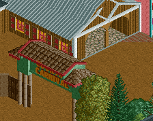
I think green kumba roof stands out too much.
Beautiful and immersive.