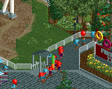
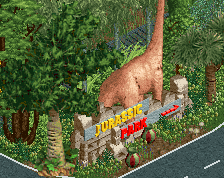
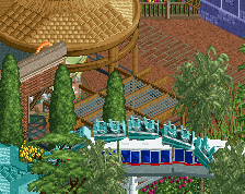
Top bit of the screen is frankly a mess (all rock types, rocks looking to float, tan path blending with tan building, messy building in general) but otherwise this is dope and among your very best work. Looks like a good use of a palette too!
Bit overboard on the green metal roofs I think, especially on the right side. Honestly I think a grey or black would look a lot better.
Agree about the rocks as well. Also feel you could probably find a better color for the awnings in the middle of the screen, not that it blends too much, just that its the same color you used for rocks and it's kind of an ugly color to begin with.
Overall a great screen though, probably among your best.
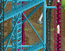
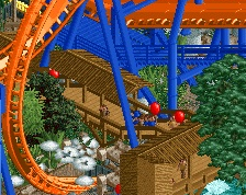
Ha a flying coaster, classic BG I like it, don't want you to change the coaster colors but maybe just changing the colors of the umbrellas will help enough.
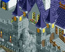
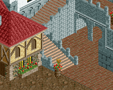
Honestly, I think you’re leaving a TON of potential atmosphere on the table.. I know you like the steel roofs but why not the rusted color ones from the base game? They’re just sucking a huge amount of vibe away from things. You could also have the foliage be so much more lush - why not use the thick jungle bushes? Jurassic park is supposed to be very tropical. The repetitive castle texture is also too dry for this imo - personally I think this should be steel, concrete, and corrugated steel. I’m also partial to changing out the off white paths to using either dirt or tarmac depending on where you are in the map. The white paths capture neither the rugged look or the clean industrial look that Jurassic Park should be a mix of.
yew I love some good JP areas. I'd actually encourage you to tone up the lushness- more overgrown bushes, rocks, flowers, jungley vibe shit. palm trees and ferns and more tropical/prehistoric vibes
Really liking this. I agree with cocoa, more lush jungle to sell the atmosphere. Also ditch those two floating 1k ruins on the krypton/lotr rock combo (which works really well btw).
 04-November 20
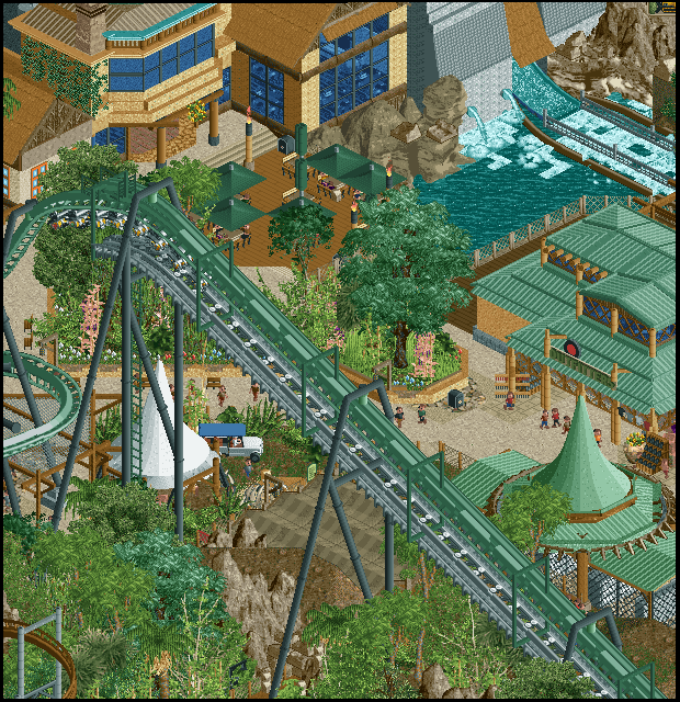
Top bit of the screen is frankly a mess (all rock types, rocks looking to float, tan path blending with tan building, messy building in general) but otherwise this is dope and among your very best work. Looks like a good use of a palette too!
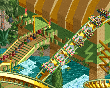
Love this. Very high calibre stuff and with these nice vintage BG influences for me. Reminds me of Stoksy's design as well.
Those umbrellas are actually fantastic, are those new objects? I agree with Liam about the rocks, but I'm excited about the rest.
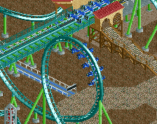
Of course now everyone picks to build B&M flyer designs...I was hoping I picked a more unique coaster type!
Bit overboard on the green metal roofs I think, especially on the right side. Honestly I think a grey or black would look a lot better.
Agree about the rocks as well. Also feel you could probably find a better color for the awnings in the middle of the screen, not that it blends too much, just that its the same color you used for rocks and it's kind of an ugly color to begin with.
Overall a great screen though, probably among your best.
Ha a flying coaster, classic BG I like it, don't want you to change the coaster colors but maybe just changing the colors of the umbrellas will help enough.
Love where this is headed.
if this is jurassic park thing then i think it's an appropriate amount of green.... otherwise one green element here should probably be changed.
yew I love some good JP areas. I'd actually encourage you to tone up the lushness- more overgrown bushes, rocks, flowers, jungley vibe shit. palm trees and ferns and more tropical/prehistoric vibes
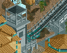
too messy, i love it tho
Really liking this. I agree with cocoa, more lush jungle to sell the atmosphere. Also ditch those two floating 1k ruins on the krypton/lotr rock combo (which works really well btw).
I loved the buildings