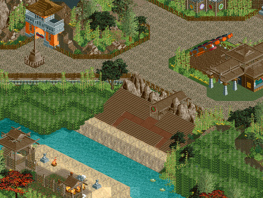
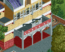
Screenshot / Bali theatre
-
 17-August 17
-
TerraVentura
-
6 of 15
- Views 1,865
- Fans 0
- Comments 14
-
Description
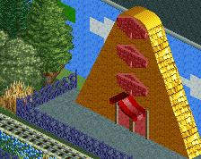
TerraVentura is still alive and kicking! Come to our theatre between the rice fields, to watch a typical Bali spectacle with original Bali residents!
Afterwards, you can take a ride on our enterprise or visit Antraboga where you can watch the creation of the world.
Have to yet add path and also benches and such... -
Full-Size
-
No fans of this screenshot
-
Tags
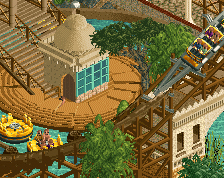
The foliage seems really appropriate and nicely done.
Very open, I like it. Almost too open, but peeps and some path details and stalls would fix that easily.
The building to the right is really cool
You should've finished this before posting... This has potential but it's dead and weird. Don't tell me you were going to leave the theatre seats like that?
It mainly needs benches, trash bins,... and some stuff to break the path. I think and hope it looks more atmospherical with peeps (you know I add them at the very end). Yes, I was gonna leave the seats like this. I could do them more detailed but that would cost objects... What do you suggest?
At least some kind of barrier on the sides and at the back from keeping the peeps from falling backwards into razor sharp rocks or sideways into a puddle of green standing water. And something at the front. If you want to save object slots, you better figure out a way to do rice paddies without stacking 1k bushes like that...
Needs a little bit more love, but it's still great. Very promising.
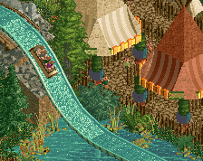
I would also change the green path; I thought it was a planter at first.
I agree with Liampie too. For me there's too much brutal contrast everywhere and some parts are too much calculated. For instance, the brown fences don't match with the paths and your foliage in general is a bit too bright in my opinion. I would also suggest to improve the paths, to break their monotony.
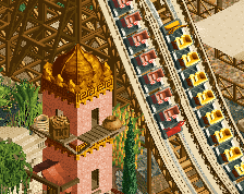
On the other hand, the buildings are particularly great, love them.
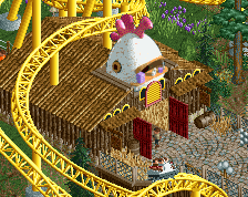
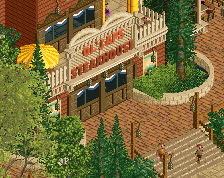
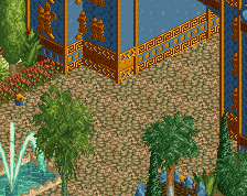
Made some changes with the feedback I got.
- changed the 1/4 bushwalls to heg wall (saving objects and looks kinda the same)
- got rid of the green water object and changed to normal water with a darker underbush
- placed fences near the edges of the theatre
- changed the seats to some more detailed seats
- changed the green path to a brownish one
- In the meantime I've placed some trees on the path to make it less monotone.
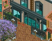
This is an improvement but I'm confused by the interaction between the railroad tracks and the walkway building.
I think it's missing a fence to keep guests from entering the water.
it's looking better in that second screen but it's still looking way too inorganic. There's no 'buffer' or softening between any elements. Just hard straight lines everywhere I look. Use landscaping and foliage to break things up. You can have reeds where the rice paddys meet the river for instance.
I do like the structures but I think they can be bigger in a wide open setting like this.
Holy crap this looks awesome now. Great job on this.
Damn it. I like the first screen a lot more than the second. Oh well, seems like you've made up your mind. Still excited to see more of this.