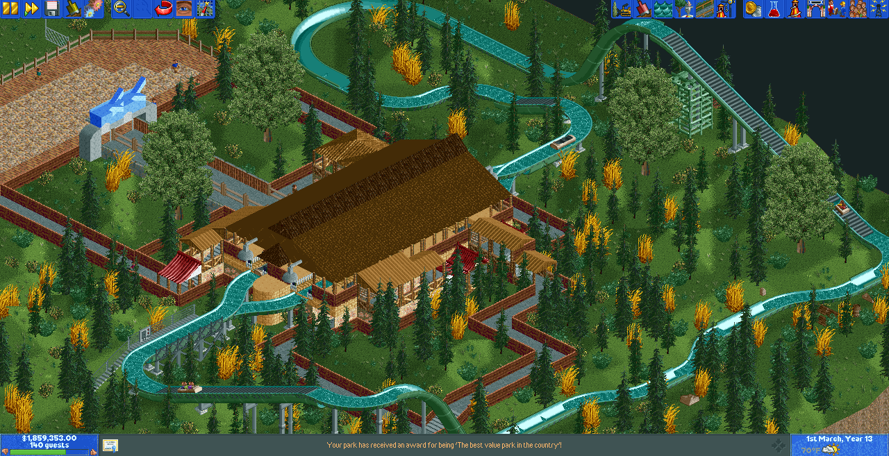
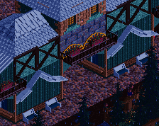
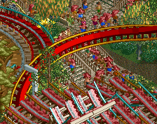
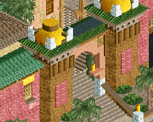
The roof is as a mess of textures. Awful really. Choose different colours for the walls and the top surface so it doesn't blend together, and stick to those colours for the entire building! Overall this isn't half bad though. Not at all like that other screen with the ultimage megapark that's included that wasn't included. More of this!
thank you! that first photo was suppose to be something else, and my pc didnt display my photos. just words, so i though i clicked the right one when it was too late
Otherwise this is far from the worst first screenshot posted here. Just need to spend a bit more time and make sure everything is to your liking before moving on.
Otherwise this is far from the worst first screenshot posted here. Just need to spend a bit more time and make sure everything is to your liking before moving on.
*Second
Agreed with most of what has been said so far. Try to avoid using the same color/shade everywhere as Liam said as well as not going too overboard with textures (and random objects like that oriental roof).
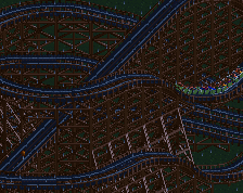
What's the point in merging dinghy slide track everywhere? it makes sense on drops and the wide turns, but there are a few straightaways where it just doesn't make sense.
Liampie is right about the roof. Unless you can find a combination of colors that doesn't make it look awful, don't use it. Usually you need to use 2 slightly different colors to make that roof work, for example a light brown and a dark brown.
The gold plants look absolutely awful, either change them to another color or get rid of them.
This screen could also use some better land textures. Oftentimes your foliage looks a lot better if the land is on a mix of grass/patchy grass of patchy grass/dirt.
I see a great effort to build a pretty large area that's trying to incorporate too many 'tricks' within each element, with each 'trick' competing for attention.
Most the comments above are pretty legit.
I suggest smoothing out your colors a bit and keep your textures a bit more consistent.
You can do a lot more with what you have here for sure, you just need the time consuming details that will make this look great.
EDIT: It's been bugging me I didn't say this..But there's still a lot of cool ideas going on here!!! Don't stop with the ideas, just tone them down a little. It has its coolness.
There was some effort put into this, I feel; however, it does not seem like enough effort, unfortunately for ya lad.
This needs quite a bit of refinement. There are several natch paraphanalia here that could be changed:
-There are far too many pointless merges
-The colour palette is dreadful - namely, those golden hay bale objects. Rid those, or change to a more homely, natural colour.
-I prefer station rooves to be all one colour. This feels uncultivated, here. Perhaps a bit too much brown.
The index of wrong could continue, but I will spare words that others have spoken already. Even though there is far too much wrong with this screen, it still bares some promise. I am keen to see where ya go with this!
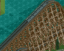
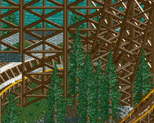
I gotta get in the realism and determination mood first. This flume was an old flume i made back in May. Maybe it is high time for me to build another one, or something similar.
This is a log flume a did back in May. Sorry about the random screenshot I done. It was suppose to be something else, and I clicked the wrong one... I'm open for tips on this log flume!
 20-September 17
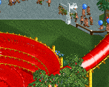
Who pissed in the bushes?
The station itself isn't terrible, but the colors of the entire screen need a major revamp.
I also approved your account now.
thank you! that first photo was suppose to be something else, and my pc didnt display my photos. just words, so i though i clicked the right one when it was too late
Then why don't you name your photos so you don't mix them up?
Otherwise this is far from the worst first screenshot posted here. Just need to spend a bit more time and make sure everything is to your liking before moving on.
*Second
Agreed with most of what has been said so far. Try to avoid using the same color/shade everywhere as Liam said as well as not going too overboard with textures (and random objects like that oriental roof).
What's the point in merging dinghy slide track everywhere? it makes sense on drops and the wide turns, but there are a few straightaways where it just doesn't make sense.
Liampie is right about the roof. Unless you can find a combination of colors that doesn't make it look awful, don't use it. Usually you need to use 2 slightly different colors to make that roof work, for example a light brown and a dark brown.
The gold plants look absolutely awful, either change them to another color or get rid of them.
This screen could also use some better land textures. Oftentimes your foliage looks a lot better if the land is on a mix of grass/patchy grass of patchy grass/dirt.
I see a great effort to build a pretty large area that's trying to incorporate too many 'tricks' within each element, with each 'trick' competing for attention.
Most the comments above are pretty legit.
I suggest smoothing out your colors a bit and keep your textures a bit more consistent.
You can do a lot more with what you have here for sure, you just need the time consuming details that will make this look great.
EDIT: It's been bugging me I didn't say this..But there's still a lot of cool ideas going on here!!! Don't stop with the ideas, just tone them down a little. It has its coolness.
There was some effort put into this, I feel; however, it does not seem like enough effort, unfortunately for ya lad.
This needs quite a bit of refinement. There are several natch paraphanalia here that could be changed:
-There are far too many pointless merges
-The colour palette is dreadful - namely, those golden hay bale objects. Rid those, or change to a more homely, natural colour.
-I prefer station rooves to be all one colour. This feels uncultivated, here. Perhaps a bit too much brown.
The index of wrong could continue, but I will spare words that others have spoken already. Even though there is far too much wrong with this screen, it still bares some promise. I am keen to see where ya go with this!
like I said, I take the tips. And i'll totally try to take it all when I build my next log flume. whenever that is
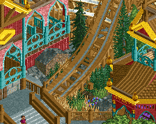
Why not rebuild this one?
Looking forward to it!
I gotta get in the realism and determination mood first. This flume was an old flume i made back in May. Maybe it is high time for me to build another one, or something similar.