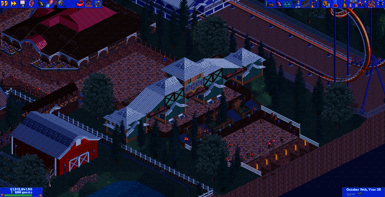
I want to like/comment/critique this, but I can't see a damn thing.
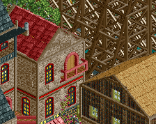
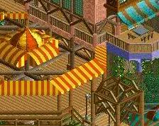
use gray instead of white for the decorative pillared fences. it still looks white because the object is so light, but you get more depth.
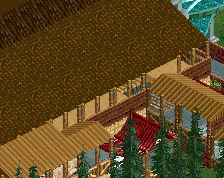
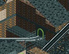
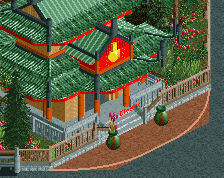
The structure is decent. It just needs more path organization. It just looks like a big archway as it is now. Add lines/queues/fences and more open pathing instead of having stairs right in front, should help make the building fit better
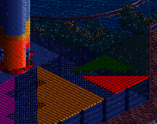
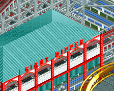
I did this in the same park as the log flume....lets take a moment and notice the crappy colors of the entrance and how ugly it is lol.
 26-September 17
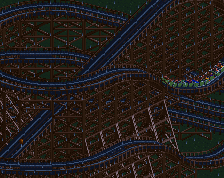
I want to like/comment/critique this, but I can't see a damn thing.
use gray instead of white for the decorative pillared fences. it still looks white because the object is so light, but you get more depth.
The structure is decent. It just needs more path organization. It just looks like a big archway as it is now. Add lines/queues/fences and more open pathing instead of having stairs right in front, should help make the building fit better