Fred, this is great! I was just looking at pictures of Cuban streets thinking about using it as a them for the multiplayer park and you really nailed the feel here. I love the rooftop terrace!
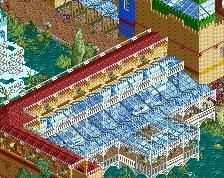
The black roofed portions of all the buildings could use something, but not sure what. They just need something simple to break up all the black (simple round poles might do the trick to serve as plumbing vents). I think you can also replace the black roof on the top of the church with more spanish tile, but its hard to say without seeing the rest of that building.
Keep up the great work! Looking forward to seeing more!
Very nice ! I feel like archy and trims could benefit from some variations, break it a bit. Add more details, add more dirt, it's too clean in my opinion. Otherwise very nice work and very excited to see how this project evolves.
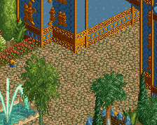
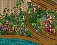
Nice work. The pavement/sidewalk is a bit of an obstacle course with all those benches and planters. Maybe it doesn't matter if the road isn't functioning but it looks weird.
Thanks for the lovely posts! Don't worry, adding stuff to the roofs is on my to-do list, I just planned to do it after everything else is done since I'm so afraid of hitting the object limit. The road isn't an actual road so it's kinda meant people walk there I think it will look better, more logical when there are actual peeps in the park.
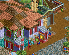
this is great, maybe my favorite thing from you yet. I think you may have gone a bit overboard on the bricks though. one trick I figured out was if your wall is made out of quarter tile blocks, just replace an occasional one with the brick texture block. it'll give you a similar effect to this but slightly less overwhelming
I'm not going to make the same mistake as with FUCK. Almost every building is made with large arches or the backsides of roofs. In order to save as much object data space. Thanks for the tip though.
I wish you'd make proper buildings rather than these awkward 3x3 (much less the 5x7) cubes. Your weakest link now is composition and it's clearly what is keeping you from getting higher than 75%
I wish you'd make proper buildings rather than these awkward 3x3 (much less the 5x7) cubes. Your weakest link now is composition and it's clearly what is keeping you from getting higher than 75%
3x3 is one of the most used forms in rct, so I don't really get what you're saying?! It's not all 3x3... I know there's enough stuff to improve on but I felt composition is one of the points that's clearly better than last work. In FUCK it felt more like a bunch of zones thrown together, this is way better here. Can it be better, probably. But for now I'm very happy with it.
Also, park looks better in-game than the screens look.
Nice work, Fred! Nice atmoshpere too. I like your colour choises.
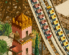
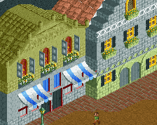
I think you need to slow down a bit with the crown moulding pieces. I think you use them a little bit too much on your buildings.
Also the pink building looks a bit bulky. Perhaps you could change the shape and size of it.
Still this is very good. Really looking forward to see more.
Wander trough the colorful streets of Havana, the capital of Cuba. Come eat delicious Cuban meals or go for a fruity cocktail at our "Cuba Libre" cocktailbar that features a rooftop terrace!
 31-October 17
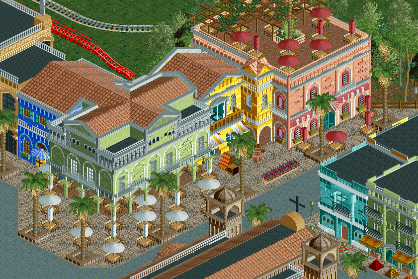
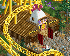
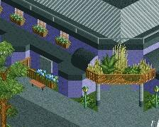
Fred, this is great! I was just looking at pictures of Cuban streets thinking about using it as a them for the multiplayer park and you really nailed the feel here. I love the rooftop terrace!
The black roofed portions of all the buildings could use something, but not sure what. They just need something simple to break up all the black (simple round poles might do the trick to serve as plumbing vents). I think you can also replace the black roof on the top of the church with more spanish tile, but its hard to say without seeing the rest of that building.
Keep up the great work! Looking forward to seeing more!
Beautiful work Fred, you've put together a wonderful little corner of the map!
probably the best archi ive seen from you so far. good work
Looks really nice, though you have a ton of clipping into those white umbrella tables from the columns of the green building.
Very nice ! I feel like archy and trims could benefit from some variations, break it a bit. Add more details, add more dirt, it's too clean in my opinion. Otherwise very nice work and very excited to see how this project evolves.
Those are some lovely planters.
Nice work. The pavement/sidewalk is a bit of an obstacle course with all those benches and planters. Maybe it doesn't matter if the road isn't functioning but it looks weird.
Thanks for the lovely posts! Don't worry, adding stuff to the roofs is on my to-do list, I just planned to do it after everything else is done since I'm so afraid of hitting the object limit. The road isn't an actual road so it's kinda meant people walk there I think it will look better, more logical when there are actual peeps in the park.
this is great, maybe my favorite thing from you yet. I think you may have gone a bit overboard on the bricks though. one trick I figured out was if your wall is made out of quarter tile blocks, just replace an occasional one with the brick texture block. it'll give you a similar effect to this but slightly less overwhelming
I'm not going to make the same mistake as with FUCK. Almost every building is made with large arches or the backsides of roofs. In order to save as much object data space. Thanks for the tip though.
fantastic work! your best yet!
I wish you'd make proper buildings rather than these awkward 3x3 (much less the 5x7) cubes. Your weakest link now is composition and it's clearly what is keeping you from getting higher than 75%
3x3 is one of the most used forms in rct, so I don't really get what you're saying?! It's not all 3x3... I know there's enough stuff to improve on but I felt composition is one of the points that's clearly better than last work. In FUCK it felt more like a bunch of zones thrown together, this is way better here. Can it be better, probably. But for now I'm very happy with it.
Also, park looks better in-game than the screens look.
Nice work, Fred! Nice atmoshpere too. I like your colour choises.
I think you need to slow down a bit with the crown moulding pieces. I think you use them a little bit too much on your buildings.
Also the pink building looks a bit bulky. Perhaps you could change the shape and size of it.
Still this is very good. Really looking forward to see more.
you know what i actually love about your work?
the fact that it is realistically styled, but its still rct, it still has the right vibe going for it, it isn't trying so hard to be real.
Stunning Work.