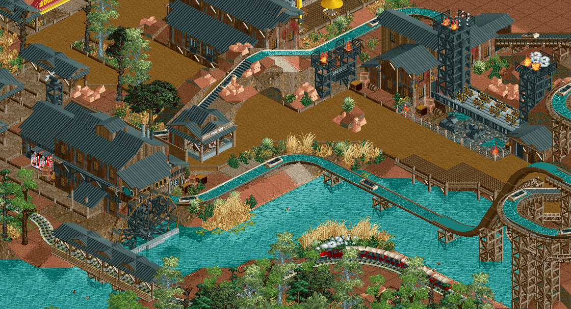
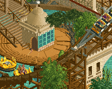
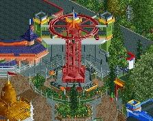
Very charming screen, Fred. You're constantly improving. Really like the the custom wooden supports. The overall atmosphere is pleasant. This just needs a little bit more finish. Great job.
Feels a bit rushed, but overall it could be quite nice with a bit more polish.
On what kinda stuff you see it as rushed? I didn't rush it.
Gonna try some different colors on the roofs. I also found a new fitting wall texture I can use in the buildings. Will show a new screen this evening or tomorrow. Other tips and suggestions highly appreciated
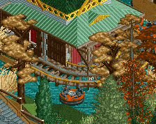
I like this a lot, especially the flume supports and all that frame stuff! I actually don't mind the black as much, but it'd be nice if you could add a fountain or something to break it up.
Aside from what others said about the roofs and stuff, I think you should make all of them overhang a bit, or at least add some trims.
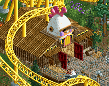
I tried patches of red, gray and black roof. I don't know if this is a real improvement. I tried full red and full gray roofs here and there but I really didn't like those. So it will be these patches or just complete black roofs;
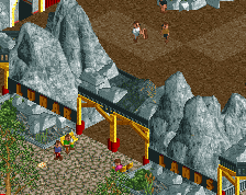
Otherwise, I don't think Australia's Outback needs more detailing except for landscaping details or color, the red clay is enough color for me and the outback is a bare landscape anyway. Some colored flowers wouldn't fit the theme at all.
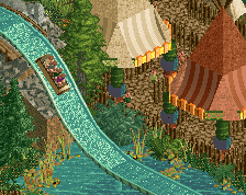
Explore the outback on one of the rapids sitting on a log. Old Jacks water mill is the place to be in the Outback for a good refreshment. If you dare ride Coal Blaster, the park's topspin that takes your world upside down!
 26-November 17
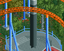
Very charming screen, Fred. You're constantly improving. Really like the the custom wooden supports. The overall atmosphere is pleasant. This just needs a little bit more finish. Great job.
too much black though, try and mix in some grey, reddish tints on the roofs
This is a very charming screen, Fred. I agree heavily with BelgianGuy on there being too much black.
Overall, this feels rather drab; it needs a pop of colour here and there, but it certainly is not bad! You've got me interested.
Feels a bit rushed, but overall it could be quite nice with a bit more polish.
On what kinda stuff you see it as rushed? I didn't rush it.
Gonna try some different colors on the roofs. I also found a new fitting wall texture I can use in the buildings. Will show a new screen this evening or tomorrow. Other tips and suggestions highly appreciated
Good work ! I also agree there's too much black
I like this a lot, especially the flume supports and all that frame stuff! I actually don't mind the black as much, but it'd be nice if you could add a fountain or something to break it up.
Aside from what others said about the roofs and stuff, I think you should make all of them overhang a bit, or at least add some trims.
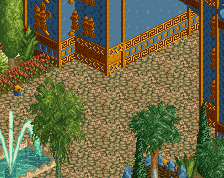
Obviously you have a few things to finish, but it looks nice so far.
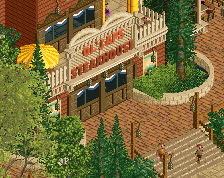
Don't forget path amenities!
Yeah Fredd, great job on the flume supports, or rather the choice of object.
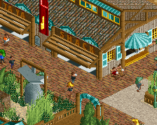
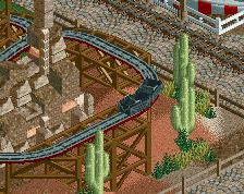
On a different note, I do enjoy the old rusty mining theme. Just as I said, make sure it's not too orthogonal.
Not as manically detailed as other stuff we get to see which I like. Very good composition too. Rather likable screen.
I tried patches of red, gray and black roof. I don't know if this is a real improvement. I tried full red and full gray roofs here and there but I really didn't like those. So it will be these patches or just complete black roofs;
Otherwise, I don't think Australia's Outback needs more detailing except for landscaping details or color, the red clay is enough color for me and the outback is a bare landscape anyway. Some colored flowers wouldn't fit the theme at all.
Not keen on that multicolour roofs. I'd keep them black, with maybe one or 2 tiles per roof a different colour, not total patchwork like this.
Just as if the roofs have been patched up in places.
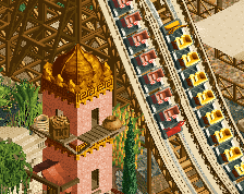
It's too orthogonal! The wilderness doesn't have such 90° angles for their cross country trails.
Trust this guy Fred, he's a RCT Mine Engineering Pro
I'm just gonna stick with black. I tried red and gray but both didn't convince me.