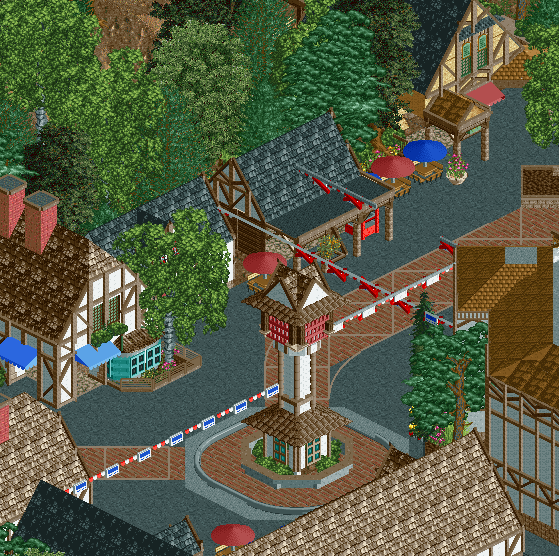
Not bad! Feels cleaner than your other work, though it also feels a bit deader at the moment. Maybe peeps will help it feel a bit more lively, or things like racks of souvenirs spilling out of shops, more tables, etc.
Could easily be called a German village and I would buy it. Sorry, not the right feel to call it English imo, but to be fair: BG Williamsburg suffers the same problem with their 'English' zone.
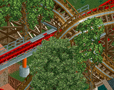
I think the main tower is a bit too skinny, the deco trim flags or whatever are too thick too. Maybe try finding a different object for the red "x" bits? Can't say I understand the point of the trackitecture on the path either.
Really good though, probably your most "themeparky" work yet. Archy is both clean and very detailed too.
I'm not keen on the path. Too much is going on with the roadlines, the glitching path/track, and the different shades of grey. It looks rather messy. Overall it's not as good as some of your other screens.
But I'm curious to see the rest of the area.
Just curious, and i guess this kind of is a "USA v EU" thing, but why do so many of you guys care about authenticity in theme parks? This essentially is a semi-rec, so if you went to BGW would you not like it because their themes don't accurately represent what you believe they should represent?
I totally agree with the sterile/needs life camp. Unfinished screens tend to do that lol. Really appreciate the suggestions from G Force in particular.
It really isn't a European VS US thing... i mean if I would build a farm theme and then present it as a city theme, you would also mention something isn't right. As I said before, this doesn't look English at all and I also did say it's mostly BGW fault since I assumed you we're semi recreating it.
I'm going to BGW and I'll probably be slightly annoyed by seeing European countries pictured wrong. But I'll like the park anyway, like I had a blast at Kings Island while thinking their fake Eiffel Tower looked bad as hell. .
I guess you're right, but with americans its typically authenticity to certain IPs. Just like something cant be "english enough", something cant be "cedar fair enough". I'm just wondering, not really worrying, how it'll affect reception down the road.
I think the angle is a bit unfortunate. The screenshot is basically filled with trees, roofs and paths, while it doesn't show bushes, windows and other small things. This results in a sterile and perhaps somewhat dead look, but that might be different in-game and with the additions of peeps. I agree with G Force that you should find another way to do these red crosses, there are thinner objects out there that would look way better. And the paths are unnecessarily messy. The clock tower is very nice and the tudor work is executed well too.
I guess you're right, but with americans its typically authenticity to certain IPs. Just like something cant be "english enough", something cant be "cedar fair enough". I'm just wondering, not really worrying, how it'll affect reception down the road.
Who cares, just fucking build what you want and fuck the haters.
Looking back, it may not be as sterile as it seemed at first. But at the moment, it lacks a bit of liveliness. I'm aware of the recreation aspect, but i'd put this as an acceptable excuse to go off course. the lack of any real facades (aside from the tan facade, which is great!) or colour detailing on buildings or made this very underwhelming for me, the black tarmac is not contributing much either. With a bit more finish (stalls, peecs etc) I'm sure this will come out lovely
The tower isn't that thin in real life. I say add some more flags over the midway, widen the tower and call it a day. For the most part it's really good, we were there yesterday and you nailed the BGW vibe.
 24-March 18


Not bad! Feels cleaner than your other work, though it also feels a bit deader at the moment. Maybe peeps will help it feel a bit more lively, or things like racks of souvenirs spilling out of shops, more tables, etc.
Could easily be called a German village and I would buy it. Sorry, not the right feel to call it English imo, but to be fair: BG Williamsburg suffers the same problem with their 'English' zone.
such a cozy little village. i personally hate those roofs anytime they arent black though
i agree with fredd, not that i know dick about europe
I completely agree with FredD, but that's more an issue of the real park I guess. This feels nothing like any part of England.
Still looks good though.
I think the main tower is a bit too skinny, the deco trim flags or whatever are too thick too. Maybe try finding a different object for the red "x" bits? Can't say I understand the point of the trackitecture on the path either.
Really good though, probably your most "themeparky" work yet. Archy is both clean and very detailed too.
I agree with rob that this really needs life... also the framework archy feels very generic, but i can see potential here.
Not too shabby. I agree that this calls for some life....and perhaps a bigger (wider) clock tower.
You had best impress me with my home park.
I'm not keen on the path. Too much is going on with the roadlines, the glitching path/track, and the different shades of grey. It looks rather messy. Overall it's not as good as some of your other screens.
But I'm curious to see the rest of the area.
very sterile
I totally agree with the sterile/needs life camp. Unfinished screens tend to do that lol. Really appreciate the suggestions from G Force in particular.
I'm going to BGW and I'll probably be slightly annoyed by seeing European countries pictured wrong. But I'll like the park anyway, like I had a blast at Kings Island while thinking their fake Eiffel Tower looked bad as hell. .
I don't think it's sterile at all. i think you've created such a dark and unique mood here. just needs cleaning up.
I think the angle is a bit unfortunate. The screenshot is basically filled with trees, roofs and paths, while it doesn't show bushes, windows and other small things. This results in a sterile and perhaps somewhat dead look, but that might be different in-game and with the additions of peeps. I agree with G Force that you should find another way to do these red crosses, there are thinner objects out there that would look way better. And the paths are unnecessarily messy. The clock tower is very nice and the tudor work is executed well too.
Who cares, just fucking build what you want and fuck the haters.
Looking back, it may not be as sterile as it seemed at first. But at the moment, it lacks a bit of liveliness. I'm aware of the recreation aspect, but i'd put this as an acceptable excuse to go off course. the lack of any real facades (aside from the tan facade, which is great!) or colour detailing on buildings or made this very underwhelming for me, the black tarmac is not contributing much either. With a bit more finish (stalls, peecs etc) I'm sure this will come out lovely
The tower isn't that thin in real life. I say add some more flags over the midway, widen the tower and call it a day. For the most part it's really good, we were there yesterday and you nailed the BGW vibe.