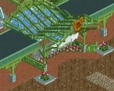
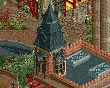
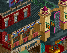
so good, like something I've always wanted to make and never quite got right. you've done that brick texture justice, which isn't something I think I'd actually seen before.
I'm still taking credit for revamping krypton rock interest
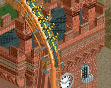
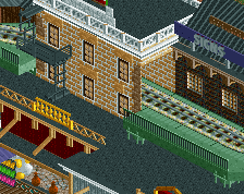
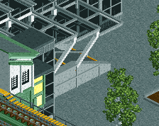
Those coaster supports look like they were filled in accurately based on the direction you gave to whomever was given that task, supposing that there was another builder on this portion of the map who contributed about 1/100th of a percent.
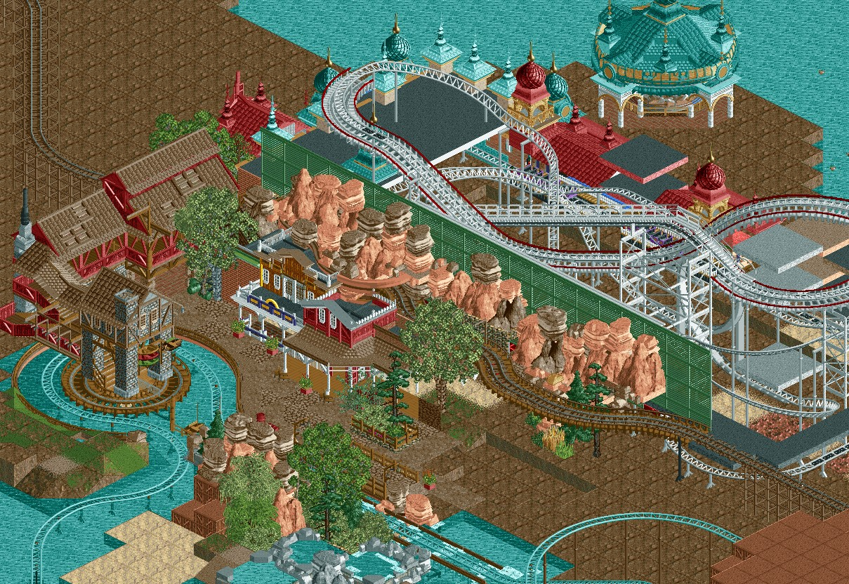
Oof. The rock backdrop layer feels unnecessary, to be honest. Running a train through there is the kind of thing I would do, which is a sign it's too cramped and will hurt the clarity of what you're trying to do with the area. I'd suggest either :
- Enclose the whole section in a tunnel and don't bother with the exterior theming since it's out of peep line of sight
- re-route the tracks to the left and do a trestle over the rapids
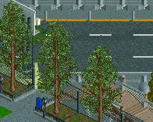
really digging the architectural style you achieved here, it's simple and effective, and not overburdened with details that don't really have any impact over the initial "wow he actually took the time to do that". i agree with intamin and think he made a great suggestion, kinda looking forward how you'll approach wider foliage in this.
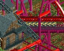
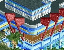
Overall the composition is great. I love the boats hanging above the station for the water ride and the stone texture 1/4 cso blocks.
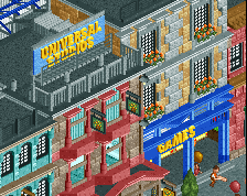
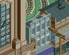
I'm not sure how I feel about the transition from the mountain backdrop to the latticed wall of the Luna Parkesque area. If the mountains are in the view of guests, that would mean a giant green lattice wall will still be rising beyond these mountains, killing the illusion of both place and depth. I think what would be the ideal situation here would be to have a few units between these two areas that foliage could soften the transition or the very least distance would bring the lattice wall out of the view of the opposing area.
I love what you've done with both areas on their own, I'm just unsure of how seamlessly they are conjoined. ][ said it right, it is just a bit too cramped for what it is there.
 11-October 18
Quite beautiful and with obvious heart. Paths just ever a bit too tight for me. Good to see you around the site.
so good, like something I've always wanted to make and never quite got right. you've done that brick texture justice, which isn't something I think I'd actually seen before.
I'm still taking credit for revamping krypton rock interest
nice work, continue
So glad you're going through with this. Everything in this screen is fucking gorgeous!
Those coaster supports look like they were filled in accurately based on the direction you gave to whomever was given that task, supposing that there was another builder on this portion of the map who contributed about 1/100th of a percent.
Also, that rockwork is phenomenal!
Oof. The rock backdrop layer feels unnecessary, to be honest. Running a train through there is the kind of thing I would do, which is a sign it's too cramped and will hurt the clarity of what you're trying to do with the area. I'd suggest either :
- Enclose the whole section in a tunnel and don't bother with the exterior theming since it's out of peep line of sight
- re-route the tracks to the left and do a trestle over the rapids
I like the rocks. Amazing work so far, I'd love to see more of that boardwalk architecture!
I agree entirely with ][ntamin. There's something stuffy about this screen
Looks amazing!
really digging the architectural style you achieved here, it's simple and effective, and not overburdened with details that don't really have any impact over the initial "wow he actually took the time to do that". i agree with intamin and think he made a great suggestion, kinda looking forward how you'll approach wider foliage in this.
holy sh*t this much of took a lot of patience.
Overall the composition is great. I love the boats hanging above the station for the water ride and the stone texture 1/4 cso blocks.
I'm not sure how I feel about the transition from the mountain backdrop to the latticed wall of the Luna Parkesque area. If the mountains are in the view of guests, that would mean a giant green lattice wall will still be rising beyond these mountains, killing the illusion of both place and depth. I think what would be the ideal situation here would be to have a few units between these two areas that foliage could soften the transition or the very least distance would bring the lattice wall out of the view of the opposing area.
I love what you've done with both areas on their own, I'm just unsure of how seamlessly they are conjoined. ][ said it right, it is just a bit too cramped for what it is there.