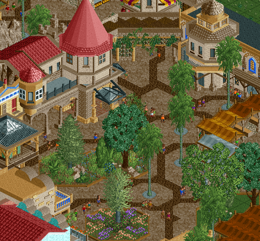
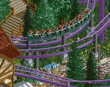
Archy is pretty good, probably some of your best. Those planters are pretty messy though, I'd look at something like BGA or PoE to get a better feel for that tropical/jungle atmosphere.
Agree with Russ about the planters, too messy imo - eg the sparse grass and grass/dirt land combo suggests neglect whereas a tropical/jungle atmosphere should have very lush foliage.
Also, just be wary of repetitiveness in your archy. Had a quick look at the video and it seems the towers of a lot of your buildings are the same shape and style (two-straight, one-diagonal, single floor). Would be good to see some more variation in those towers and overall footprint composition of some structures.
Otherwise, excellent work. Probably your best as others have said. I've never liked that dirt path but it almost works here. Still think similar pathing to PoE or more brick texture would work better though.
I really like the path pattern, but not the mud path itself. You have this great, big, beautiful entrance plaza and then there's mud everywhere? No, I suggest using something different, or at least something with a different colour. It's too brown now IMO. I also agree with Russ about those planters.
The archy is great though and feels welcoing, like I'm about to enter this massive adventure. In that aspect, it's succesfull.
MULCH! I actually like the path choices. Planters could be fixed up, and maybe drop a tree or two. I know it's supposed to be lush, but it feels a bit too closed in right now. Archy is great!
At first glance, I really liked this - so that's promising.
Agreed with above about the planters; that dark tree trunk is eye catching in a bit of a bad way in my opinion.
I like the path, but I wish there was a bit more contrast between the mulch objects, the brown dirt looking path, and the ground floors of the structures.
 28-November 18


https://www.youtube....fe2dphxw03c010c Here is the video link as promised.
Archy is pretty good, probably some of your best. Those planters are pretty messy though, I'd look at something like BGA or PoE to get a better feel for that tropical/jungle atmosphere.
I love it The path actually works really really well.
Nice job!
Agree with Russ about the planters, too messy imo - eg the sparse grass and grass/dirt land combo suggests neglect whereas a tropical/jungle atmosphere should have very lush foliage.
Also, just be wary of repetitiveness in your archy. Had a quick look at the video and it seems the towers of a lot of your buildings are the same shape and style (two-straight, one-diagonal, single floor). Would be good to see some more variation in those towers and overall footprint composition of some structures.
Otherwise, excellent work. Probably your best as others have said. I've never liked that dirt path but it almost works here. Still think similar pathing to PoE or more brick texture would work better though.
I really like the path pattern, but not the mud path itself. You have this great, big, beautiful entrance plaza and then there's mud everywhere? No, I suggest using something different, or at least something with a different colour. It's too brown now IMO. I also agree with Russ about those planters.
The archy is great though and feels welcoing, like I'm about to enter this massive adventure. In that aspect, it's succesfull.
MULCH! I actually like the path choices. Planters could be fixed up, and maybe drop a tree or two. I know it's supposed to be lush, but it feels a bit too closed in right now. Archy is great!
At first glance, I really liked this - so that's promising.
Agreed with above about the planters; that dark tree trunk is eye catching in a bit of a bad way in my opinion.
I like the path, but I wish there was a bit more contrast between the mulch objects, the brown dirt looking path, and the ground floors of the structures.
SG
That's awesome Scoop. My favorite screen from you.
He has evolved. Nice Scoop.