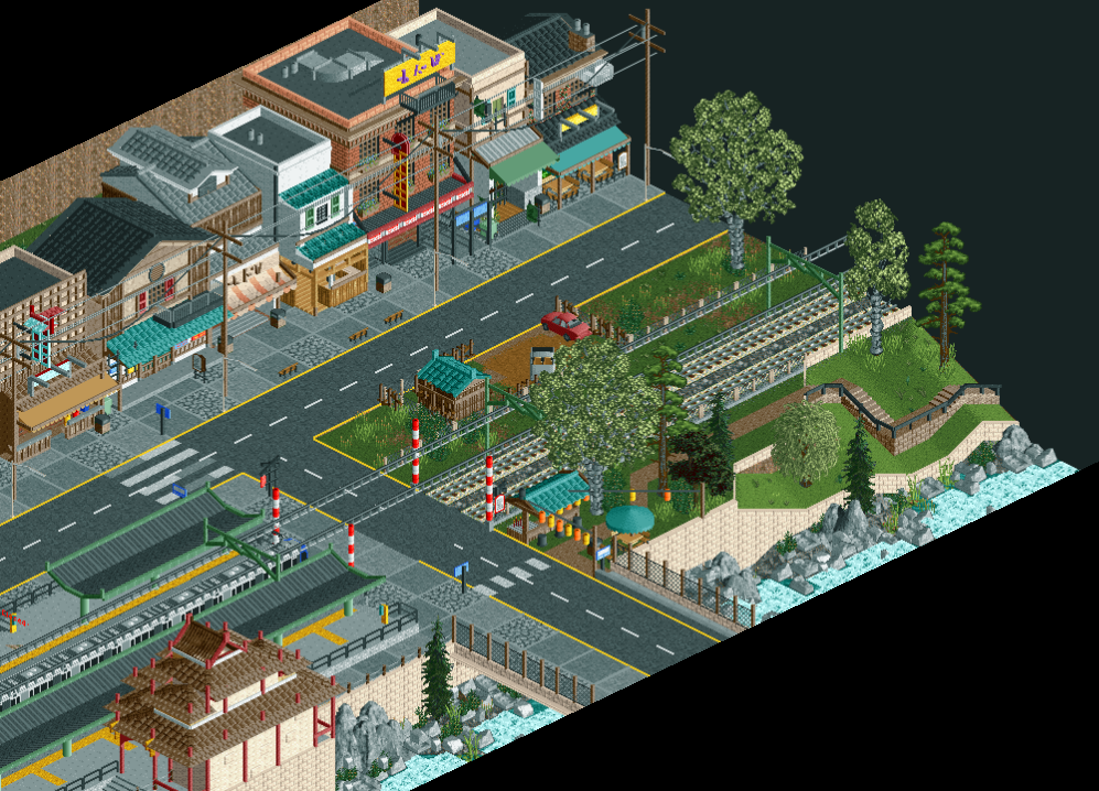
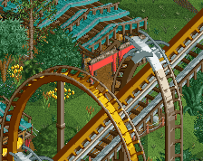
Screenshot / Asian project
-
 30-December 18
-
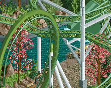
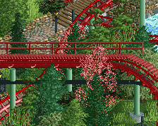
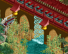
Yangshou Valley Thrill & Water Park
-
1 of 10
- Views 1,692
- Fans 4
- Comments 9
Community Forum Software by IP.Board
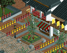
That looks really good Rec! H2H really helped you to step your game up it seems. I'd go for more diagonal road lines and more messy paths, it looks a bit too clean with all those roadlines in squares.
unlike a lot of people i know, this still looks as good now that im sober. Really good detail and balance in the architecture. I'd suggest trying a less bright color for the wall near the canal, it really draws a lot of attention the way it is now! Also, i agree with Fred about the roads. It needs more trash.
Comment of the week right here.
So much to love here. You absolutely nailed the theme as far as I'm concerned. I personally like the roadlines in squares, as they provide some nice contrast from the messy power lines above it. The cleanliness speaks towards a different aspect of the theme. I think you could make a more messy section of these town surroundings elsewhere to differentiate little areas, but I love where this is right now.
Those street lamps get camouflaged by the path, though, which is a shame.
The archy is way too good. Can't wait to see more!
Thanks! I will check if it looks good if I make it a bit more messy.
Yea the wall was giving me a headache, I also tried light brown and dark brown (which looked atrocious) and Liam suggested I use grey. Grey looked kinda good as well but it made the whole scene so grey. Do you have a suggestion for a different colour? I might also play around with different objects, but I kinda like this wall object.
I actually agree with you on the street lamps and considered just making my own ones out of objects as I also think the current street lamps are kinda low. Will try some stuff out, thanks for the suggestion!
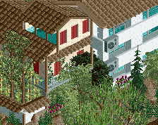
Thanks, I definitely took inspiration from Tubaio as I really liked that style. I also took inspiration from some different parks (Like Riverland, BGA and Lijang). However I can assure you that the rest of the park is very different from any of these parks and I think that because of that this park will still get its own unique feeling.
Amazing screen
Thanks V1 and MrTycoonCoaster !
!