Screenshot / Kanchenjunga
-
 17-April 19
-
 The Good Earth
-

 5 of 13
- Views 1,465
- Fans 1
- Comments 9
-
 Description
Deep in the Nepalese highlands, the land does more than provide subsistence. Every peak and valley is sacred; this is the land of Shiva.
This reverent yet regal locale is the latest chapter to be featured in The Good Earth.
Another full screen to tide you over between Micro Madness rounds. -
 Full-Size
-
1 fan
 Fans of this screenshot
-
 Tags
Tags
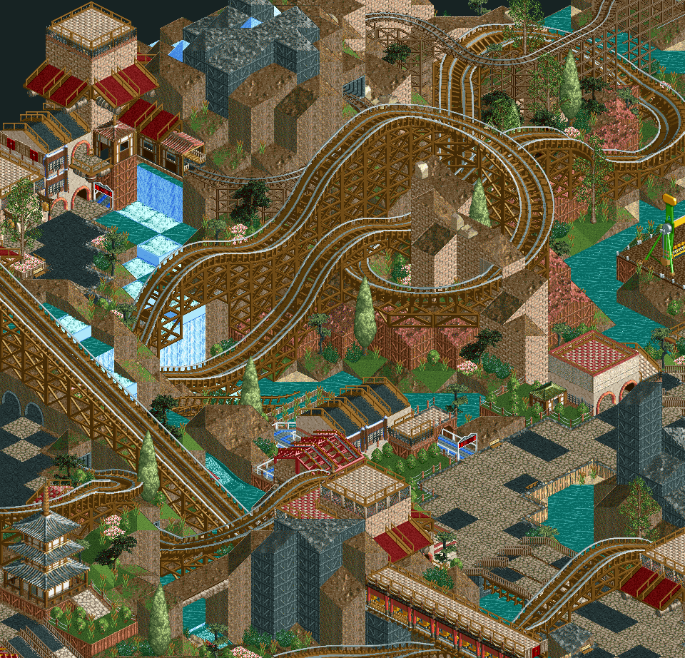
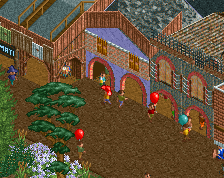
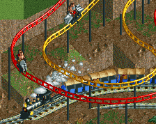
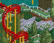
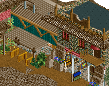
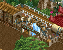
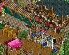
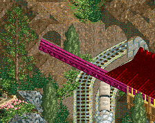
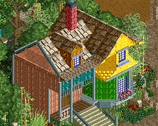
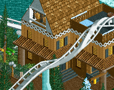
The black wood land/wall texture is a bit odd to me. Other than that I really enjoy this!
Very chaotic but I like the way it is.
Nice screen. Cool stuff and you're tossing some modern elements into a throwback style.
To touch on what Liampie covered, I like the ambitious landscape but I do think it is a source of some of the problems. In a larger area with a mountain in the middle most angles will have the issue of the building on top of the mountain in the foreground looking like it is level with the buildings in the background. That's just an unfortunate reality. What comes into play is building location and composition. Keeping buildings around the base of elevation changes and having them built more into the steep cliffs would help. For the composition you could sprinkle in some more modern elements by keeping the buildings that are higher up more distinct by stacking and hacking fences/banners/path and use less of the bulky land blocks.
I agree that the elevation causes some issues with perspectives. But I want the viewer to have to look at it from all 4 angles to get the full experience. And if I'm going to do a Himalayan theme, it's gotta have a pretty drastic landscape.
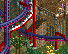
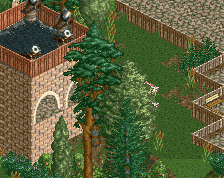
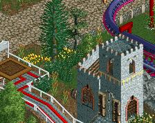
Here's a look from another angle that might help put some elements into place without spoiling too much.
I realize it'll be hard to grasp what's going on without seeing the entire area on one screen, so I guess you'll have to wait for the release!
I honestly forgot to respond earlier, was going to.
Great atmosphere and I think you're nailing the theme. The landscaping is a bit chaotic for me though, or too many different types of rock? Idk. I think the verticality is good however and the second screen is much more legible.
edit: i think you need more textural distinction between the path, buildings and landscape - everything kind of blends together right now (which is only an issue when you have this kind of jagged landscape). i'd maybe consider brown dirt for the paths so that you don't have the blacks and greys/beige which you also use in the buildings.