Screenshot / MaXair
-
 09-July 19
-
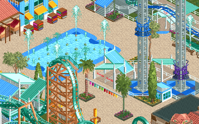
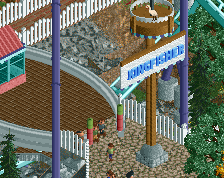
San Esteban Fiesta Village
-
4 of 5
- Views 1,613
- Fans 1
- Comments 13
-
Description
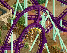
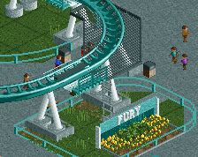
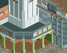
In our newest park expansion you can find the ultimate thrill shooting you to the sky! MaXair! For those with a weaker stomach, we also have a not-launch version ;)
California can get pretty hot, so cool down with our dancing fountains! Ideal refreshment for the young and elderly! -
Full-Size
-
1 fan Fans of this screenshot
-
Tags
Looks awesome, great colours. Really cheery atmosphere. I like the blue under the power tower. Peeps are going to make this even better
When the inevitable Faas anti steel roof comment arrives, don't listen they look great here
Bold move mixing the mint toothpaste color with aqua toothpaste color. Idk about the colors, everything seems washed out. Even the black roof doesn't seem very dark. This is probably what california really looks like but I need sunglasses to look at this screen.
Besides the colors it looks great. Even the colors aren't that bad, just need maybe one or two more darker hues to balance everything out.
I feel the scale is a bit off, the coasters lift should be a tad bit taller. The color and textures could use some tweaking as well. Overall I like where this is going.
I'd probably mix in some more of that darker shade of path color along some of the edges/buildings to give it a little more contrast without losing the overall look you're going for. Love this project!
This, my friend, is a great suggestion! It really looks much more interesting right now with that darker shaded path mixed in. Thanks
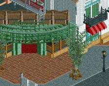
I think it's a bit too much white and blue. i also think the facades to the left are a bit too flat, they don't really look like the buildings are being used.
You know i like this. But Recurious has a point. it's missing path features.
Those are already added in the mean time
I hate the path but I love everything else