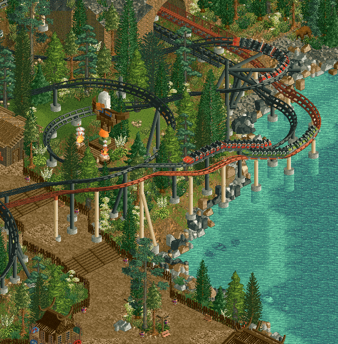
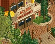
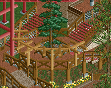
I like it, Fred. I like the dark colours. On the other hand I find the paths to be quite clunky... Maybe it's because you have such a hard boundary with the tall fences, something I often notice in your work. Maybe try a different approach here. Smoother path-park transitions, and perhaps some variation as well
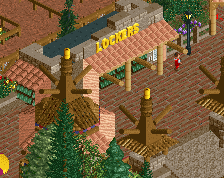
Cool screen and an interesting theme in general with the Viking settlement. However, I would caution against the theme of "Can Leif Erikson hold up against the Natives?!"
1. Leif Erikson may or may not have encountered any First Nations people on his voyages. It's unclear.
2. I'm not sure it's prudent to trivialize the beginnings of a genocide. However, I think this theme could be done tastefully if the beliefs + traditions of the First Nations of Atlantic Canada are accurately / respectfully represented here.
To be clear, I'm not accusing you of any wrongdoing; I just think it's worth being careful about and researching. I myself have made parks with Native American themes before, and I certainly could have done a better job representing them.
I like it, Fred. I like the dark colours. On the other hand I find the paths to be quite clunky... Maybe it's because you have such a hard boundary with the tall fences, something I often notice in your work. Maybe try a different approach here. Smoother path-park transitions, and perhaps some variation as well
Any suggestions on how to reach a smoother transition? Ideally I wanted no fence there, like a path in the forest. But with the coaster all around, can't really do that realistically
Any suggestions on how to reach a smoother transition? Ideally I wanted no fence there, like a path in the forest. But with the coaster all around, can't really do that realistically
Instead of using the fence only at the direct border of the path and putting foliage behind that, you can sometimes move it back a bit and put some foliage or other stuff (rockwork etc.) that's now behind a fence in front. That way peeps still can't reach the coaster but it doesn't feel too fenced in.
I like the colors and the overall atmosphere. Also i think you really textured that path quite well. For improvement i agree with Faas' suggestions regarding the fence.
Agreed, it's always nice to see new work from you Fred, and it feels like it's been a hot minute.
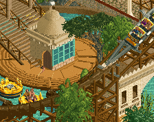
I like the screen overall. Both the ride and theme seem well inspired and fun. Stylistically it's in the lower gold level for me, a bit lower perhaps than your other recent screens. I'm a little on the fence with the 1k brick edge. Not sure it's quite working. And perhaps is there anything you could do to make the supports feel less imposing? For instance could the parallel tracks receive Y-supports that carry both tracks, and could this go into the path with a small planter around it (?), ie making the path a little bigger there. Just to make everything speak with one another more. I think how the three chonky supports sit right on top of the path is a bit unfortunate currently.
By the way, how many times have I told you to build with peeps already in the park haha. This is another peepjam disaster waiting to happen!
I've let in peeps a few times to test the peepability, but I want them out when building because they are dumb and distracting. Big difference now compared to my old peepjam parks is that I already do the path and shops right away now, and not at the very last moment. Should leave unconnected paths etc to a minimum.
I can def look to simple down the supports so they take less space on the path. On the rocky coast, I myself quite rather like it so don't know if I'll get rid of it. Probably not.
Having built Legend of the Lake, I have no reservations when it comes to including black in the rock color palette. Regardless of the colors you choose, it might look a bit more natural if you include a few underwater as well so that they don't appear as if they are floating.
For the very first time in history, Europeans are setting foot on American soil. Leif Erikson has landed and names the place Vinland. Can the newly arrived Vikings settle and hold up against the Natives?!
 23-January 24
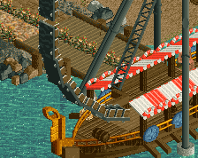
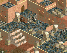
Haha I love this totem! My only complaint would be the black color of the rocks, maybe keep only the other two colors or add a 3rd a little softer.
Agree with babar. Black rocks stick out a bit too much. Everything else is cool.
I like it, Fred. I like the dark colours. On the other hand I find the paths to be quite clunky... Maybe it's because you have such a hard boundary with the tall fences, something I often notice in your work. Maybe try a different approach here. Smoother path-park transitions, and perhaps some variation as well
Cool screen and an interesting theme in general with the Viking settlement. However, I would caution against the theme of "Can Leif Erikson hold up against the Natives?!"
1. Leif Erikson may or may not have encountered any First Nations people on his voyages. It's unclear.
2. I'm not sure it's prudent to trivialize the beginnings of a genocide. However, I think this theme could be done tastefully if the beliefs + traditions of the First Nations of Atlantic Canada are accurately / respectfully represented here.
To be clear, I'm not accusing you of any wrongdoing; I just think it's worth being careful about and researching. I myself have made parks with Native American themes before, and I certainly could have done a better job representing them.
Any suggestions on how to reach a smoother transition? Ideally I wanted no fence there, like a path in the forest. But with the coaster all around, can't really do that realistically
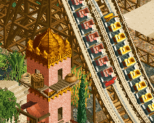
This is how Rct1 Scenarios look in my nostalgia filled rose tinted googles glow up memory of them. Love it
Instead of using the fence only at the direct border of the path and putting foliage behind that, you can sometimes move it back a bit and put some foliage or other stuff (rockwork etc.) that's now behind a fence in front. That way peeps still can't reach the coaster but it doesn't feel too fenced in.
I like the colors and the overall atmosphere. Also i think you really textured that path quite well. For improvement i agree with Faas' suggestions regarding the fence.
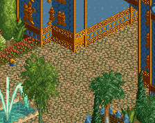
I moved the fence a tile or two behind the bushes and it really looks much better. Great suggestion!
Always glad to see new Fred content. Great stuff!
I've let in peeps a few times to test the peepability, but I want them out when building because they are dumb and distracting. Big difference now compared to my old peepjam parks is that I already do the path and shops right away now, and not at the very last moment. Should leave unconnected paths etc to a minimum.
I can def look to simple down the supports so they take less space on the path. On the rocky coast, I myself quite rather like it so don't know if I'll get rid of it. Probably not.
Having built Legend of the Lake, I have no reservations when it comes to including black in the rock color palette. Regardless of the colors you choose, it might look a bit more natural if you include a few underwater as well so that they don't appear as if they are floating.
Beautiful eagle totem!
Super classic feeling. Agreed with terry on the floating rocks syndrome, sink some of those bad boys