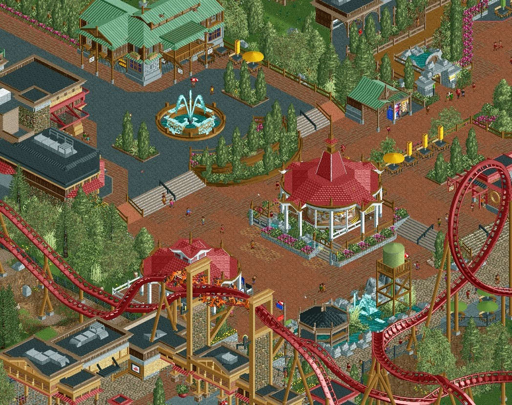
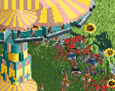
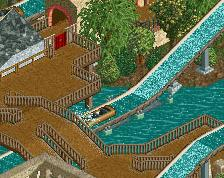
Screenshot / Same project, different screen. Quarry Themed park?
-
 05-April 20
-
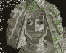
Quarry Adventures
-
2 of 8
- Views 1,650
- Fans 2
- Comments 16
Community Forum Software by IP.Board
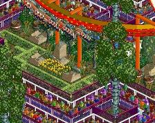
that looks pretty fantastic. good stuff- feels like a herschend park or some other well-kept american park.
play with your foliage colors though- that pale green for every tree isn't working well imo. the more saturated green for oak/birch type trees is standard, and then the darker green for pine trees etc. this will fill out the atmosphere more and help it pop
That looks really good! You got some lovely archy over here and some nice texture use. Overall the screen looks a bit dull, don't know if that's due to the image quality or just the colors in-game. I echo Cocoa to repaint your foliage colors a bit. I think that will do wonders and elevate this whole area so much
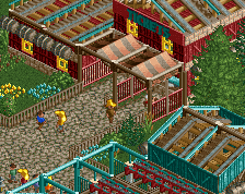
I really really like how you flipped the Gatekeeper aesthetic to something more natural and organic from a texture standpoint. It works incredibly well. That two-level curved planter is also phenomenal.
Wow this is great. The combination of the blacks, dull reds and browns is so nice. I agree with using a more lush foliage colour.
Maybe it's too late to bother changing, but the entrance position feels a tad awkward and would benefit from being moved to the left a few tiles (along with the coaster element).
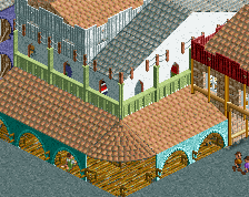
This is fantastic, love how you've integrated the stone lotr walls into the entrance structure. General color and mood of everything is great too. I have two suggestions.
1) Bush/Foliage color, seems you're using a really washed out and sickly green for the bushes here. Not sure if I really like that, always prefer the default greens.
2) Path types, theres a few too many of them. Especially the orange brick infront of the carousel, and the alternating tarmac-brick-tarmac on the left side. I'd just use one brick style and simplify the path on the left. You're work is good enough you don't need to compensate by using a bunch of different path types in my opinion. Simplifying them would do you a lot of good.
I'm in love
I dig the guillotines
Impressive.
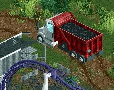
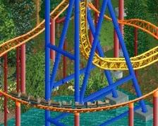
Very nicely done! Good archy and different textures. But I suggest giving the coaster a different colour to make it pop more. Dull red with tan supports is not a good idea when the rest of your surroundings already have those two as primary colours as well.
Really, really nice work. Everything looks clean, and the whole black path setup leading to the fountain and planters is really smart. Lovely stuff.
definitely great, colors are fantastic (especially the roof colors imo). I agree with the foliage comments, needs some variation
RaunchyRussell Offline
Thank you so much for the feed back everyone! Seriously appreciate it!
Added some more saturated greens to the tree types.
Edit: I tried to respond to every response, but it wouldn't post! Thanks again, new screen soon.
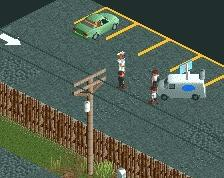
Hmmm, little odd you have to very similar structures like that next to each other like that. Personally I'd try to change the little guess service building, but thats a minor complaint. Might just be the angle though. Its looks great though!
on the right track- I would say to actually try and pay attention to the type of tree you're coloring in. typically, pine trees would probably be the darker shade of green, and trees like oak trees or birches would have the saturated green. obviously there's a bit of freedom here, but you should try and be consistent and if you're going for realism, try and match it to how the actual tree would look. I would also put that soft pastel green on the backburner- it looks good in some places but you need to be careful. in particular, those tall rushes just come off as too 'minty'- I'd usually go with a more saturated green for them, or even a tan/wheat color, which gives a fantastic atmosphere usually.