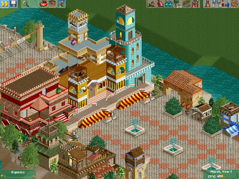
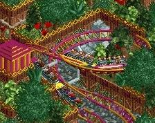
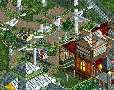
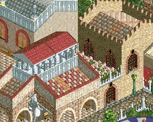
I think it's pretty cool, and some of my favorite work from you. I think it might look better a bit if the structures were taller and the colors blended a little more instead of being so distinct.
I like all the little details that add to the atmosphere, like the awnings, signs, planter detail etc... This has me interested for sure.
The grass in the top right is really ruining the atmosphere for me, but I'm sure that's just the unfinishedness .
I think that the building height is not really an issue given the river(?) that extends around the entrance plaza; however, I do agree that the colours should blend a little more (I think it's just the teal building that stands out too much; perhaps a white/light brown could work?).
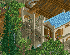
I only recently acquired the path object that you're using and am yet to see it used correctly, but I think that you've done that here, kudos.
Finally, and this is probably just me, I think that the red and yellow awnings are slightly too low. As someone viewing the park I want to see some of the structural foundations (especially on a building(s) this size), and I feel that the awnings are hiding that. Alternatively, reducing the width of the awnings by a quarter-tile on each side could also conceivably solve this.
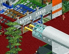
i feel like i don't like this screen as much as i could, as because none of the architecture coheses into a whole, it's all standalone pieces that are working against each other as far as atmosphere's concerning
that's the biggest thing about old-school parks, like you're emulating somewhat with the object choice, the atmosphere was the best feature. look at isole calabria and tell me that the italian area doesn't make you shit your pants due to the atmosphere; you'd be a damned liar
if i were you, i'd rebuild this on the tenses of making the buildings fit as a whole, as well as possibly taking some unnecessary buildings out and making the architecture in general more purposeful.
@JJayMForce – Thank you very much. I tried to make the colours distinct so that the different buildings were distinguishable. I didn’t want it to look like one mass of structure, but rather a collection of unique houses and towers. I was also hoping that the range of colours would help to create a welcoming atmosphere. Nonetheless, I’ll experiment with other shades to see what else works. About the height, did you mean to make the towers taller or all the buildings in general?
@inthemanual – Cheers I was happy with the way they matched up too.
@Stoksy – Thanks. Now you mention it, I can see what you’re saying about the awnings. The peeps can walk under them clearly, but I too feel that they hide the entrance a bit. I’ll try shortening them, as you suggest, and see how that works (as I don’t really want to raise them and the walkways above them as it interferes with the structures themselves). I’ll also give the colours a shot, as I said to JJay.
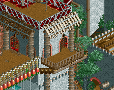
@tigre53 – The terrace is not for the peeps to enter. It’s intended to be a platform for entertainers to walk on and greet the guests, and to generally enforce the idea that these are homes with balconies. Alternatively, we can just imagine there’s access from inside the buildings Thanks for the comments though.
@Shotguns? and PokeCoasterEmpires – Regarding the cohesion, as I’ve said to others, I wanted the buildings to be distinguishable. Admittedly, the smaller buildings along the path serve little purpose other than to add to the theme (although they could be used for storage/maintenance/surveillance), but the larger buildings, aside from adding some grandeur to the entrance gates housing ticket booths, are just an example of what continues in the entrance plaza across the bridge. I agree with you that Isole Calabria is very atmospheric, and I will indeed try to create such atmospheres in the separate themed areas of this park. However, the theme in this area is intended to be “lost island”, incorporating Aztec, Mayan, Atlantis, pirate and any other style of hidden island world. Essentially, I wanted the entrance to be a place where all the styles have joined, while the separate themed areas focus on the individual styles. About the object choice though, I was simply selecting the items I liked the look of. I also wasn’t intending to emulate any other park, but I guess with these themes being done so many times before, a certain amount of similarity is unavoidable. Many thanks for your in-depth comments!
Thanks everyone for the feedback. It’s greatly appreciated and I’ll take your comments on board.
I see what you are saying about the colors, may be if they were all different, but shared some common colors on the trim or something would look good to bring them together.
For the building height I meant overall, to make it look even more grand, but as Stoksy said it's really not a big deal, and because it is an entrance.
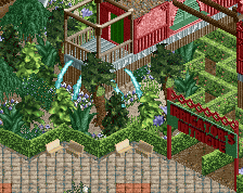
I really like the atmosphere you got going though and hope you can continue it to all the other areas!
@JJayMForce: Ah, I get what you're saying. I will definitely be incorporating this common colour idea into the other areas. As it stands, the blue tower is now white (with some blue trim), helping to blend it in a bit more. I have left the height as it is though, as I wanted these buildings to hide the park behind them, and the height they currently are is sufficient, I think. Thanks for your help
@Im4gin33rtycoon14: Thanks very much. As I said somewhere else before, I've always considered my buildings to be heavily inspired by others, so to hear that I've created somewhat of a style is encouraging. Cheers.
 27-February 14
I think it's pretty cool, and some of my favorite work from you. I think it might look better a bit if the structures were taller and the colors blended a little more instead of being so distinct.
I like all the little details that add to the atmosphere, like the awnings, signs, planter detail etc... This has me interested for sure.
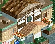
I like how the awnings loook with the footpaths above.
Looks quite nice actually; a few things however.
The grass in the top right is really ruining the atmosphere for me, but I'm sure that's just the unfinishedness .
.
I think that the building height is not really an issue given the river(?) that extends around the entrance plaza; however, I do agree that the colours should blend a little more (I think it's just the teal building that stands out too much; perhaps a white/light brown could work?).
I only recently acquired the path object that you're using and am yet to see it used correctly, but I think that you've done that here, kudos.
Finally, and this is probably just me, I think that the red and yellow awnings are slightly too low. As someone viewing the park I want to see some of the structural foundations (especially on a building(s) this size), and I feel that the awnings are hiding that. Alternatively, reducing the width of the awnings by a quarter-tile on each side could also conceivably solve this.
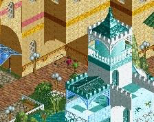
Those stairs in the terrace make no sense to me if they aren't gonna descend into the plaza.
Apart from that this screen looks really great
i feel like i don't like this screen as much as i could, as because none of the architecture coheses into a whole, it's all standalone pieces that are working against each other as far as atmosphere's concerning
that's the biggest thing about old-school parks, like you're emulating somewhat with the object choice, the atmosphere was the best feature. look at isole calabria and tell me that the italian area doesn't make you shit your pants due to the atmosphere; you'd be a damned liar
if i were you, i'd rebuild this on the tenses of making the buildings fit as a whole, as well as possibly taking some unnecessary buildings out and making the architecture in general more purposeful.
i gave this a 55, so it isn't that bad, i guess
@JJayMForce – Thank you very much. I tried to make the colours distinct so that the different buildings were distinguishable. I didn’t want it to look like one mass of structure, but rather a collection of unique houses and towers. I was also hoping that the range of colours would help to create a welcoming atmosphere. Nonetheless, I’ll experiment with other shades to see what else works. About the height, did you mean to make the towers taller or all the buildings in general?
@inthemanual – Cheers I was happy with the way they matched up too.
@Stoksy – Thanks. Now you mention it, I can see what you’re saying about the awnings. The peeps can walk under them clearly, but I too feel that they hide the entrance a bit. I’ll try shortening them, as you suggest, and see how that works (as I don’t really want to raise them and the walkways above them as it interferes with the structures themselves). I’ll also give the colours a shot, as I said to JJay.
@tigre53 – The terrace is not for the peeps to enter. It’s intended to be a platform for entertainers to walk on and greet the guests, and to generally enforce the idea that these are homes with balconies. Alternatively, we can just imagine there’s access from inside the buildings Thanks for the comments though.
@Shotguns? and PokeCoasterEmpires – Regarding the cohesion, as I’ve said to others, I wanted the buildings to be distinguishable. Admittedly, the smaller buildings along the path serve little purpose other than to add to the theme (although they could be used for storage/maintenance/surveillance), but the larger buildings, aside from adding some grandeur to the entrance gates housing ticket booths, are just an example of what continues in the entrance plaza across the bridge. I agree with you that Isole Calabria is very atmospheric, and I will indeed try to create such atmospheres in the separate themed areas of this park. However, the theme in this area is intended to be “lost island”, incorporating Aztec, Mayan, Atlantis, pirate and any other style of hidden island world. Essentially, I wanted the entrance to be a place where all the styles have joined, while the separate themed areas focus on the individual styles. About the object choice though, I was simply selecting the items I liked the look of. I also wasn’t intending to emulate any other park, but I guess with these themes being done so many times before, a certain amount of similarity is unavoidable. Many thanks for your in-depth comments!
Thanks everyone for the feedback. It’s greatly appreciated and I’ll take your comments on board.
I see what you are saying about the colors, may be if they were all different, but shared some common colors on the trim or something would look good to bring them together.
For the building height I meant overall, to make it look even more grand, but as Stoksy said it's really not a big deal, and because it is an entrance.
I really like the atmosphere you got going though and hope you can continue it to all the other areas!
Im4gin33rtycoon14 Offline
I like your style of building more than others for some reason ??
@JJayMForce: Ah, I get what you're saying. I will definitely be incorporating this common colour idea into the other areas. As it stands, the blue tower is now white (with some blue trim), helping to blend it in a bit more. I have left the height as it is though, as I wanted these buildings to hide the park behind them, and the height they currently are is sufficient, I think. Thanks for your help
@Im4gin33rtycoon14: Thanks very much. As I said somewhere else before, I've always considered my buildings to be heavily inspired by others, so to hear that I've created somewhat of a style is encouraging. Cheers.
So nice! I love the colored pavements and the fountains in there.
great stuff!
i have a feeling liam will love this