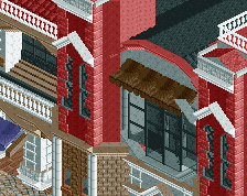
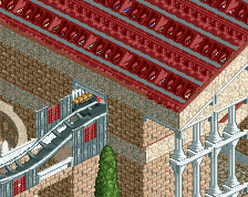
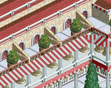
are you colorblind? your roof choice colors reaaaly remind me of another player who was famously colorblind and whose name has gone out of my head. not bad though, i especially would want to visit the pizza pasta cafe
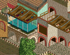
I agree with you about the colors. The grey building on the left is awesome tho. I also like the beige building in the middle, reminds me of my castle in Parenzo. Scaling is a bit off here and there, for example with the white building, which is probably why you think it's not that cohesive. What you're showing here is very promising tho!
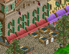
Good stuff, I think it's just the overall planning and layout that's causing trouble. I see what you're going for with the canals but it just gets eaten up by the architecture when it's set up like a grid.
What I've learnt
-Color could be better
-Architecture could be more cohesive
-Next one will have peeps and rides
-ProTip- never make your park go the edge
 31-May 20
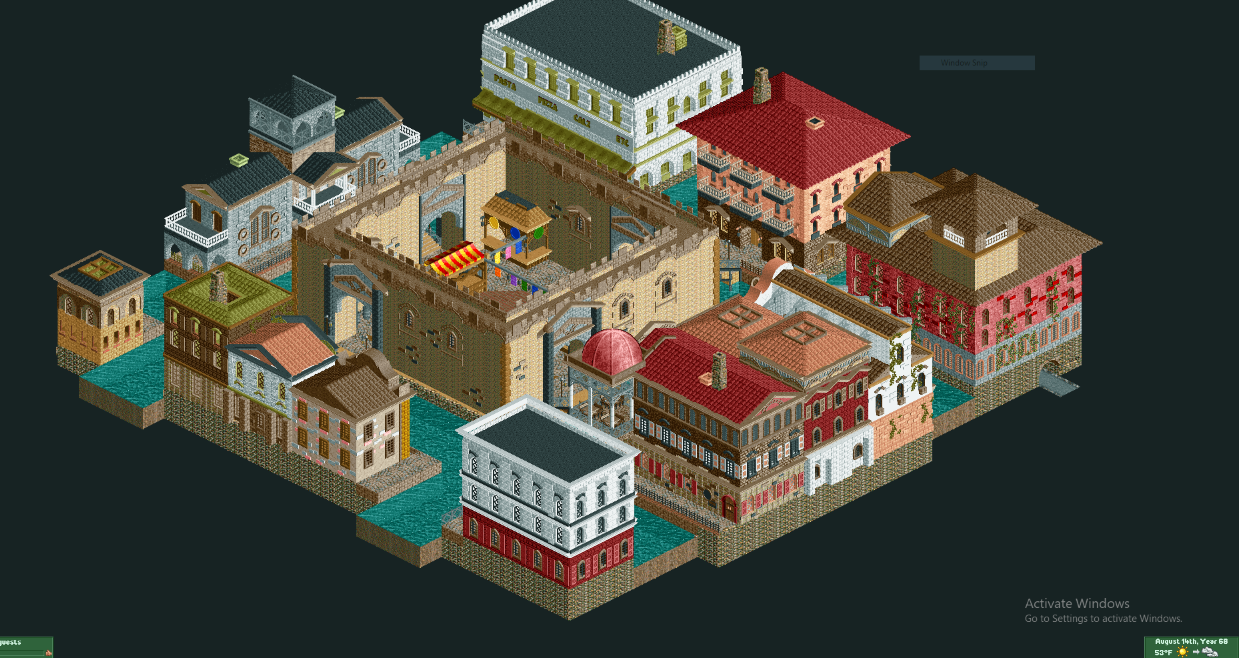
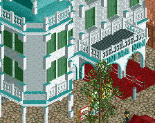
Outside of that green, I think your color choices are alright! Lovely screen, promising... Adding peeps in your parks will do a lot more
are you colorblind? your roof choice colors reaaaly remind me of another player who was famously colorblind and whose name has gone out of my head. not bad though, i especially would want to visit the pizza pasta cafe
Hello Thethrillman,
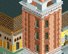
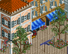
Really nice block of buildings in this screen.
The scale of the central beige castle-esque courtyard seems large compared to the rest of the architecture, which is all very nice.
Looking forward to seeing more of your work.
~B-]
This looks a lot more like Venice than Rome haha.
Strikes me as colourblind too. Looks very promising nonetheless. I could tell from the thumb that this was Italian, so good job on capturing it.
I agree with you about the colors. The grey building on the left is awesome tho. I also like the beige building in the middle, reminds me of my castle in Parenzo. Scaling is a bit off here and there, for example with the white building, which is probably why you think it's not that cohesive. What you're showing here is very promising tho!
Good stuff, I think it's just the overall planning and layout that's causing trouble. I see what you're going for with the canals but it just gets eaten up by the architecture when it's set up like a grid.