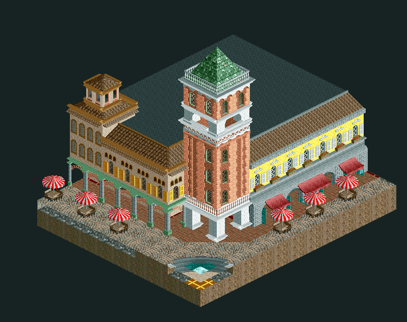
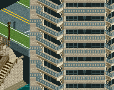
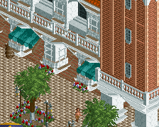
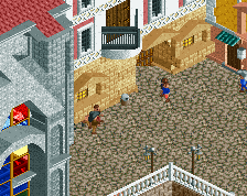
I'm probably not the best at architectural advice, but the first thing I notice is that the tower seems short compared to the rest of the building, at least from what I know of the source material. Your first floor scaling on the left side seems pretty good, but once you get to the upper levels something feels a little off to me.
I agree with CC9, either make the tower taller or thinner. Or both. I like what you have here, the big lines are good. A good base to further polish and detail.
2x2 seems like the perfect um... 'girth' of the tower, but definitely needs to be taller. In that process, I would also suggest to increase the height of the white pillars that it rests on.
When I imagine a peep on this scale, it does make sense in many places why you scaled everything a certain way, but it may be better to use an extra height unit or two here and there, and utilize it to add more complexity. It adds details and most times even if it isn't scale-accurate, the illusion of accuracy is maintained.
I agree with the others, increase the tower's height and it will be far better already. Also, the tower is hollow at the moment, add a base on the open floor
 30-January 21
I'm probably not the best at architectural advice, but the first thing I notice is that the tower seems short compared to the rest of the building, at least from what I know of the source material. Your first floor scaling on the left side seems pretty good, but once you get to the upper levels something feels a little off to me.
I agree with CC9, either make the tower taller or thinner. Or both. I like what you have here, the big lines are good. A good base to further polish and detail.
2x2 seems like the perfect um... 'girth' of the tower, but definitely needs to be taller. In that process, I would also suggest to increase the height of the white pillars that it rests on.
When I imagine a peep on this scale, it does make sense in many places why you scaled everything a certain way, but it may be better to use an extra height unit or two here and there, and utilize it to add more complexity. It adds details and most times even if it isn't scale-accurate, the illusion of accuracy is maintained.
Besides that, really cute!
I agree with the tower size queens
I agree with the others, increase the tower's height and it will be far better already. Also, the tower is hollow at the moment, add a base on the open floor