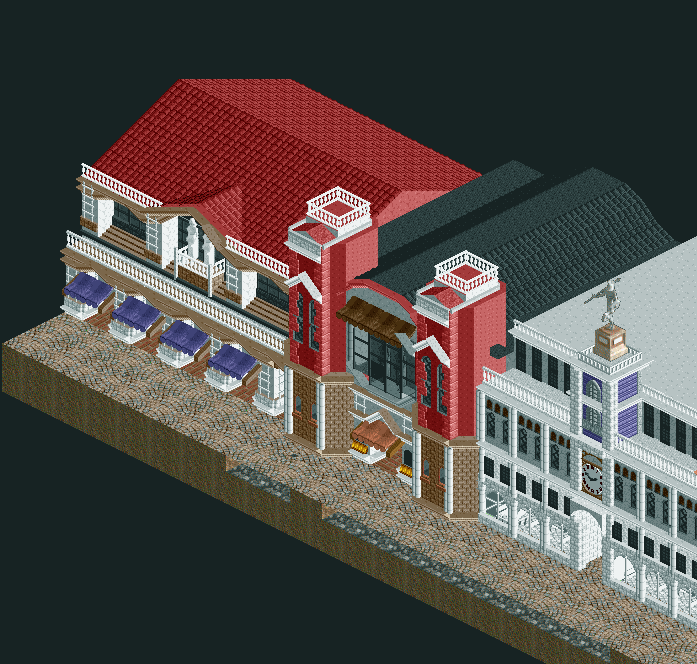
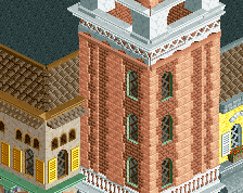
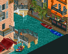
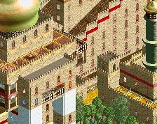
This is pretty cool, the two towers are looking nice. I would suggest making the large red roof a little smaller or accentuating it with details like chimneys etc. Also, the balcony railings at the top are quite bright at the moment, try using gray for tops of them.
The shapes you've got here are already good, but I think it's the colours you should take another look at. For the rooves, I suggest using the dark orange isntead of the dull red you're already using for the walls. It looks a little odd to see it on both the sides and the top. And I echo Xtreme's suggestion for adding chimneys and other details to the left hand roof to break up the monotony of it somewhat.
The white balcony railings are indeed always an eye-sore, as that piece is already very light, and white kills the shadows and highlights. I personally go grey usually.
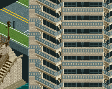
I recommend using Tile Inspector more in OpenRCT2 to rearrange the drawing order on things like the two towers, where the deco stone edges are on top of the quarter windows. I see a few other places as well.
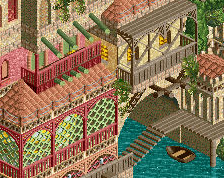
Aside from a dark orange which would work great for this Venice stuff, the salmon pink is always an option too Roof details are always nice to open up the sea of roof tiles: solar panels, chimneys, power boxes, satellite TV dishes even, or whichever combination of those seems more pleasant or realistic.
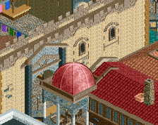
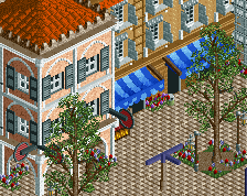
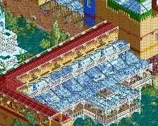
Some cuts and openings in the roof (idk the word for it, not talking about cutaway into interior details) would also be good, but I don't mind the lack of them.
I feel like the larger-than-normal scale allows for detailing much more, so use that to your advantage!
I wouldn't use red walls and red roofs both - especially when they're neighbouring each other and even visually overlapping. Those roofs are massive, anyway.
"The shapes you've got here are already good, but I think it's the colours you should take another look at. For the rooves, I suggest using the dark orange isntead of the dull red you're already using for the walls."
 21-June 20
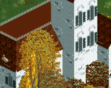
This is pretty cool, the two towers are looking nice. I would suggest making the large red roof a little smaller or accentuating it with details like chimneys etc. Also, the balcony railings at the top are quite bright at the moment, try using gray for tops of them.
The shapes you've got here are already good, but I think it's the colours you should take another look at. For the rooves, I suggest using the dark orange isntead of the dull red you're already using for the walls. It looks a little odd to see it on both the sides and the top. And I echo Xtreme's suggestion for adding chimneys and other details to the left hand roof to break up the monotony of it somewhat.
The white balcony railings are indeed always an eye-sore, as that piece is already very light, and white kills the shadows and highlights. I personally go grey usually.
I recommend using Tile Inspector more in OpenRCT2 to rearrange the drawing order on things like the two towers, where the deco stone edges are on top of the quarter windows. I see a few other places as well.
Aside from a dark orange which would work great for this Venice stuff, the salmon pink is always an option too Roof details are always nice to open up the sea of roof tiles: solar panels, chimneys, power boxes, satellite TV dishes even, or whichever combination of those seems more pleasant or realistic.
Some cuts and openings in the roof (idk the word for it, not talking about cutaway into interior details) would also be good, but I don't mind the lack of them.
I feel like the larger-than-normal scale allows for detailing much more, so use that to your advantage!
I wouldn't use red walls and red roofs both - especially when they're neighbouring each other and even visually overlapping. Those roofs are massive, anyway.
"The shapes you've got here are already good, but I think it's the colours you should take another look at. For the rooves, I suggest using the dark orange isntead of the dull red you're already using for the walls."
But I liked the buildings.