Screenshot / Entrance Plaza
-
 14-June 20
-
Conway Castle
-
2 of 12
- Views 1,866
- Fans 1
- Comments 9
-
Description
Hey Peeps,
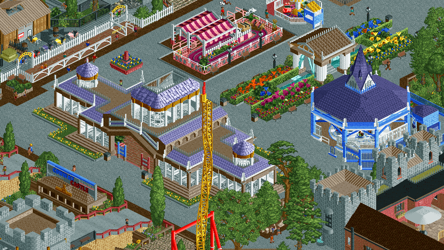
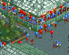
Showing the scene after the main castle hub with a conservatory and garden area. With the rides Ralph's Vintage Tours, The Marley express (pink one), Emma's Tea Party and Krazy Katz.
Not sure about the grey path, suggestions welcome -
Full-Size
-
1 fan Fans of this screenshot
-
Tags
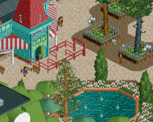
Pretty sweet, and very lively and colourful as always! The purple and gold is a nice look on that conservatory, and I really like the row of gardens with the column structure. To be honest I think the tarmac looks alright, it fits the garden aesthetic quite well. I would only suggest having more planters/flowers in the areas with the brown path.
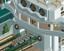
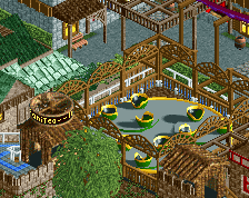
Nice stuff! The open-air station is lovely and the restaurant has a great shape.
I think the tarmac looks decent. It's always a bit textureless imo but I think it looks better with more peeps.
I like how you've given this more room to breathe than usual which helps a lot IMO.
yes, definatley needs more planters, cheers PS Just seen Cannonball run is out. Check it out!
Some may disagree, but you're using too much brown in my opinion, especially on the building with purple roof. I think you could make that stand out much more using a more garden-esque color.
Otherwise, this is a really impressive screen.
^ I think you might be on to something there. That washed out brown often looks pretty good on it's own, probably owing to it's neutrality, and I think it's one of those colors on the palette that you very often start out trying your color schemes with. But when used this much, to some degree on almost all buildings, it kind of compromises the contrast. Maybe at least for the roof on the big building, try changing the pale brown to black or some other darker color, and for the spinning cups, try using a path with some texture, perhaps the same brick texture that you are using for the purple building.
I'd also be interested in seeing how this looks with another path - while the grey looks alright, you also have a (understandably grey) castle theme going on that disappears a bit. Rather than changing the color of the castle buildings, the more obvious choice is to experiment with the path.
I'm not sold on the planters on either side of that building with round pillars - it looks a bit too saturated and not sure those flowers mix with the hedge wall too well. I'd maybe try making it less busy and throwing in a few taller plants/trees there.
Lastly, I wonder if you could add in some diagonals in your paths, instead of having right angles everywhere. Even just using a few 1/4 tile triangular roof pieces here and there to smooth it out could improve it I think.
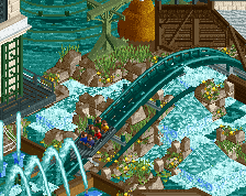
Those points aside I do dig this! I really like the small pink/purple car ride and the spinning cups building. Looking forward to seeing more of this and Cannonball Run which I haven't checked out yet!
This is cool, but I suggest to remove the two flat rides. They're an island of pink and an island of blue in a sea of things that are not pink or blue; very dissonant. Simply getting rid of them and not putting anything in their place will likely make this area a lot more pleasant. The flowers and the little building with the columns are great. More of those vibes please!
haha I loved it, it was charming, the purple was great contrast.
