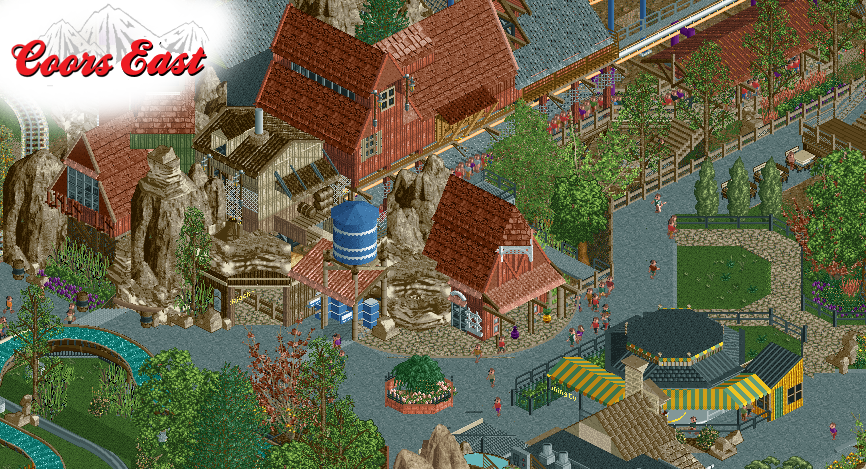
Screenshot / Blackjack Station -- Coors East
-
 03-February 19
-
the big dirty
-
9 of 10
- Views 4,454
- Fans 3
- Comments 47
Community Forum Software by IP.Board


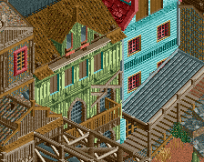
There is nothing good looking in this screen.
I thought you retired...
Let's just look at the face value of the screen, shall we.
I think it's quite nice. As you know it's not my cup of RCT tea, but I can appreciate it for what it is - good recreationlist palette edited work that's a mixture of boredom from spending too much time with the game and talent at work.
Honestly, the only real downside of this screen is the colour you chose for almost every building here. I just don't seem to like it, and I can't train myself to do so. The remainder of the screen is pretty neat though.
What happened here? 52%? Looks awesome, i like the interaction with the terrain
Id mess around with the colors. I wouldnt make the walls and the roofs the same color. Also not a huge fan of the little garden walk through thing. Other than that this looks really good. Keep it up!
I like the composition of the rockwork and the collection of buildings. It makes an effective statement without being monolithic. That being said, there's almost so much going on texturally with very little change in color that it's making the massing a bit illegible. The one small building in the middle has the same color as the rockwork and it makes it come off a lot messier than it actually is' maybe change that one building to either the same red tones as the rest or some other non-brown color and that'll help.
If you don't like it then don't worry about it. This is what shogo wants to build let him do his thing.
This comment section is so great, I can deny the holocaust here and it probably wouldn't be the most controversial thing said by far
I agree that this isn't your best screen, especially on the right there is some stuff I don't 'get'. It's also relative though, because it's still impressive work. I also know that you suck at taking and cropping screens. It'll look better in context. I vote 40%
You know I like it shogo
That sounds awesome!