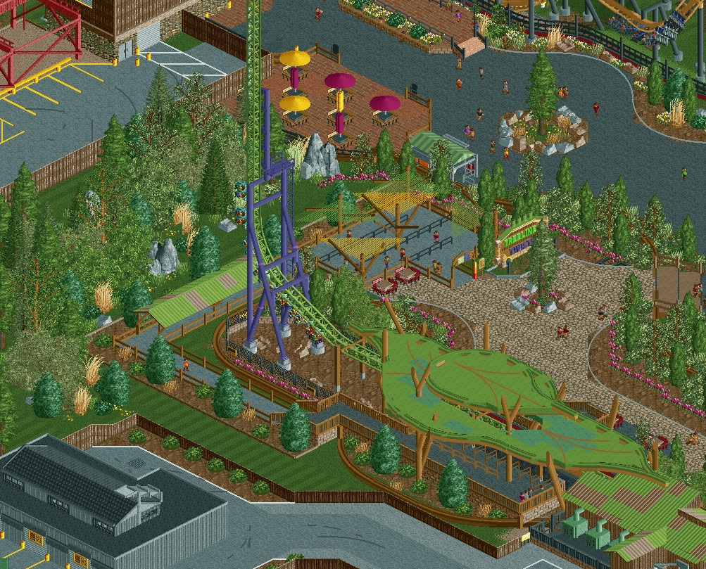
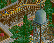
I’d suggest using dr. dirt’s curved walls to help recreate the trackitecture roof to avoid the glitchiness which is very distracting here. Would be a simple update and clean up the screen significantly.
I will say I'm not a fan of the station roof. It definitely is a bit sloppy.
Also not a fan of the multi-colored steel roof you have on the launch section. Neither really feels super believable considering the style of this park.
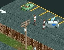
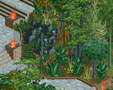
I think it's important to create a visual barrier between the park and the backstage area. Not just for peeps, but for us too. It's also weird that the backstage area looks nicer kept than the actual park, which is all mud and weeds. Unless you're trying to capture the Battle of Ypres, I'd make some changes in that department.
I'd stick to 2-high fences for backstage borders. With one high fences theres just not as much of a visual barrier like Liam said.
I'd also recommend just swapping all the mud land for the mulch objects to clarify that they're landscaped planters. If you're going to use the mud, I would try to cover it as much as possible when it's a planter. So it's not confused for a under-ride area or backstage area like it might be here.
Using the brown sand is also a good replacement for dirt in these under-ride situations and stuff.
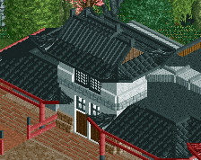
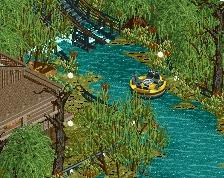
Nice again. I like your style a lot. When people devote to theming an impulse usually good things happen.
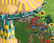
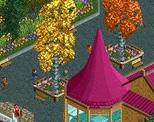
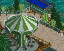
Was thinking the tables just outside the ride exit are a bit strange. I could understand benches to sit down, but tables? Maybe also a "T" shape allowing to exit both left and right might look nicer.
 28-September 20
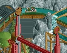
I’d suggest using dr. dirt’s curved walls to help recreate the trackitecture roof to avoid the glitchiness which is very distracting here. Would be a simple update and clean up the screen significantly.
Very interesting station, I dig it. Wish it were cleaner tho.
Very sweet. Super organised, and without losing a certain charm.
I will say I'm not a fan of the station roof. It definitely is a bit sloppy.
Also not a fan of the multi-colored steel roof you have on the launch section. Neither really feels super believable considering the style of this park.
Loving the checkerboard... rock it
RaunchyRussell Offline
Thanks for the feedback everyone! I do agree and made some changes to it!
I think it's important to create a visual barrier between the park and the backstage area. Not just for peeps, but for us too. It's also weird that the backstage area looks nicer kept than the actual park, which is all mud and weeds. Unless you're trying to capture the Battle of Ypres, I'd make some changes in that department.
I'd stick to 2-high fences for backstage borders. With one high fences theres just not as much of a visual barrier like Liam said.
I'd also recommend just swapping all the mud land for the mulch objects to clarify that they're landscaped planters. If you're going to use the mud, I would try to cover it as much as possible when it's a planter. So it's not confused for a under-ride area or backstage area like it might be here.
Using the brown sand is also a good replacement for dirt in these under-ride situations and stuff.
Nice again. I like your style a lot. When people devote to theming an impulse usually good things happen.
Was thinking the tables just outside the ride exit are a bit strange. I could understand benches to sit down, but tables? Maybe also a "T" shape allowing to exit both left and right might look nicer.