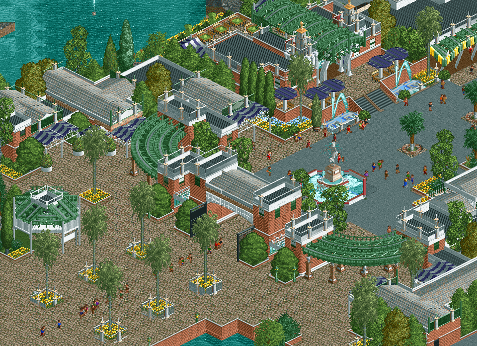
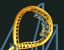
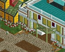
This looks quite nice, but I'm not sure Junior track is the right choice for the roof topper. You can still see the inside of the building through the holes in the track.
Also, why are the fences on the bottom gardens all placed outside on the path tiles instead of on the same tile as the gardens? Not only do they appear completely disconnected from one another, but the clipping could be avoided entirely if they were all on the same tile instead of shoved halfway underground on a path-occupied tile.
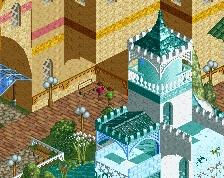
Overall I really really like this. I'm going to be nit-picky here because you've really nailed the composition and layout and I'd love to see this even better (imo).
Entrance gate planters are glitching through the ground. Should be easy fix. Double layer mesh fence on the left-most tile of the entrance arch looks a bit funny.
The roofline is really busy. If you're going for that vibe, then I'd keep it. If you want to clean it up a bit, it's heavy on the usage of the center spike railing. I think this is one of the reasons the screen comes off (to me) as almost being too busy. I would think about cleaning up the sides/backs of the buildings that guests don't see with plain railings to focus more attention on the facades and clean up the roofline.
The entrance archway has almost like an office building vibe. I would mess around with adding some of those entrance pillar objects from the heartline coaster arch building or another dome/spire type object to the front archway building to spice it up some. It's the entrance, have fun with it!
The walls behind the brick fence gates are inconsistent. I know they're not fun to work with, so some of them might be necessary, but you could use the transparency to your advantage here:
-add variety by mixing up the usage of a solid brick wall behind them on some buildings
-make the green fences pop more with a green and salmon door wall behind them
-add another accent color using the door wall behind the gates with a salmon surround and a door color of your choice.
Right now some of the fences are backed with solid brick, solid white, or split between wall types and colors part-way up, and it makes the green of the fences feel a bit inconsistent from window to window.
This is all just my 2c, it's already a really good screen, just wanted to provide some points to take into consideration. Looking forward to more, good stuff!
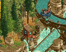
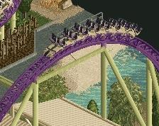
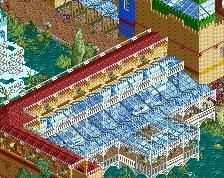
Looks nice, especially the green wooden trackitecture against brick, but since I am terribly familiar with the white rails, why are they seemingly at different heights around the palms?
Looks nice, especially the green wooden trackitecture against brick, but since I am terribly familiar with the white rails, why are they seemingly at different heights around the palms?
Looks like its just glitching in this screen, not intentionally different heights.
 21-February 21

slapa
doesn't scream "story book glen" to me. Looks cool though.
That's why that's not the name ;-)
This is beautiful. Just fantastic work.
This looks quite nice, but I'm not sure Junior track is the right choice for the roof topper. You can still see the inside of the building through the holes in the track.
Also, why are the fences on the bottom gardens all placed outside on the path tiles instead of on the same tile as the gardens? Not only do they appear completely disconnected from one another, but the clipping could be avoided entirely if they were all on the same tile instead of shoved halfway underground on a path-occupied tile.
RaunchyRussell Fan Offline
Super tidy stuff.
i can get into this
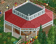
I agree with Faas about the roofs. The rest is not bad. The fountains are great.
the colour palette of red brick, white, yellow flowers, dark purple and dull green is lovely here.
the jelly bean fence placed around the awning looks quite shit though, in the sense it only looks like a jelly bean fence placed around an awning.
i'm also wondering if the railings on the rooves might look better if you put a white post at the corner of each?
Overall I really really like this. I'm going to be nit-picky here because you've really nailed the composition and layout and I'd love to see this even better (imo).
Entrance gate planters are glitching through the ground. Should be easy fix. Double layer mesh fence on the left-most tile of the entrance arch looks a bit funny.
The roofline is really busy. If you're going for that vibe, then I'd keep it. If you want to clean it up a bit, it's heavy on the usage of the center spike railing. I think this is one of the reasons the screen comes off (to me) as almost being too busy. I would think about cleaning up the sides/backs of the buildings that guests don't see with plain railings to focus more attention on the facades and clean up the roofline.
The entrance archway has almost like an office building vibe. I would mess around with adding some of those entrance pillar objects from the heartline coaster arch building or another dome/spire type object to the front archway building to spice it up some. It's the entrance, have fun with it!
The walls behind the brick fence gates are inconsistent. I know they're not fun to work with, so some of them might be necessary, but you could use the transparency to your advantage here:
-add variety by mixing up the usage of a solid brick wall behind them on some buildings
-make the green fences pop more with a green and salmon door wall behind them
-add another accent color using the door wall behind the gates with a salmon surround and a door color of your choice.
Right now some of the fences are backed with solid brick, solid white, or split between wall types and colors part-way up, and it makes the green of the fences feel a bit inconsistent from window to window.
This is all just my 2c, it's already a really good screen, just wanted to provide some points to take into consideration. Looking forward to more, good stuff!
good good good good good
This is okay, something just feels off about it to me. But don't listen to me lol.
I love this!