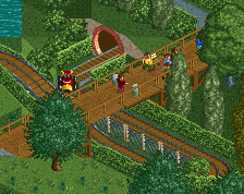
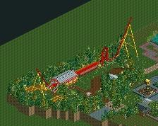
I can imagine having a lot of fun in this area with so many rides in such a small space. If I were to build again then my style wouldn’t involve too much cramped in, as I enjoy negative and breathing space as a tactic to showcase details as more highlighted, but that may just be me. As for the colors, it’s nice the rides are more bold in color than the surroundings. Recurring peep signs are a nice idea. I also like the use of angels and curves. And the architecture is neat in my opinion. No real complaints I guess.
From the peep's standpoint it's all good, but from the viewer's standpoint, I wish a couple of those trees were gone so I could see the drop a little better.
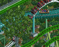
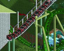
Do the stock designs have the lowered turnaround after the station and the small lift back into the station? I imagine they don't but it doesn't matter, it's a clever concept and I think you're doing right by it.
Do the stock designs have the lowered turnaround after the station and the small lift back into the station? I imagine they don't but it doesn't matter, it's a clever concept and I think you're doing right by it.
No I make slight adjustments to the stock design to make it work better. I also moved Mouse Towers' station one tile and made the woodie and looper flow a bit better.
Thanks everyone for the replies. CC9: I removed some trees in the background and the foliage looks cleaner now.
Great screen, Faas. I also think the foliage could use some more love. Glad that you already tackled that. I especially agree with CP6. It's a shame the drop is not visible from this angle. No complaints otherwise. Good stuff.
Sweet. Feels like you're debating heavily with some of the newer meta styles and whether to adopt them or not. Everything's a bit tight perhaps? Feel just a little more breathing room could help. I know the density is your thing, but I believe it would help sometimes to even things out more.
 20-September 21
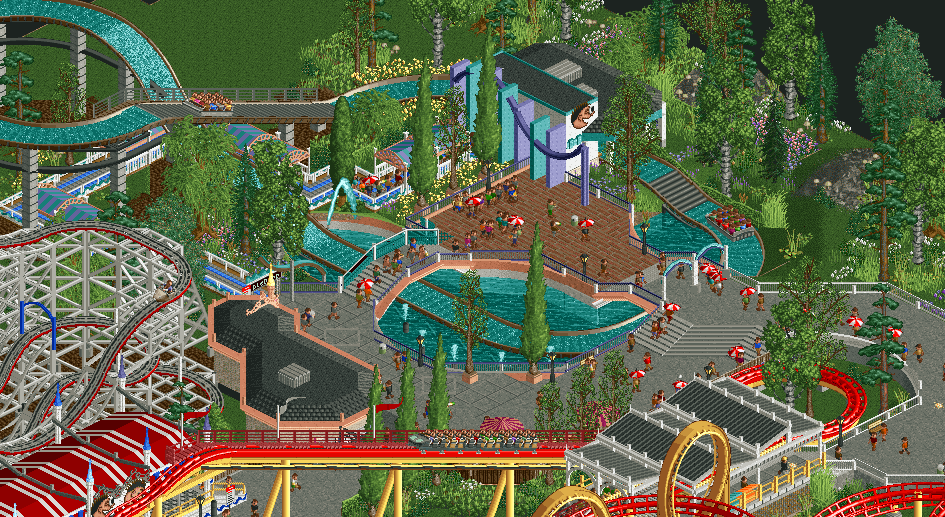
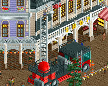

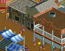
Kinda hard to tell, but is the exit of the ride in that little brick plaza?
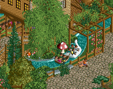
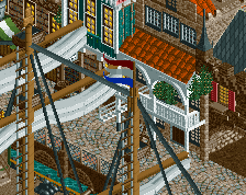
That station is great. Love the vibes
Maybe try to make the exit a bit more clear? Idk if that is a type of detail you're going for but it helps with readability.
Love the vibe! Looks like a lot of fun.
From the peep's standpoint it's all good, but from the viewer's standpoint, I wish a couple of those trees were gone so I could see the drop a little better.
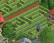
I appreciate what you're doing here, it's a charming idea for a park. Foliage is maybe a bit wild in places? It's hard to tell from this screenshot.
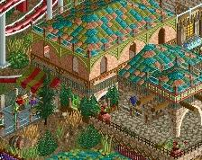
This is incredibly classy.
Amazing stuff.
Do the stock designs have the lowered turnaround after the station and the small lift back into the station? I imagine they don't but it doesn't matter, it's a clever concept and I think you're doing right by it.
No I make slight adjustments to the stock design to make it work better. I also moved Mouse Towers' station one tile and made the woodie and looper flow a bit better.
Thanks everyone for the replies. CC9: I removed some trees in the background and the foliage looks cleaner now.
I'd replace the red brick path with more grey tarmac. This is great, in either case.
Great screen, Faas. I also think the foliage could use some more love. Glad that you already tackled that. I especially agree with CP6. It's a shame the drop is not visible from this angle. No complaints otherwise. Good stuff.
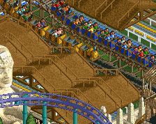
Sweet. Feels like you're debating heavily with some of the newer meta styles and whether to adopt them or not. Everything's a bit tight perhaps? Feel just a little more breathing room could help. I know the density is your thing, but I believe it would help sometimes to even things out more.