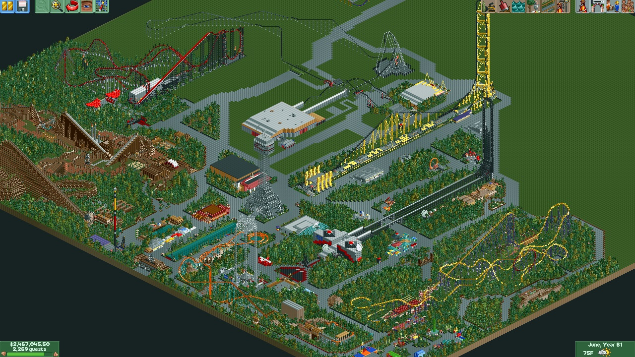
i really agree with recurious, normally parks have 1 or 2 big coasters, you've got 5 of them already with only half of the map filled in. and it looks like you don't have a lot of thrill rides compared to the coasters. and then instead of 1 really high point in the park you've got 2 (or 4 counting the coasters) each taking attention off the other
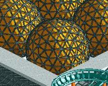
Gdb, not everyone wants to make credible realistic parks, and there's not a limit for the amount of 'high points'. Not in RCT, not in the real world. I do agree though that the strata coaster and the double coaster in front of the strata coaster are an awkward couple, because of the similar aesthetics. They line up unfortuntaly as well, especially from this angle.
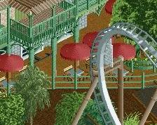
Have you considered using a simpler path layout? Instead of surrounding each new ride with paths, creating 'islands of park', you could build more compact by clustering rides and buildings. Also, I recommend using another path texture, or at least varying the path texture, and adding planters and stuff to make it all look less bare. It seems like a fun park, but it's not very lively. The large concrete blocks (path) aren't helping.
thanks, and yea its a huge park, still more to come.
@ gdb
yea there is some more rides i got to put in, and other thrill rides of course.
@ Liampie
yea the way they are lined up does bug me a little, but the way i had it planned, having one ride or the other face a different angle, they wouldnt fit correctly on the map, they are just to big. Also the "islands" i make, arnt that bad, i have lots of hidden gems in them to make them less bland. And i actually do have other path textures all over the map! excluding quene line paths, they're just hard to see. besides im not done yet lol
thanks for the feedback guys, ill post another update soon
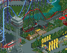
I actually quite like this; sure it's not the most technically brilliant park but from the overview there's a lot to see, which I think is really important. The strata coaster is way too close to Sonic though; I think it would look better if you copied it and put it further back in the park. Looks very grey from the overview... some change in path colour/style and some more defined areas would do this park a world of good.
thank you:) and i think they are both strata coasters? lol, and i dont think ill move it (Disaster Trasnport) is the black/Gray one. and i will definitely take changing some of the path textures into consideration
You can say goodbye to this project, as my computer was reset I do however have a backup, but it is only at the point where I started that yellow coaster (bottom right) Everything West and East of the Eiffel Tower is gone. I might eventually get back to work on this, but that was a lot of hours gone. Sorry guys
 22-March 14
This park looks like a lot of fun. But I think some things are a bit big and overwelming. Still looks like lots of fun tough
i really agree with recurious, normally parks have 1 or 2 big coasters, you've got 5 of them already with only half of the map filled in. and it looks like you don't have a lot of thrill rides compared to the coasters. and then instead of 1 really high point in the park you've got 2 (or 4 counting the coasters) each taking attention off the other
Gdb, not everyone wants to make credible realistic parks, and there's not a limit for the amount of 'high points'. Not in RCT, not in the real world. I do agree though that the strata coaster and the double coaster in front of the strata coaster are an awkward couple, because of the similar aesthetics. They line up unfortuntaly as well, especially from this angle.
Have you considered using a simpler path layout? Instead of surrounding each new ride with paths, creating 'islands of park', you could build more compact by clustering rides and buildings. Also, I recommend using another path texture, or at least varying the path texture, and adding planters and stuff to make it all look less bare. It seems like a fun park, but it's not very lively. The large concrete blocks (path) aren't helping.
@ Recurious
thanks, and yea its a huge park, still more to come.
@ gdb
yea there is some more rides i got to put in, and other thrill rides of course.
@ Liampie
yea the way they are lined up does bug me a little, but the way i had it planned, having one ride or the other face a different angle, they wouldnt fit correctly on the map, they are just to big. Also the "islands" i make, arnt that bad, i have lots of hidden gems in them to make them less bland. And i actually do have other path textures all over the map! excluding quene line paths, they're just hard to see. besides im not done yet lol
thanks for the feedback guys, ill post another update soon
I actually quite like this; sure it's not the most technically brilliant park but from the overview there's a lot to see, which I think is really important. The strata coaster is way too close to Sonic though; I think it would look better if you copied it and put it further back in the park. Looks very grey from the overview... some change in path colour/style and some more defined areas would do this park a world of good.
@ Stoksy
thank you:) and i think they are both strata coasters? lol, and i dont think ill move it (Disaster Trasnport) is the black/Gray one. and i will definitely take changing some of the path textures into consideration
You can say goodbye to this project, as my computer was reset I do however have a backup, but it is only at the point where I started that yellow coaster (bottom right) Everything West and East of the Eiffel Tower is gone. I might eventually get back to work on this, but that was a lot of hours gone. Sorry guys
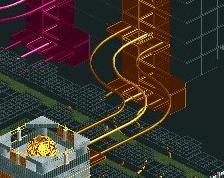
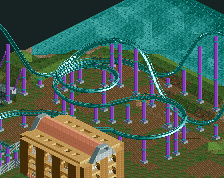
The supports on the tophat look quite nice, not much else to really say based the overview however.