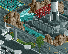
Well improved! I agree with Thethrillman, colours could be streamlined better in my opinion. On the other hand, there could be unity in diversity as well when I see the bigger picture.
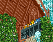
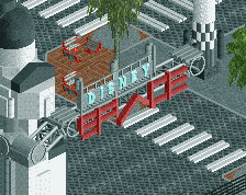
Agreed with alex; the path design is sick but overall distracting. It's the first thing to catch my eye and since they are paths, I would knock that as a negative. In fact, with how much is going on in the screen, I would suggest not only dialing back on the path decals but maybe using a less textured path in general. The rest of the screen is otherwise stellar, dude!
This is beautiful ugly retro-futurism in it's prime years. Huge fan of your work Pants. I do agree with Steve and Alex that making the pathlines less visible could make the rest of the screen pop even more. Could use a darker grey or just black or maybe even that really dark blue that's going around in some of the palets. But regardless of what you chose, this looks phenomenal.
The beige will probably stay. I'm pretty committed to that rct2wwtt sandstone skyscraper look lol
As for the path, I wondered if it would draw too much attention. I'll give it another pass. Figuring out the right balance of colours for this area has been a real uphill battle
This is just absolutely delightful, and agree with coco I wouldn't change it. You were already at spotlight level, and now you've developed your style further, and applied it to such a funky theme. Amazing.
So keen to be seeing this park, best of luck with all remaining process, and thank you for making this.
 27-September 22
![screen_250_Spaceship Earth [take 2]](https://www.nedesigns.com/uploads/screens/250/250_thumb.png)
I think you could have played around with the color a bit more. Beige doesn't scream future guggi style to me IMO.
Outside of that great work
wowowowow
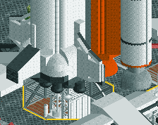
When the great sci-fi gods created retrofuturism, this is what they envisioned.
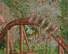
You've even made those weird topiary objects blend well. From what I've seen, you're the first to accomplish such a feat!
Like it so far! Gonna need some time to let this sink in though.
Well improved! I agree with Thethrillman, colours could be streamlined better in my opinion. On the other hand, there could be unity in diversity as well when I see the bigger picture.
Your fencing game is beyond.
Your entire game is beyond.
My favourite park maker and project by far, this is inspiring.
Just stunning... Wow...
Amazing screen. I do still think the paths would be better without the lines tho, or in a less contrasting grey perhaps?
This is great
Curious if you switched the beige to white.
Agreed with alex; the path design is sick but overall distracting. It's the first thing to catch my eye and since they are paths, I would knock that as a negative. In fact, with how much is going on in the screen, I would suggest not only dialing back on the path decals but maybe using a less textured path in general. The rest of the screen is otherwise stellar, dude!
Absolutely outstanding. Like x-coaster back in the day, just so far beyond/different to what everyone else is doing. LOVE it.
This is beautiful ugly retro-futurism in it's prime years. Huge fan of your work Pants. I do agree with Steve and Alex that making the pathlines less visible could make the rest of the screen pop even more. Could use a darker grey or just black or maybe even that really dark blue that's going around in some of the palets. But regardless of what you chose, this looks phenomenal.
The pathing does draw too much attention, but other than that. Another screen to start drooling. Awesome!
Thanks for the kind words, everyone.
The beige will probably stay. I'm pretty committed to that rct2wwtt sandstone skyscraper look lol
As for the path, I wondered if it would draw too much attention. I'll give it another pass. Figuring out the right balance of colours for this area has been a real uphill battle
I like the path and the beige. retropolis is a great name too