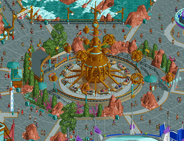
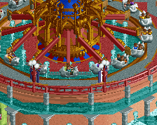
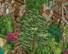
Screenshot / Orbitron: Machines Volantes
-
 01-November 22
-
Disneyland Resort Paris
-
4 of 5
- Views 3,427
- Fans 13
- Comments 23
Community Forum Software by IP.Board
I can nitpick this but I won't. It's rather good dude. Damn.
Wow
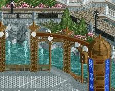
I can also gripe about the rocks, but for a different reason. The lines don't bother me, but they do feel a bit too evenly spaced, and not clumpy and natural. Kinda feels like a giant clock with the mechanical center and the even spacing.
Love this overall though. The colors and the orbs and the way that all the pathwork visually leads right into the ride? Amazing
its really amazing to see how much love and attention to detail you seem to put into every single ride you've shown so far on this map - inspiring, and im sure it will pay off in the end
Amazing.
The attention the ride receives from that composition and tasteful high level details is incredible.
Airtime does it again.
I really like it, even if it's based on a real ride.
Screen of the year for me.
I understand the LOTR rocks but I think they're a detractor here. I have to wonder what the screen would look like using the red dirt land pieces instead.
Damnnn.
I agree w Scoop about the rock edges. Maybe it's just needing one or two 1k rocks to soften the hard/square lines
The rocks feel very Disney to me. I like them. Also, stop being so good at the game.
Perfection
But I will.
First of all, it looks great. Truly. Like, fuck, great composition and detailing.
I think the paths are a mess. The stone path already has lines within it, on top of the road lines you've added then the half diagonal designs within them with different grey textures to fill the gaps...it could be cleaner but I get that you clearly made sacrifices to achieve a certain look. I guess I just wish you didn't have to.
I think the rocks are fine. Great, even. I think the bigger offender is the fences. A couple different queue fences, a grey retaining wall, beige planter walls, trackitecture fences along the water in grey and then the same trackitecture fence for the ride but in beige, etc. I can't decide it's exactly not harmonious, because it works I think. I just wonder if something else could work even better.
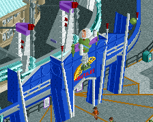
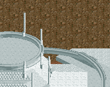
What's going on with the ride base?
Steve Trees were a good choice. Foliage overall in this little spot is great, actually, with the rocks. Well done, there.
I go to Disneyland Paris at least once a year. It's so good to see it so beautifully made in that game.
outrageous. been there a bunch and this feels so real. great stuff