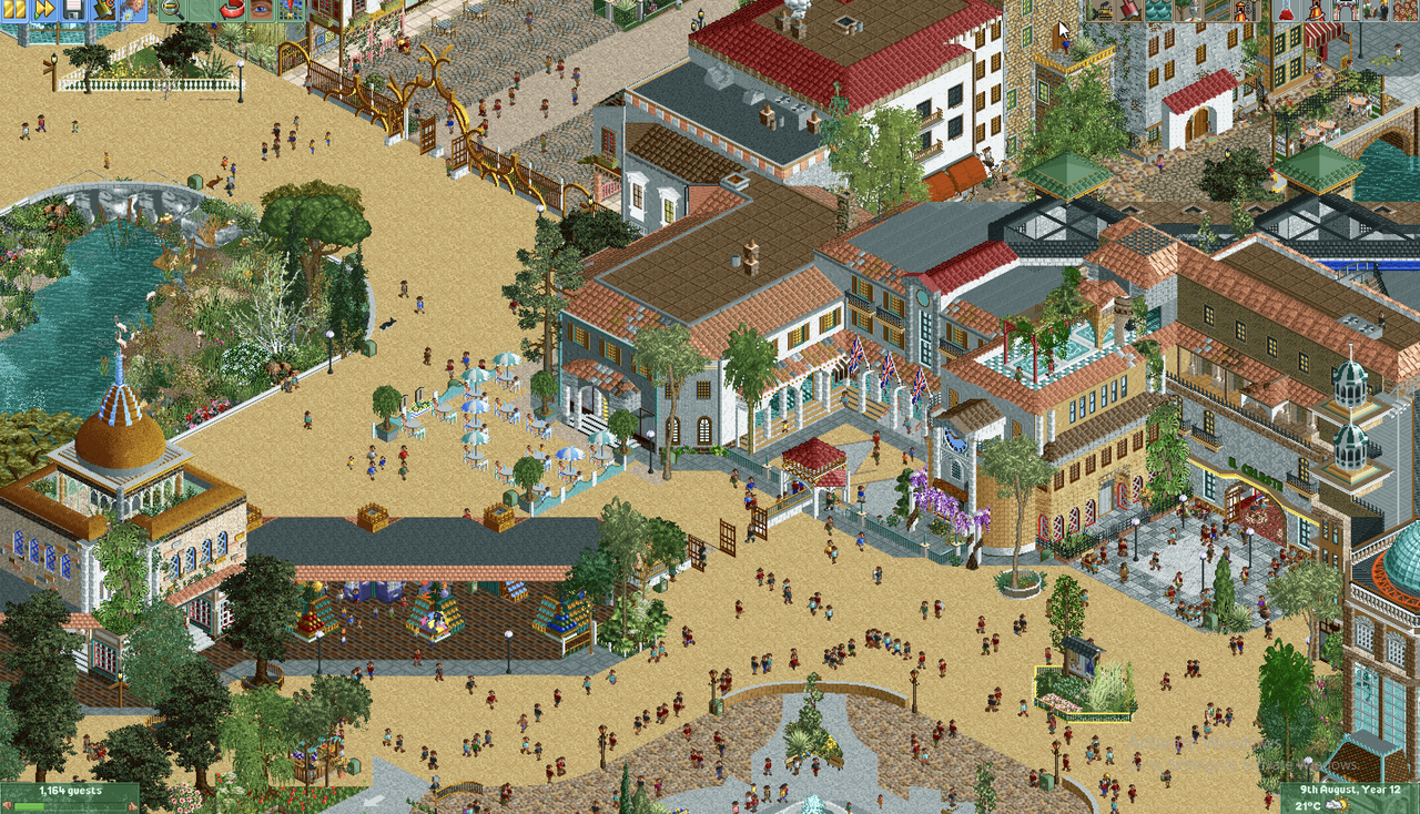
Screenshot / Arcosolia: Entrance Area
-
 06-February 23
- Views 1,192
- Fans 0
- Comments 13
-
Description
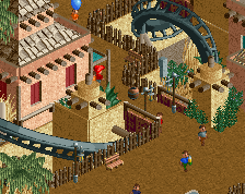
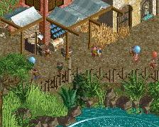
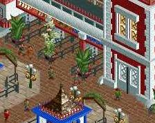
Part of the entrance area for a mixed European-style park called Arcosolia, situated near a fictional European, probably Mediterranean, city.
Visible are:
- A solid golden entrance gate
- Part of the ticket & souvenirs building
- A hotel that still needs a name and 'Il Celeste' Bazar next to it.
- Part of 'Plaza Sal', the main square. -
Full-Size
-
No fans of this screenshot
-
Tags

Thank you! I find this community very inspiring too
Also, I love your username.
wow, i really like this. nice colors and great vibe!
This is really quite a way to make an entrance on NE. You have some really great detailing going on, and if a nice warm Mediterannean vibe was what you were going for, I think you definitely achieved it - it's very inviting and I can definitely picture myself enjoying a crisp lager on that patio
One point of critique is that I think you could have let each idea for each building or feature "breathe" a bit more. Some of the buildings feel a little arbitrarily tucked into each other - either I think you could have separated them out a bit, or maybe picked a more coherent style for those clusters.
Another thing is that I think the tan path is too dominating here. Maybe something simple as adding a layer of "crunch" - variations in the texture - to it would improve it a lot.
Very nice stuff, I hope you will share more
That's how you make an NE entrance! Mic drop!
That golden fence/gate is gorgeous. Great bits of variety all over this screen! I'm in a similar camp with Splitvision about the path, don't really mind the color but you need to add something more too it, make it look a little more worn, adding some more gardens, vendors etc to break up the vastness of the paths.
That being said, please take any advice, suggestions and critique with a grain of salt. You'll receive plenty of ideas from other players, but don't feel pressured or offended. Just pick and choose what tips you want to implement in your parks and have fun.
This is a really awesome debut! You're off to a great start with architecture and I love the gate as well. Only thing that's not really doing it for me is the yellow path. A more subtle color or path type could bring more focus to the rest of the park.
Also I second what BSG said. It's great to listen to different perspectives, but make sure you maintain your direction and not get too weighed down by different approaches.
Wow, where did this come from?!
If I had one criticism it's that I think there are some parts of path that could benefit from some small planters to break it up a bit. But, that is a tiny thing in a sea of beauty here.
Welcome to NE!
Your work is pure vibes!!! Welcome to NE!
RaunchyRussell Offline
Yeah man, this is cool
Always love it when new members just pop up and are fantastic from the getgo. Welcome to New Element! It sucks! You'll love it here
Thanks for the compliments and tips! That yellow footpath is definitely getting some more work, because now it´s been pointed out I can´t unsee it! I didn´t even know I had that crunch texture until now haha
There is more in development, but who knows when I will share something again? Certainly I don´t...