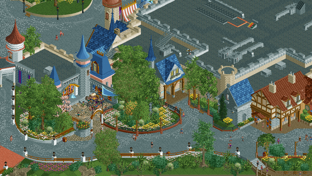
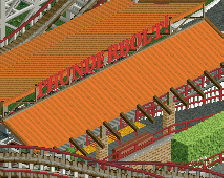
Screenshot / Cinderella and Hundred Acre Goods
-
 09-June 23
-
Otter's Magic Kingdom
-
2 of 5
- Views 1,506
- Fans 2
- Comments 12
Community Forum Software by IP.Board
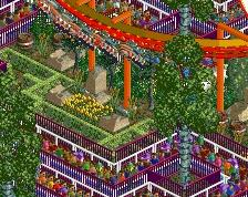
Really nice. The curved paths have really unlocked the next level of your building.
Perhaps path "crunch" is a bit too readable right now, subtly blending it a little more is maybe worth looking in to.
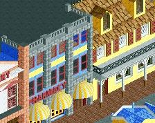
So very nearly there. Few things I'd change to have an instant impact with this. Textures on the most Disney buildings are off. The Pink building you've chosen a dull pink texture that's looking muddy, and the classic Alsace style building is also looking confused with that marble texture. Change those for a cleaner texture and this will scream more Disney. Is the cycad bush thing close to the region here? They feel super tropical. I'm also being drawn to the HVAC so much in this screen where the theme should be king. 80% for me but you've been building at 90% for most of what you've shown me.
Love the curves and the colour schemes you've chosen are top tier. Easily sorted dude!
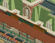
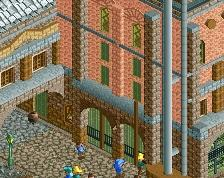
I'll add a bit more variation to the walls and roofs, to give the buildings more realism and a strong identity. For the wall I'll mix a stone block with a brick block and a bit of wall corner :
I'll do the same for the roofs, using the castle tile roof with a slight variation in colours for the Alsacian building.
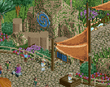
Love the inside look Babar. Gonna have to steal that. Great stuff as well Otter!
Good points, thanks guys. Cleaned up those few things already!
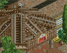
Overall composition is stellar. I do think creating little focal points will help this come to life a bit more. I'm unsure about the control panel on the roof, seems like that would likely be covered then open to the elements up there, but I love the dedication to making the roof interesting.
I don't hate the crunch approach on the path, as it shouldn't look 'dirty' so much as 'textured' for a Disney concept, but some more blending could certainly help. Would be happy to advise if you'd like, just hit me up.
Pretty clean
Really lovely and clean stuff Otter. Instantly recognazible as a Disney park because there's a queue for a "meet and greet" with an underpaid actor
man, white trim with gold fence is a power move. stealing that
I love this and I love how clean it is. .
.
The path has some "crunch"(ugh), but enough to still keep this pleasant to look at
Tiny detail: The stairs in the bottom right of the screen have like one unit of steel fence randomly in between the two fence types. I think that it's unnecessary.
i absolutely think you're reaching a new level with your building. outside of the fence chaos (barf, i sound like liam saying that), what you've created is composed and dripping in atmosphere, while keeping it feeling grounded into recreationalism
to add onto this, think of using crunch to simulate certain textures, and how those materials blend and interact with other materials. it'll give you a lot more of an idea to go for than just using the objects themselves
Did I miss this? Holy crap Otter you seem to keep leveling up!