This having a 50% rating is a fucking joke and shows what a flawed system this is for screen ratings. The ridicules votes should be dropped, like how the lowest AP score is dropped. Anyone who voted sub-60% should be banned from the site forever. Your opinions are wrong.
Anyone not getting the joke on this: Last night, on rob's stream I was acting quite the dick (though tongue-in-cheek) and I was saying on the stream that I was jokingly screenwhoring. I said that I voted my stuff 100%, which got most people on the stream to vote it 0. The lowest score I had was 4%. It's a testament to the fact i'm actually good by getting over 50% despite about 5 or 6 people voting 0%
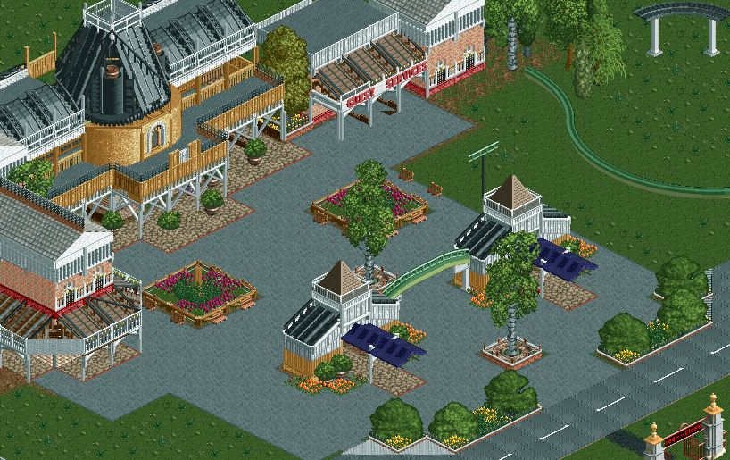
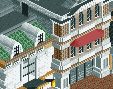
I changed my vote to 60%. The entrance building is really cool, as are some other details, but it's a little uncohesive as a whole. The buildings on the sides clash with the central building, and they have too many fences anyway. The awnings on those buildings look good though, especially the one on the left with diagonal bits. The birches don't look good centred, in my opinion.
My favourite building is the guest services building as it's the cleanest and most aesthetically pleasing. I would take away the fences on the windows though because in my opinion they just don't add anything to the building. You have several things that just don't add anything to their building apart from making it look messier.
1. He got played for posting during a stream where we could all conspire against him.
2. It's not bad by any means, some of it is very nice
3. It's unfinished, which his screens always are, so he deserve people conspiring against him to give low scores.
4. He got 22 votes on the screen. Even if some of those were pranking him, this screen still got a ton of exposure. I've never received more than 6 votes on any of my screens.
I really like the archway-castle window combo. Everything else looks great too. Very well done on creating a circular looking tower with the pieces provided.
This having a 50% rating is a fucking joke and shows what a flawed system this is for screen ratings. The ridicules votes should be dropped, like how the lowest AP score is dropped. Anyone who voted sub-60% should be banned from the site forever. Your opinions are wrong.
Great work on this!
Kumba, the reply box has auto spell-check. Are the ridiculous misspellings just for flavor now?
I'm not a fan of the screen ratings being gamed like this either; the good news is that the points don't matter for much. I don't know if the answer is for the admins to police inappropriate ratings or for everyone to just use their better judgement.
I think the black spire roof is way too messy. Why build so much stuff throug each other? Besides that I like that building. I don't like the textures on the booths and I would like to see a finished screen from you sometimes. I think part of the reason this screen looks messy is because there is a lot of unfinished stuff around the edges.
 18-April 14


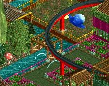

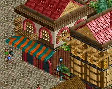
I like everything except for the brown 45 degree car ride awnings. I love the tags BTW.
This having a 50% rating is a fucking joke and shows what a flawed system this is for screen ratings. The ridicules votes should be dropped, like how the lowest AP score is dropped. Anyone who voted sub-60% should be banned from the site forever. Your opinions are wrong.
Great work on this!
Anyone not getting the joke on this: Last night, on rob's stream I was acting quite the dick (though tongue-in-cheek) and I was saying on the stream that I was jokingly screenwhoring. I said that I voted my stuff 100%, which got most people on the stream to vote it 0. The lowest score I had was 4%. It's a testament to the fact i'm actually good by getting over 50% despite about 5 or 6 people voting 0%
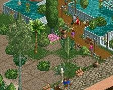
I like the brown building and the white builing to the right.
shotguns, i think at this point people are just voting 100% to get it a little higher, i mean look at the number of votes
I changed my vote to 60%. The entrance building is really cool, as are some other details, but it's a little uncohesive as a whole. The buildings on the sides clash with the central building, and they have too many fences anyway. The awnings on those buildings look good though, especially the one on the left with diagonal bits. The birches don't look good centred, in my opinion.
I was explaining to rob that i was going to change the textures out to something more cohesive
i might change the entrance to white to bring it all together
My favourite building is the guest services building as it's the cleanest and most aesthetically pleasing. I would take away the fences on the windows though because in my opinion they just don't add anything to the building. You have several things that just don't add anything to their building apart from making it look messier.
1. He got played for posting during a stream where we could all conspire against him.
2. It's not bad by any means, some of it is very nice
3. It's unfinished, which his screens always are, so he deserve people conspiring against him to give low scores.
4. He got 22 votes on the screen. Even if some of those were pranking him, this screen still got a ton of exposure. I've never received more than 6 votes on any of my screens.
5. FINISH SOMETHING
I like it. But I like all of your stuff. Your composition is superior to many.
You still added some totally useless details in this unfortunately.
I just hope one day you will find the drive and enjoyment to finish a project. In a continuous, quick and smooth process.
Take this as inspiration. It is possibly the single most important comment you have or will ever receive.
Haha, true. It's taken me six years and I still haven't heard that
If this is considered 'messy', I'd hate to see what people now think of work from 5 or 6 years ago.
I really like the archway-castle window combo. Everything else looks great too. Very well done on creating a circular looking tower with the pieces provided.
i think it's the ticket booths that aren't being very cohesive
i'll change that to the stone and bam
Now these are good comments.
ridules
Kumba, the reply box has auto spell-check. Are the ridiculous misspellings just for flavor now?
I'm not a fan of the screen ratings being gamed like this either; the good news is that the points don't matter for much. I don't know if the answer is for the admins to police inappropriate ratings or for everyone to just use their better judgement.
I think the black spire roof is way too messy. Why build so much stuff throug each other? Besides that I like that building. I don't like the textures on the booths and I would like to see a finished screen from you sometimes. I think part of the reason this screen looks messy is because there is a lot of unfinished stuff around the edges.
I thought this was outstanding for ncso. Keep building on this. Totally awesome.