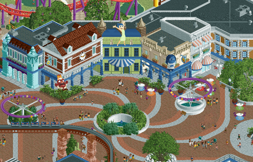
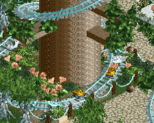
I love the vortex in the path design, so cool. Architecture is very good too obviously. You've always had such an easy time to frame things nicely in RCT, when actually it's a difficult thing to do.
I'm not super keen on those objects. I get they're intended to sell an IP, but they look a little jarring and foreign to me.
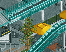
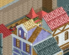
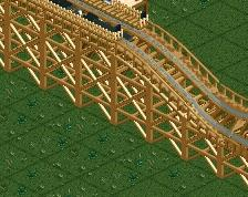
I've held off commenting until now because I wasn't sure how I felt about this screen.
It's obvious very good and shows a lot of skill, but I don't think it's your best.
I think it's just a bit too clean and sort of sterile. You have these buildings but do they really have a purpose? Currently they're great facades and have some fun pop imagery on them but don't really seem to connect much more to the path than that. It could just be the angle of the screen but I worry that a park filled with archy like this will sort of feel artificial.
In addition the path is just very clean, a few benches but otherwise not much going on to make it feel lively or liver in. These days there are so many options to add depth and detail here that the bar is really high, and this just doesn't quite hit that for me.
Your screens for this project have all sorta felt a bit like this, sometimes it's been justified because of the theme but here I really feel like there's some missed opportunities. Hope this doesn't sound too harsh because this is good but I don't think I can see myself voting a park with content at this level much higher than 80% in 2025.
 21-June 25
Just release it already man.
Can't wait to see this finished park in all of it's glory. It is going to be ICONIC for sure!
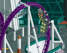
Waiting for this release is an.. emotional whirlwind! Ba dum.. tst
girlthatsabootyhole.gif
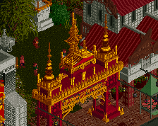
Those statues are really cool. Are fear and disgust there too?
you bring that yourself jag
Oh wow didn't expect this movie to be included!
Not a hole, Keisha... a valve.
what can I say? It is fantastic
I had to post it.
I wasn't planning on it as it's a smaller section.
Speechless! I agree with others. Just release it already!
Fantastic.
insanely good.
Really looking forward to this park J K ! The screens you´ve showed all look so good.
It's obvious very good and shows a lot of skill, but I don't think it's your best.
I think it's just a bit too clean and sort of sterile. You have these buildings but do they really have a purpose? Currently they're great facades and have some fun pop imagery on them but don't really seem to connect much more to the path than that. It could just be the angle of the screen but I worry that a park filled with archy like this will sort of feel artificial.
In addition the path is just very clean, a few benches but otherwise not much going on to make it feel lively or liver in. These days there are so many options to add depth and detail here that the bar is really high, and this just doesn't quite hit that for me.
Your screens for this project have all sorta felt a bit like this, sometimes it's been justified because of the theme but here I really feel like there's some missed opportunities. Hope this doesn't sound too harsh because this is good but I don't think I can see myself voting a park with content at this level much higher than 80% in 2025.
I'd say hold off damning the entire park to an 80% vote until you see the rest of the content.
What would you specifically do to elevate this screen? Depth and detail are fair points but how would you do that?