(Archive) Advertising District / Dump-Place
-
 19-April 07
-

TwistedHelix Offline
fizzix: Hmmm I can see what you mean now. This any better?
BTW the wooden pathing up top is the same idea as the picture earlier on on this page.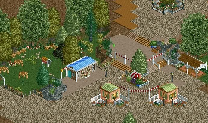
Cheers
TwistedHelix -
 RCT2day
Offline
^That's better than what you originally had but why are there random light posts on the path (next to the blue-roofed building and brown-roofed building on the right)? And why are there still some different paths? Just make everything the stone path or be consistent with the non-stone path pattern. Great small buildings and foliage, too.
RCT2day
Offline
^That's better than what you originally had but why are there random light posts on the path (next to the blue-roofed building and brown-roofed building on the right)? And why are there still some different paths? Just make everything the stone path or be consistent with the non-stone path pattern. Great small buildings and foliage, too. -
TwistedHelix Offline
RCT2Day: The different colour paths are due to me seeing if I coudl create a park without using 8cars or hacking so this was the best way that I could get some variations in the pathing and add some details in. I don't really wangt to make it all the buidlings blocks due to how bland the pattern would be but don't know any way to achieve what I want to achieve without using hacks other than this.
The random lights were to try and break up the path a bit but your right I dont think they work very well to be honest.
rctisboss: Lol well I do see what you mean I think the yellow carpet was a no go to be honest with the first screen lol.
Cheers
TwistedHelix -
 Cocoa
Offline
I would generally only make steps that go up two instead of one incase you wanted to make it peep friendly. thats a quality that we sort of look for around here nowadays.
Cocoa
Offline
I would generally only make steps that go up two instead of one incase you wanted to make it peep friendly. thats a quality that we sort of look for around here nowadays. -
Ruben
Offline
Twistedhelix: Actually, that looks like you've had a lót of fun building it.
 There's quite a fun atmosphere around it. Only suggestion I have is maybe playing around with the pathing a bit more. The first version was, as said before, kinda messy. The second one feels a bit monotonous though. Maybe use the different pathing types you used in the first version, but use them in a more structured way?
-
 Mr. Coaster
Offline
Alright, I concur, this has to be the ugliest support job I've ever done, I love it. Apologies of the unfinishedness of the screen, i just felt the need to show something.
Mr. Coaster
Offline
Alright, I concur, this has to be the ugliest support job I've ever done, I love it. Apologies of the unfinishedness of the screen, i just felt the need to show something.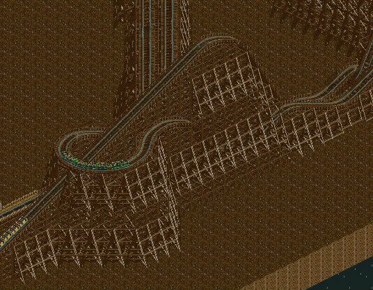
(Edit)Here's the screenshot I was too lazy to take. I know its raining, go ahead, sue me. -
 Jonny93
Offline
Rct has a function, called screenshot. Would be fine if you could use it in the future.
Jonny93
Offline
Rct has a function, called screenshot. Would be fine if you could use it in the future. -
CCI
Offline
^ It can distort some details and it makes the screen darker.
Unfinished, but I wanted to show something. -
 Ride6
Offline
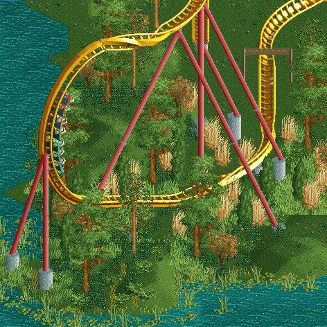
It needs MOAR supports. I like the way those couple elements appear to flow though, what little we can see of that layout seems very sound. The foliage isn't half-bad either, at least to the extent to which it's finished.
Ride6
Offline
It needs MOAR supports. I like the way those couple elements appear to flow though, what little we can see of that layout seems very sound. The foliage isn't half-bad either, at least to the extent to which it's finished.
I'm not a bit fan of the color scheme though. Seems very much like a faded McDonalds with the yellow track and dull red supports... I like the train's colors though. That kinda car-by-car coloring is sadly quite uncommon and looks pretty sweet.
Ride6 -
 ZeRoSkIlL
Offline
CCI - try placing the supports over the track right where the barrel roll meets the half loop.
ZeRoSkIlL
Offline
CCI - try placing the supports over the track right where the barrel roll meets the half loop.Damn 700 pages. I remember when it was just 280 lol
Well, I remember when it didn't exist.
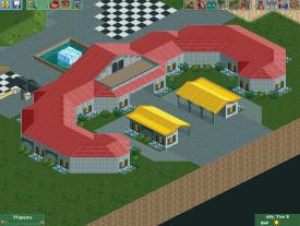
Here's a quick screen of some shanties for the ranch hands and a boathouse I made for the design I'm working on. I would like to get some input on the layout of the coaster but it's current SNAFU due to a failed 8car hack. If you guys get the chance, check out my topic in the Ask the Experts board to help me out if you can.
Should I stick with one colored path? -
Cocoa
Offline
there's a lot of textures for those walls, but its actually pretty interesting. reminds me of mice and men.
-
 Arjan v l
Offline
Looks good Mr Buckeye. Nice architectural form.
Arjan v l
Offline
Looks good Mr Buckeye. Nice architectural form.
You might wan't to use diagonal windows or diagonal glass wall for the empty diagonal walls i see, but it's up to you ofcourse. I'm not sure about the roof texture variation, but that's just me.
Edit : You might want to experiment with the colours of the building or roof. -
 MikaRCT2
Offline
^The roof texture variation is there because there isn't a diagonal corrugated roof object I think.
MikaRCT2
Offline
^The roof texture variation is there because there isn't a diagonal corrugated roof object I think. -
Ruben
Offline
^The roof texture variation is there because there isn't a diagonal corrugated roof object I think.
Which still doesn't force him to use a corrugated roof on the straight bits. I agree with Arjan, doesn't really go together.
I still feel like you're doing the same all over again mrbuckeye. The shape of this station is more interesting than usual, but it lacks atmosphere. It just needs some elevation, some variation, just something More to it. It's up to you to use it or not, but if you act like you want to improve, which you do, than please do something with the critique you get.


Tags
- No Tags