(Archive) Advertising District / Dump-Place
-
 19-April 07
-
 Ling
Offline
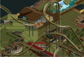
You're right, it isn't much. The layout of the hyper just looks way too extreme, and the Schwarzkopf has too many helices. You should sort out how the ride is going to play into the landscape and surroundings, and at least give us that to comment on. On flat land the layouts don't make much sense, and I have no idea what themes you're after.
Ling
Offline
You're right, it isn't much. The layout of the hyper just looks way too extreme, and the Schwarzkopf has too many helices. You should sort out how the ride is going to play into the landscape and surroundings, and at least give us that to comment on. On flat land the layouts don't make much sense, and I have no idea what themes you're after.
Also, as a rule of thumb, we don't care in the slightest what your coasters' "stats" are. Mainly because they don't go hand-in-hand with good design, and we're more interested in your design. -
 Pacificoaster
Offline
Pacificoaster
Offline
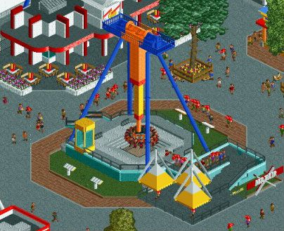
Looks like Maxair and Jonny Rockets. Good work Maverix. People are vandals in your park man. I mean just look at those benches.
Nice archy Robbie. I also really like the support work on that invert in the background.
-
 Fizzix
Offline
The proximity of Maxair to Johnny Rocket's seems a bit off. There's a row of games on that same building, which ends by Maxair. Ignore this if this is just a heavily inspired Cedar Fair park.
Fizzix
Offline
The proximity of Maxair to Johnny Rocket's seems a bit off. There's a row of games on that same building, which ends by Maxair. Ignore this if this is just a heavily inspired Cedar Fair park.
Love the use of those fences, Rob. Looks great, as always. -
 SixFlagsTexas1994
Offline
I like the Johnny Rockets buiding!
SixFlagsTexas1994
Offline
I like the Johnny Rockets buiding!
Robbie's archy is perfect...
But like mentioned 10ryansmith, the loopng coaster design is so over done...simple and less is sometimes more
-
 A.S.Coasters
Offline
Robbie that looks fantasic, please continue.
A.S.Coasters
Offline
Robbie that looks fantasic, please continue.
Here are a couple screens from a park a started about two months ago, I'm not done with any foliage though, right now I'm mainly working on the rides, architecture and other things like stalls.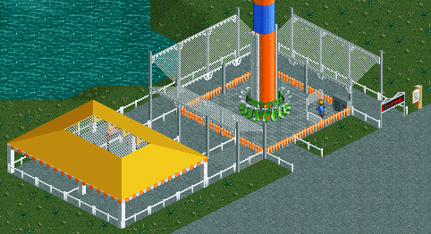
-

disneylhand Offline
Could you use different wall scenery for the garage doors such that one doesn't have the border right up the center? Can't decide if I like the brick motif on the side, but beautiful building nevertheless.
-disneylhand -
SixFlagsTexas1994
Offline
I like the first screen, but texture of the roof on the carousel is off to me.
-
 MikaRCT2
Offline
@A.S.Coasters: I think you should change the roto-drop car color. I like the mechanic in the corner though
MikaRCT2
Offline
@A.S.Coasters: I think you should change the roto-drop car color. I like the mechanic in the corner though
In the second pic: I don't get why you placed flowers on the roof. The colors are a bit boring for a carousel IMO.
There isn't much more to comment on though... -
Ling
Offline
Focus more on architecture and foliage, A.S.Coasters. I agree, the flowers make no sense and the roof texture is boring. Maybe add some queue details to the roto-drop to show you've actually given thought to how riders would be organized and actually get onto the ride.
-
 Mr. Coaster
Offline
@Robbie: Very impressive, though it might be the unfinishedness of the surrounding area, but the building feels as if it lacks purpose.
Mr. Coaster
Offline
@Robbie: Very impressive, though it might be the unfinishedness of the surrounding area, but the building feels as if it lacks purpose.
@A.S.Coasters: I have to agree with what those above me have said, though the half hashed grass in front of the carousel looks boring and uninspired like you slapped it down. Anyway, thats just my two cents here. -
 BC(rct2)
Offline
robbie92@ I love that building! Very impressive!
BC(rct2)
Offline
robbie92@ I love that building! Very impressive!
A.S.Coasters@ The pics are so unfinished that I don't know what to say, maybe change the roof on the Merry-Go-Round house and improve the foliage, the rest is nothing impressive and it's very unfinished. -
 RCT2day
Offline
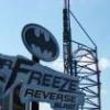
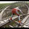
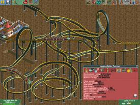
^B&M Stand-up? Looks pretty realistic, just shorten that brake run (forget that last helix) and I think you have a winner.
RCT2day
Offline
^B&M Stand-up? Looks pretty realistic, just shorten that brake run (forget that last helix) and I think you have a winner.


Tags
- No Tags