(Archive) Advertising District / Dump-Place
-
 19-April 07
-
 RCTNW
Offline
^ I was referring to the fact that it seems to be getting worse and if the trend will continue. I agree though however even designs are falling off IMHO
RCTNW
Offline
^ I was referring to the fact that it seems to be getting worse and if the trend will continue. I agree though however even designs are falling off IMHO -
 Scoop
Offline
Jin that is truly amazing and unique keep up the good work.
Scoop
Offline
Jin that is truly amazing and unique keep up the good work.
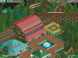
To some of you these screens may look familiar. I hope you like them.Attached Thumbnails
-
-
 Ling
Offline
I'm not sure what I'm looking at, School_Jin, but I think I like it.
Ling
Offline
I'm not sure what I'm looking at, School_Jin, but I think I like it.
And mrbuckeye... those look extremely familiar. the woodie's station could use a little more detailing, and you could get some underbrush and more interesting colors in those screens. Landscaping for the river is very underwhelming too, you should spend more time there. -
 chorkiel
Offline
mrbuckeye, I'm pretty sure you already submitted that park. Why would you still advertise it then?
chorkiel
Offline
mrbuckeye, I'm pretty sure you already submitted that park. Why would you still advertise it then? -
Scoop
Offline
I was just showing screens. sorry I will either put them on my (official
 ) topic or not at all.
-

disneylhand Offline
I didn't begin advertising Phantom until I had sent it in. Releases take a while.mrbuckeye, I'm pretty sure you already submitted that park. Why would you still advertise it then?
-disneylhand -
 A.S.Coasters
Offline
The problem with advertising after the submission is that someone may find a problem spot that you can't fix, thus bringing down your score (if you're going for an accolade this could be a problem).
A.S.Coasters
Offline
The problem with advertising after the submission is that someone may find a problem spot that you can't fix, thus bringing down your score (if you're going for an accolade this could be a problem). -
 leonidas
Offline
Fr3ak, that is absolutely fantastic!
leonidas
Offline
Fr3ak, that is absolutely fantastic!
This kind of thematic detailed-ness is a concept on itself, not something you give up, just to fill up a map. I don't get that line of thinking honestly. Quality before quantity, always. You're betraying yourself as an artist when you choose for the latter.
If you start a painting you don't choose to work expressionistic, just because it takes less effort. The technique and way of building is a result of the concept. The point is not to complete as many canvases as possible, unless you're doing it for the money, or in this case; points. -
 trav
Offline
trav
Offline
Quality before quantity, always. You're betraying yourself as an artist when you choose for the latter.
But finding a good balance between quality and quantity offers the largest amount of profit. -
 Cocoa
Offline
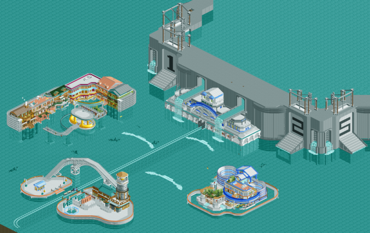
I really want to see those structures up close, school_jin. not sure I approve of vast tracts of water but I guess if it makes sense for the concept...
Cocoa
Offline
I really want to see those structures up close, school_jin. not sure I approve of vast tracts of water but I guess if it makes sense for the concept...
-
 ScOtLaNdS_FiNeSt
Offline
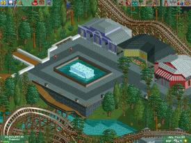
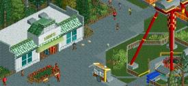
Obviously completely unfinished. Im mainly trying to improve my foliage. So... Oh and before you mention the seating in the bottom of the screen. That no longer exists.
ScOtLaNdS_FiNeSt
Offline
Obviously completely unfinished. Im mainly trying to improve my foliage. So... Oh and before you mention the seating in the bottom of the screen. That no longer exists.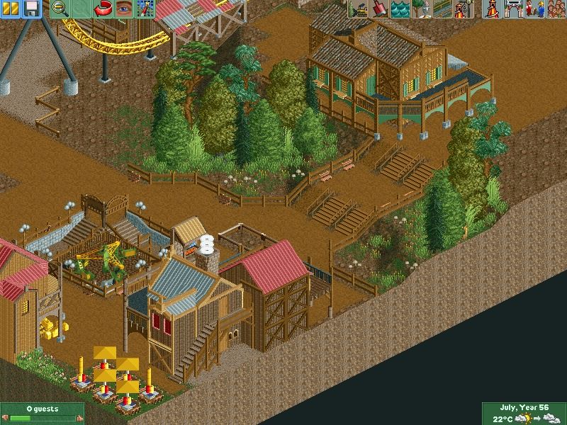
-
Ruben
Offline
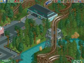
Now thís is the stuff that makes me believe you're one of the most promising upcoming members. It just looks very refined and oozes atmosphere. Maybe just get a bít more grass underground going at the foliage surrounding that bridge section? Just to get some more color in there?

-
 Austin55
Offline
Scotlands, I've never heard of you but that is pretty damn good! Building that close to the edge scares me some though, could use some breathing room perhaps?
Austin55
Offline
Scotlands, I've never heard of you but that is pretty damn good! Building that close to the edge scares me some though, could use some breathing room perhaps? -
Scoop
Offline
RMM you can definatly see that he is right. He does have some dull spots on the map. I do love the arch btw Scotland. It is very atmospheric if that is word.wait... what?


Tags
- No Tags