(Archive) Advertising District / Dump-Place
-
 19-April 07
-

RMM Offline
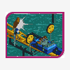
it's ugly. brown. random. blah. it's like you have these ideas and then just randomly throw them in. the coaster so close to the landscape doesn't look good. it needs some variation, some height, some color. your design had the blue color coaster that dominated the desert backdrop. that was such a bold choice and it's weird to see you go from that to this level of blandness. -
 Milo
Offline
I really want to see this layout... seems cool. I quite like what you have going although I agree it is bland... try some land type variations for starters... straight dirt rarely looks good even with good stuff along with it. Try a yellow or maybe green alternate wall type for your buildings. Other than that I'm liking the looks of this. One other thing I see is to try to do some trackitecture that isn't the actual ride you are using for the area. There are plenty of other options for wooden awnings in LL (and in most cases I'm not a fan of wooden track used like that)... try maybe side friction or even reverser track.... s-bends and other special pieces.
Milo
Offline
I really want to see this layout... seems cool. I quite like what you have going although I agree it is bland... try some land type variations for starters... straight dirt rarely looks good even with good stuff along with it. Try a yellow or maybe green alternate wall type for your buildings. Other than that I'm liking the looks of this. One other thing I see is to try to do some trackitecture that isn't the actual ride you are using for the area. There are plenty of other options for wooden awnings in LL (and in most cases I'm not a fan of wooden track used like that)... try maybe side friction or even reverser track.... s-bends and other special pieces.
r_k... peepable mini looks like it'll be fun to look around... any idea when it'll be completedEdited by Milo, 30 November 2009 - 08:03 PM.
-
![][ntamin22%s's Photo](https://www.nedesigns.com/uploads/profile/photo-thumb-221.png?_r=1520300638) ][ntamin22
Offline
very interesting louis. i'd have to agree that the trackitecture doesn't seem to be the best solution here, but I'm not sure what is. might look better in context.
][ntamin22
Offline
very interesting louis. i'd have to agree that the trackitecture doesn't seem to be the best solution here, but I'm not sure what is. might look better in context. -
 Midnight Aurora
Offline
Midnight Aurora
Offline
I'll disagree with you completely. I love the fact that the ground clearance is so low. Can you imagine riding that thing? It would be fun as shit.it's ugly. brown. random. blah. it's like you have these ideas and then just randomly throw them in. the coaster so close to the landscape doesn't look good. it needs some variation, some height, some color. your design had the blue color coaster that dominated the desert backdrop. that was such a bold choice and it's weird to see you go from that to this level of blandness.
And as far as the colours go, I really dig what's going on. Aesthetically, far the most part anyway, the things that he wants seen are seen, and the rest takes a back seat. There are no unimportant details to draw the eye away from the ideas Louis wants to be most prominent (probably because there aren't enough unimportant details yet...). And I realize that this is a theme park, and theme parks generally go for the brightest, most offensive colour schemes, but not everything has to be bold. Not everything needs to be accented.
That said, the execution of some of those ideas could be a lot better. Codex is your friend. -
 RCTCA
Offline
RCTCA
Offline

work in progress. slightly unfinished by shoreline.Edited by RCTCA, 01 December 2009 - 12:15 AM.
-
 Louis!
Offline
Louis!
Offline
What's the bobsleigh track meant to represent? some kind of canvas? if so you need another pole in the middle.
Yeah it's meant to be a tent type structure. The pole up the middle is indeed needed, thanks for pointing it out
it's ugly. brown. random. blah. it's like you have these ideas and then just randomly throw them in. the coaster so close to the landscape doesn't look good. it needs some variation, some height, some color. your design had the blue color coaster that dominated the desert backdrop. that was such a bold choice and it's weird to see you go from that to this level of blandness.
The whole idea of this area is the landscape. Obviously I'm not going to show the whole area but maybe in future screens the idea with the landscape will be portrayed better. I agree about the colour but in this particular little section I don't think colour is needed. Suggestions taken on board though.I really want to see this layout... seems cool. I quite like what you have going although I agree it is bland... try some land type variations for starters... straight dirt rarely looks good even with good stuff along with it. Try a yellow or maybe green alternate wall type for your buildings. Other than that I'm liking the looks of this. One other thing I see is to try to do some trackitecture that isn't the actual ride you are using for the area. There are plenty of other options for wooden awnings in LL (and in most cases I'm not a fan of wooden track used like that)... try maybe side friction or even reverser track.... s-bends and other special pieces.
Yeah the land colouring is going to be varied up a little bit. I think green would be a bit of an odd colour choice for the theme, but yellow could be an option. Yeah there is other trackitecture in this section that isn't wooden rollercoaster. Thanks.very interesting louis. i'd have to agree that the trackitecture doesn't seem to be the best solution here, but I'm not sure what is. might look better in context.
Thanks and I guess i'll work on the trackitecture.I'll disagree with you completely. I love the fact that the ground clearance is so low. Can you imagine riding that thing? It would be fun as shit.
And as far as the colours go, I really dig what's going on. Aesthetically, far the most part anyway, the things that he wants seen are seen, and the rest takes a back seat. There are no unimportant details to draw the eye away from the ideas Louis wants to be most prominent (probably because there aren't enough unimportant details yet...). And I realize that this is a theme park, and theme parks generally go for the brightest, most offensive colour schemes, but not everything has to be bold. Not everything needs to be accented.
That said, the execution of some of those ideas could be a lot better. Codex is your friend.
Cheers The execution probably could be better and i'll probably come back and eventually improve whats there.
RCTCA - That looks awesome, you've got so much better
-
 In:Cities
Offline
happy december
In:Cities
Offline
happy december
just an updated version of that previous screen i showed:]
still very unfinished, but i like the direction that this project is goingEdited by In:Cities, 01 December 2009 - 03:10 AM.
-
 RRP
Offline
i like that,makes me feel cold just looking at it.I always enjoy a good snow theme aswell which is probably because they are pretty rare
RRP
Offline
i like that,makes me feel cold just looking at it.I always enjoy a good snow theme aswell which is probably because they are pretty rare -
 Splitvision
Offline
I love that I:C, the atmosphere is fantastic! I don't often like snow themed stuff but this is an obvious exception.
Splitvision
Offline
I love that I:C, the atmosphere is fantastic! I don't often like snow themed stuff but this is an obvious exception. -
misterthom
Offline
thats a very good screen, i would love to see the lay-out of that woodie
Edited by misterthom, 01 December 2009 - 07:58 AM.
-
In:Cities
Offline
thanks guys:]
i'm debating whether or not this should be just a design, or a full park.
i could finish it sooner if its a design, but then again, i have so many ideas for this that i think it should be a full park lol -
TwistedHelix Offline
Loius it dosent really have any warhammer like feeling to it if rthats what your going for (I'm guessing slightly so as you said it would be based slighlty on Warhammer) Karak Kardin is built entirely out of stone as far as I'm aware on a wooded mountianside (just like most of the Dwarfen strongholds even their main port is built into a mountian lol). As it is I cant see that landscaping being representitive on any interesting part of the Warhammer world (the only areas I can see it being a part of would mabye be the Orge kingdoms or the begginnings of the Chaos wastes). i do also agree that some of it looks messy but I will aslo say I know nothing really of LL's limits or possibilities.
Cheers
TwistedHelix -
 SSSammy
Offline
SSSammy
Offline
thanks guys:]
i'm debating whether or not this should be just a design, or a full park.
i could finish it sooner if its a design, but then again, i have so many ideas for this that i think it should be a full park lol
just do whatever the hel you want and submit it for spotlight either way.


Tags
- No Tags