(Archive) Advertising District / Dump-Place
-
 19-April 07
-
 Maverix
Offline
RCTNW: I do realize that there aren't steal bombers in the movie, this is themed off of a would-be sequel/ military aircraft in general, but don't worry, there will be other planes/ jets throughout, this is just the first one I made
Maverix
Offline
RCTNW: I do realize that there aren't steal bombers in the movie, this is themed off of a would-be sequel/ military aircraft in general, but don't worry, there will be other planes/ jets throughout, this is just the first one I made
-
 Fizzix
Offline
I like the idea behind it, Maverix, but I think you should fix that support like JK said.
Fizzix
Offline
I like the idea behind it, Maverix, but I think you should fix that support like JK said.
-
Maverix
Offline
Wait, the support for the coaster or the plane?It's very unfinished and I don't like the sharp support like that.
-
 J K
Offline
Both to me look sloppy. I like the idea you're going for but I feel it could be executed better. That said, I'm glad you're active and I hope the layouts as good as your others have been.
J K
Offline
Both to me look sloppy. I like the idea you're going for but I feel it could be executed better. That said, I'm glad you're active and I hope the layouts as good as your others have been. -
 Jaguar
Offline
Can anyone tell me about this layout, it is an LSM launched coaster with decent ratings.
Jaguar
Offline
Can anyone tell me about this layout, it is an LSM launched coaster with decent ratings.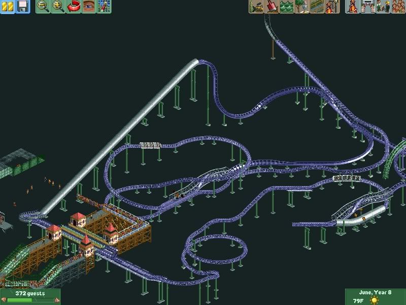
-
Maverix
Offline
Alright well I'll see if I can't find a better way to support the plane/ coaster. And thanks man, I think I should be active for a long time to come cause I'm only 16 and it seems like a bunch of members are all off in college and beond. And don't worry, the layout is very good by my standardsBoth to me look sloppy. I like the idea you're going for but I feel it could be executed better. That said, I'm glad you're active and I hope the layouts as good as your others have been.

EDIT: Jag, the layout is... interesting. I'm not a huge fan of the backwards section though, it seems like you just threw it in there because you could. -
 Coaster Ed
Offline
Robbie -- The only thing I don't like about that screen is where you put those two stalls in the middle. I don't understand what they are or what they're doing there. I've seen that object before and I don't think it really fits in the game. If it's meant to be like a street vendor type of thing I feel like it should (a) be embellished more so it looks more like a vendor stall, perhaps with an awning with stuff hanging on it or some jars on the ground nearby and (b) have an entertainer of some kind standing nearby to run the stall and/or prevent people from stealing stuff. Really though, I think's a bad place in general for that kind of a thing because it clutters up the walkway unnecessarily. Just my opinion though, everything else about that screen is lovely.
Coaster Ed
Offline
Robbie -- The only thing I don't like about that screen is where you put those two stalls in the middle. I don't understand what they are or what they're doing there. I've seen that object before and I don't think it really fits in the game. If it's meant to be like a street vendor type of thing I feel like it should (a) be embellished more so it looks more like a vendor stall, perhaps with an awning with stuff hanging on it or some jars on the ground nearby and (b) have an entertainer of some kind standing nearby to run the stall and/or prevent people from stealing stuff. Really though, I think's a bad place in general for that kind of a thing because it clutters up the walkway unnecessarily. Just my opinion though, everything else about that screen is lovely.
jaguarkid -- If it's meant to be an indoor ride I think you can get away with having just a decent layout so long as the theming supports it. Without seeing the theming though, my main complaint is that the whole layout is too flat. It looks like it would be fast that way, which is good, but it limits the dynamics of the layout because it's basically two dimensional at this point. The tunnels for the inline twists are cool, but the waterslide tunnels seem like they would be too small to fit the train without cutting people's heads off. (This is a legitimate concern -- I once had my real head nearly taken off by a low hanging outcrop on a tunnel on The Demon coaster at Great America so I'm particularly sensitive about the subject) With the track types you're using those tunnels don't seem to work, I would use the heartline track for all of the tunnels instead. I do like the reversing sections though. Indoor coasters are starting to add those these days (like the Mummy ride at Universal) and I like how it makes the ride unpredictable since you'll probably be riding in the dark so you won't see them coming. -
 robbie92
Offline
^I'm having them represent racks of park maps, mainly like the ones at KBF. The larger ones are maps while the smaller ones are show times. I can see what I can do, though, to make that area a little more cohesive.
robbie92
Offline
^I'm having them represent racks of park maps, mainly like the ones at KBF. The larger ones are maps while the smaller ones are show times. I can see what I can do, though, to make that area a little more cohesive. -
 Dotrobot
Offline
Highly unfinished. And fizzix dammit get on TPR chat.
Dotrobot
Offline
Highly unfinished. And fizzix dammit get on TPR chat.
EDIT.. Paint fails doesn't it?
EDIT.. Djbr left TPR chat. I hate you.
EDIT.. Better get back on Djbr :l -
 Comet
Offline
Robbie I agree that you should move those maps elsewhere, they really disrupt the flow there
Comet
Offline
Robbie I agree that you should move those maps elsewhere, they really disrupt the flow there
Also, the two statues in the middle fountain area just seem to be overkill
Buildings are nice though -
Jaguar
Offline
EDIT: Jag, the layout is... interesting. I'm not a huge fan of the backwards section though, it seems like you just threw it in there because you could.
Thank you, and I decided to put the backwards section because I thought it was quite unique.I think if you can theme it well, you'll have a great ride.
Thank Youjaguarkid -- If it's meant to be an indoor ride I think you can get away with having just a decent layout so long as the theming supports it. Without seeing the theming though, my main complaint is that the whole layout is too flat. It looks like it would be fast that way, which is good, but it limits the dynamics of the layout because it's basically two dimensional at this point. The tunnels for the inline twists are cool, but the waterslide tunnels seem like they would be too small to fit the train without cutting people's heads off. (This is a legitimate concern -- I once had my real head nearly taken off by a low hanging outcrop on a tunnel on The Demon coaster at Great America so I'm particularly sensitive about the subject) With the track types you're using those tunnels don't seem to work, I would use the heartline track for all of the tunnels instead. I do like the reversing sections though. Indoor coasters are starting to add those these days (like the Mummy ride at Universal) and I like how it makes the ride unpredictable since you'll probably be riding in the dark so you won't see them coming.
It is way to big to be a successful indoor ride, so I am keeping it outdoor and relying on the rundown ruins of cities like Chicago or New York and the terrain to theme it. I'll change the tunnels, but I think Levis has the park right now. The lift itself and the first switchback along with more elements actually follow the terrain, but yeah I have that problem with most of my coasters. About the Demon, I have ridden it many times and am going to say that it is really not worth it, even though there is almost no line. Maybe I can conceal the entire coaster in a tunnel like an old concept at Coney Island, or make part of it indoor dodging the ruins.
I am surprised no one noticed the stations. -
 rK_
Offline
@Dotrobot
rK_
Offline
@Dotrobot
the screen overall is very nice, beautiful atmosphere you have there, but the supports look horrid imo. the gap between the track and the support itself just kills it. -
 gir
Offline
Robbie, when I saw that screen I immediately understood them to be park maps. I say leave them, but what do I know?
gir
Offline
Robbie, when I saw that screen I immediately understood them to be park maps. I say leave them, but what do I know?
-
 Cocoa
Offline
my paint doesn't do anything to my screens... maybe its a vista improvement or something. and just for my two cents I also thought those stall things were maps.
Cocoa
Offline
my paint doesn't do anything to my screens... maybe its a vista improvement or something. and just for my two cents I also thought those stall things were maps.
this is just a tiny teaser of my current project which I'm finishing at an alarming rate. not much but I liked the atmosphere in this tiny corner that would get overlooked by even the most astute viewers of my park


Tags
- No Tags