(Archive) Advertising District / Dump-Place
-
 19-April 07
-
 Cocoa
Offline
bearcat? what? anyway, its pretty good but I think it looks funny with the fence around the trees in the helix. just get rid of the fence, have the land raised a little and then put the trees in the middle. good to see you back though.
Cocoa
Offline
bearcat? what? anyway, its pretty good but I think it looks funny with the fence around the trees in the helix. just get rid of the fence, have the land raised a little and then put the trees in the middle. good to see you back though. -
 robbie92
Offline
Looks good Pacificoaster!
robbie92
Offline
Looks good Pacificoaster!
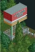
A not-so-serious attempt at throwback LL... I don't know what type of style I prefer, the codex-up modern styles or the work of Schuessler. -
 RCTMASTA
Offline
Hmm...
RCTMASTA
Offline
Hmm...
+ Nice path swoop
- Red path/yellow support awnings don't really work for me
- The path fence (poles) are too tall, try using something else
= Some bushes/trees might look good on the bare brown land around the station -
 pierrot
Offline
pierrot
Offline
agreed, looks odd.- Red path/yellow support awnings don't really work for me
sorry i hate that screen, hard to explain though. -
 Louis!
Offline
I still think that layout is slightly off. But hey ho.
Louis!
Offline
I still think that layout is slightly off. But hey ho.
And I don't think you have to prefer either style, as both are fantastic when done well. -
 Liampie
Offline
I know what I prefer. Pre-codex. (minus a few exceptions like Ouest)
Liampie
Offline
I know what I prefer. Pre-codex. (minus a few exceptions like Ouest)
I'm not a huge fan of the screen, but I guess you have the same problem as me: struggling with recreating an old style. Something's missing... -
CCI
Offline
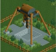
Now that bobcat is finished, I have started an new park. Here are two screens from that park
-
 BelgianGuy
Offline
@robbie and Liampie, why try to recreate a previous style of anolther player while in rct2 you both have very unique styles the both of you, I suggest trying to find your own style in LL aswell without copying too much,
BelgianGuy
Offline
@robbie and Liampie, why try to recreate a previous style of anolther player while in rct2 you both have very unique styles the both of you, I suggest trying to find your own style in LL aswell without copying too much, -
 Midnight Aurora
Offline
Midnight Aurora
Offline
Blah, don't blame codex for what people do with it. The answer lies somewhere between stacking random shit everywhere and putting in nothing and calling it perfect ala Schuessler. NCSO often looks exactly the same in the almost seemingly random stacking of objects, but that generally gets praised.I know what I prefer. Pre-codex. (minus a few exceptions like Ouest)
I'm not a huge fan of the screen, but I guess you have the same problem as me: struggling with recreating an old style. Something's missing...
Looks good, though, Robbie, but you're going to have to do a much shittier job on the foliage if you want to make it true vintage. -
 Luketh
Offline
Luketh
Offline
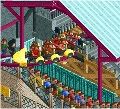
Risen in the barren desert just outside of Las Vegas, esteemed genius Luke Weir has created a great little coaster for those on their way to Vegas. -
robbie92
Offline
BG, Liam is right with the replacement of words. I love trying out new things in both games to find a way to envelop them in my style. For RCT2, I did a lot of looking at CP6, 5dave, Gee, RRP, Turtle, J K, Slob, and RCTFAN to find a style, and trying to go for all of those "styles" has essentially given me my own style, if I do say so myself. In LL, I haven't really played for long enough to really figure out what makes "my style," so I'm looking at a variety of sources to get better: Schuessler for simple, undetailed "perfect" beauty, Natelox for overall detailed beauty, Loopy for technical beauty and codex know-how, and Posix for restrainted, minimalist perfection. I feel that through exploration of all of those different styles I can essentially mix them into my own LL "look" that'll work for me. I don't like to be put in a niche when it comes to my parkmaking, which is why SFSF, except for MG, will be my last "pure realism" release for a while. I wanna explore crazy theming, crazy Mala-type rides, all of that, and I'm doing the same in LL. Hopefully I can find my own style and approach eventually in the game.
CCI: Simple, but nice. Colors on the frisbee are a bit off imo, as black and brown are just so drab and dark. Also, instead of blocks, find a way to make a more axis-like connection to the supports so it can look like it'll feasibly rotate.
Luketh: I adore that. The vibrant colors are just so fun and realistic in a sense. If the whole thing looks as good as that one screen, I'd say you've transcended to a higher skill level. -
insan sıradan
Offline
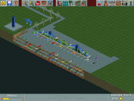
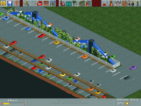
Parking Lot

It is not unfinished yet, so advice me how to make it more detail.
-
 Pacificoaster
Offline
@Luketh: What you have looks good. Hope to see this style continue within the park.
Pacificoaster
Offline
@Luketh: What you have looks good. Hope to see this style continue within the park. -
K0NG
Offline
I dunno man. I mean, it looks great and all, but to me it's just another piece of something that's severely unfinished much like everything else I've seen from you so far. The excitement or anticipation that I had when initially viewing your stuff has waned a bit until I see something more substantial than yet another skeleton of another unfinished piece of an unfinished area.


Tags
- No Tags