(Archive) Advertising District / Dump-Place
-
 19-April 07
-

 BelgianGuy
Offline
Reworked the area a lot over the past few days...
hopefully it's better
progress is slow but consistent,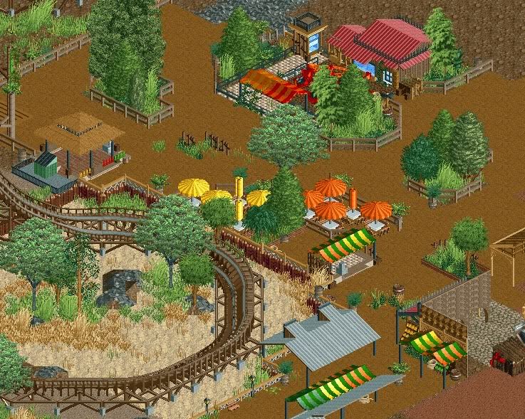
note still unfinished around the edges... -

 chorkiel
Offline
looks really good but I still find those trees placed horribly close to the coaster
 -

 Liampie
Offline
They're not. What annoys me more are the plants on the path, the overused kumba roofs and the big trees. The light green ones happen to work here, but the other (top left corner) doesn't. Try my tree instead.
It's still an atmospheric screen, my favourite by you perhaps. -

 BelgianGuy
Offline
rooves are up for debate as I'll probably change in the concept a little as far as park chain and such go... since I'm really into this atm expect more soon and I happen to like the trees and plants on the path liam sorry, otherwise it'd be way too plain and boring imo
 -

 Luigi
Offline
Very nice atmosphere you have created there. I agree with Liampie though on the plants on the path.
 -

 Liampie
Offline
If you have to put barrels and weeds on the path, there's something wrong with the design. Barrels and weeds are, if it's not a part of the theme, a last resort.
I don't think your design needs it, and moreover peeps can do wonders. This only takes away credibility! -

 disneylandian192
Offline
From ball caps and sweatshirts to disneyana memorabilia, the Main St. Emporium has everything you need to bring the magic back home.
-
 tdub96
Offline
Bg, why the varying footer sizes, and why the big ones anyways? The smaller, skinnier deco block you've used there works much better for wooden coaster footers imo. Otherwise, Im with posix, you get better and better with everything you build.
Is this a design? or from your solo? -

 K0NG
Offline
bg, so excited to see your talent finally surfacing.
Ehhhh, I saw it a year ago. But then again, I'm special. So.......
Looks great bro. -

 chorkiel
Offline
I kinda dislike the whole screen..
I mean your ideas are creative and you've put thougt into this but it just doesn't look good. -

 SSSammy
Offline
that screen suffers from "things in a place" syndrome. it lacks any form of context.
try letting ideas and themes develop more, and trying to build something consistent as opposed to some things in a place like i mentioned before. -

 Cole
Offline
So I'm doing the exact opposite of what I used to do then. Before, I just made every building in an area the same,
and none of them had any identity. Looks like I need to try to play in the middle. i guess i'll just scrap the little work I have and start over.
thank you SSSammy and Chorkiel -

 Chocotopian
Offline
^^^^^
If you do start again, I hope you keep some of the ideas and building styles. For example, I like the pastel green and red 2x1 building and the yellow archway. I just think, like others have said, they lack a sense of context and purpose. Some even seem inaccessible, with no entrance to the 2x1 and green roofed building, or a way to get to the top of the yellow archway. However, your approach here seems to be new and definitely colourful, which I greatly appreciate. I also like the hidden walkway to the toilets... don’t know why, I just do
-

 highroll3r
Offline
Disneylandien i like your screen but the quality of the archy seems to deteriorate in the top left. Maybe its the scale compared to the rest but id suggest working on improving that little part. The bottom right building looks good though and so does the arcade and emporium.
Cole i think you could benefit from looking at pictures of architecture on google. Id make each building purposeful. I mean atm they just seem hollow. I also dont see the point in building buildings if they dont house anything. You have toilets exposed when they could be in the blue building.
 Tags
Tags
- No Tags


