(Archive) Advertising District / Dump-Place
-
 19-April 07
-

 Fisch
Offline
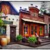
Architecturewise it's almost perfect. But somehow while your architecture is excellent, your landscaping, and layouting skills need improvement. You need to focus more on the composition as a whole. It kind of seems like you're putting a lot of effort into certain things without them fitting together that well. But I'm interested to see how this is gonna look when you get more of it finished.
 -

 Metropole
Offline
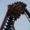
@Metropole: Thanks. How can I do the CobraRoll better? Its the first Time i'm handling with custom supports and it was really hard.
I would put one or even 2 straight track segments between the 2 corkscrews so the roll itself looks wider, and the 2 pieces of track that enter and exit the element aren't right next to eachother. -

 Luigi
Offline
^I agree, but that is probably impossible now due to the tunnel. Architecture in the first screen is VERY nice.
-

 posix
Offline
jandoa, looks fantastic. someone new who can work well with walls. exciting. hoping to see a finished release from you!
 -

 mardy
Offline
@ Dimi: That is so incredible! Awesome!
@ Jandoa: first screen looks Nice, but the second one is painfully bad. I hate the car ride. -

 TwistedSteel77
Offline
This woodie is called "Scream Surge." Still subject to change but i'm not sure. Just thought i'd post a screen of it- Feedback would be greatly appreciated!

-

 Hex
Offline
I kind of like that. It's very classic. However, I'd work on the foliage around the coaster.
 -

 Metropole
Offline
Not bad. The station is pretty cool. I'd zero clearance some bushes under those trees to give it a bit of depth. Also, not fond of the queue entrance sign. I'd rather something a little less robust, perhaps with 1/4 blocks. Finally, I'm not sure how that transfer track is supposed to work.
 -

 TwistedSteel77
Offline
Thanks guys! I agree with you about the entrance, and....i don't know how the transfer track works either
 Haha I kind of ran out of room i guess.
-

 Metropole
Offline
You've probably just about got enough room. You need to move the track that the train is transferred onto back so then there's space for the actual woodie track to be "transferred" over and then the train to be put into storage. You would then just have the 1 square wide cover over the storage track. It will probably look a little forced though. A bit more forethought required next time.
 -

 rK_
Offline
that screen has some much elegance to it but the foliage just doesn't fit it at all in my eyes and from what i can see that que can fit about 50 peeps? You Need to work on that and maybe get some interaction in or around the lift hill.
 -

 Luigi
Offline
Oh...My....God
Maybe use other path types for the interiors.
Oh, and those two grass land tiles look weird to me. -

 rK_
Offline
besides the fish pond the rocks look really unnatural and horribly placed, i don't think they need to be that high considering you have a small fish pond then out of no where you have rock faces that are higher then most of the architecture. The colors are beautiful though!
 -

 Dimi
Offline
Wow nin, I'm so glad you're building again! I think the rocks are just perfect, except for the two green tiles.
 Tags
Tags
- No Tags


