(Archive) Advertising District / Dump-Place
-
 19-April 07
-
 JDP
Offline
looking forward to what you do with the buildings around the flat because it seems a bit strange. great start though brah
JDP
Offline
looking forward to what you do with the buildings around the flat because it seems a bit strange. great start though brah
-JDP -
Colorado-Fan Offline
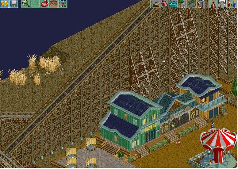
Why is the color of the whole screen that ugly? I think the supports for the Woody aren't enough. The architecture is very nice. -
 Liampie
Offline
Good architecture. Missed landscaping opportunity. You should have some intimidating jagged mountains on that empty strip of land to serve as the backdrop for the coaster. Like Monument Valley, only denser. The seatings look like "I DONT KNOW WHAT ELSE TO PLACE HERE". You can do more with that. It's a western area, right? Plenty of ideas for such a small path of land: rodeo ride, gold washing, shooting gallery. It's that kind of small theme-specific ideas that make themes immersive.
Liampie
Offline
Good architecture. Missed landscaping opportunity. You should have some intimidating jagged mountains on that empty strip of land to serve as the backdrop for the coaster. Like Monument Valley, only denser. The seatings look like "I DONT KNOW WHAT ELSE TO PLACE HERE". You can do more with that. It's a western area, right? Plenty of ideas for such a small path of land: rodeo ride, gold washing, shooting gallery. It's that kind of small theme-specific ideas that make themes immersive.
Good luck. You're improving rapidly! Glad to see you're not wasting your talent on 'lifeless mud + concrete + generic, boring rides' parks. -
 coasterfreak101
Offline
That's so much improved over your old stuff! Not sure why the colors look so gross in that picture... but it's very nice! ^His advice is really good though.
coasterfreak101
Offline
That's so much improved over your old stuff! Not sure why the colors look so gross in that picture... but it's very nice! ^His advice is really good though. -
 Xtreme97
Offline
The picture looks odd because when you edit a screenshot in paint and save it as a certian file type (not sure which one) it loses some quality and the colours go strange
Xtreme97
Offline
The picture looks odd because when you edit a screenshot in paint and save it as a certian file type (not sure which one) it loses some quality and the colours go strange
But I agree, you've improved alot, i'm really liking the western architecture. -
 ScOtLaNdS_FiNeSt
Offline
Your spot on Xtreme97, I made the screen smaller with paint so thats why the colours look like shit really
ScOtLaNdS_FiNeSt
Offline
Your spot on Xtreme97, I made the screen smaller with paint so thats why the colours look like shit really
@Colorado-fan : Yes i will add more supports and thank you
@Coasterfreak101 : Thank you very much i am hoping that i improve with every screen i hope thats coming across to you guys
@Liampie : Thank you for yet again a in-depth look at what i done wrong/can do right, I will look to implement what you have said the shooting range was top of my list with a rodeo stadium not to substantial but enough for hourly shows which is in construction. Plus your suggestion of jagged rocks would fit very well with that area as where the dried bushes are is a dry river bed that existed a few thousand years ago
Any more criticism/suggestion are very very welcome
-
 Maverix
Offline
I would either flip the track colors so the spine is the light red and the rails are dark red or make the rails grey. But other than that that's a great screen.
Maverix
Offline
I would either flip the track colors so the spine is the light red and the rails are dark red or make the rails grey. But other than that that's a great screen. -
 Dimi
Offline
Your screens are getting more and more interesting, Coupon. I love the looks of that station. Please pay attention on the foliage though, I feel like it could be done much better under the lift hill.
Dimi
Offline
Your screens are getting more and more interesting, Coupon. I love the looks of that station. Please pay attention on the foliage though, I feel like it could be done much better under the lift hill. -
 tyandor
Offline
tyandor
Offline
Just thought i would post something since i haven't in a while
Do you have any idea about how fast you are improving?!?
It's not something top level yet, but if you keep this up you're gonna end up pretty high. -
 Nitrous Oxide
Offline
Nitrous Oxide
Offline
I would either flip the track colors so the spine is the light red and the rails are dark red or make the rails grey. But other than that that's a great screen.
Completely agree. Looks great though.
ScOtLaNdS_FiNeSt, You've really come a long way. I really can see that your work is inspired alot by Coupons. Which is not a bad thing.


 sexy...

 holy fuck!
Tags
- No Tags