(Archive) Advertising District / Cyder Hill Theme Park
-
 27-October 09
-
 Liampie
Offline
Liampie
Offline

You can do better! I don't like the coaster here, can't you make the turn a 540 degree helix? The path is too bare/wide to look good, the landscaping is bare and underdetailed (in previous screens and releases you've shown that you can do good foliage) and the architecture doesn't look arabian. Add more variety in the architecture like in the last screen to give each building an identity. Also, try to avoid angled roofs and use more flat roofs instead.
The left half of the screen is so boring! The bit of landscaping is just void and I don't get the purpose of the wall. I think you can easily fit a flatride in there and the wall is a nice spot for a stairs connecitng the lower and upper paths.
It's not quite mediterranean, for obvious reasons.
I'm not trying to be harsh, I just want this park to do well, especially after the disappointment Diamondback was to me. I usually like your work and I know you can do better than these screens! I think research is the key for you. Good luck!
-
 Goliath123
Offline
thanks very much everyone, especially JK and Liam, you both raise very good points. I think ill ad some more 1x1 towers as i knew that i was missing something that really gave it some umph, so thanks everyone for pointing that out.
Goliath123
Offline
thanks very much everyone, especially JK and Liam, you both raise very good points. I think ill ad some more 1x1 towers as i knew that i was missing something that really gave it some umph, so thanks everyone for pointing that out.
Would you like to see an improvement screen when im done or no? -
Goliath123
Offline
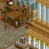
Ok i added some more little towers and other small details in the this area here:

This is what you mean by 1x1 towers right?
Oh and Liam, regarding the flat roofs, i know thats realistic but if you haven't noticed mines more fantasy based and im not gonna lie, i like it the way it is right now so ill keep my slanted roofs the way they are
Here i added another flat and staircase and switched the foliage around a little bit as Liam suggested, and beyond this to the left hand corner there is a S&S screaming swing flat so thats it for flats in this area i think:
Thanks for looking
-
 turbin3
Offline
Much better than the previous screen, but there a still a few things I don't like:
turbin3
Offline
Much better than the previous screen, but there a still a few things I don't like:
The flatride isn't looking good there and the foliage around it is awful, sorry.
Moreover I neither like the orange roof, the blue-white awning, nor the purple windows.
To my taste all of the building are a little bit small, they could be bigger.
Summarizing it's too colourful for me. -
Liampie
Offline
The architecture is much better now. And if that's your approach with the roofs... no problem. It's your park, your approach!
-
 J K
Offline
Add some more finer details in the middle of the paths like park maps maybe custom lamps etc as I think thats why it feels so bare. I also think you should get rid of the purple and orange roof as they don't suit the theme (even if you were going for a fantasy approach). After that well done on adding the ride to give us more something to look at, a bit more dense foliage would really help everywhere. As Liam said though it's your park so take from that what you will.
J K
Offline
Add some more finer details in the middle of the paths like park maps maybe custom lamps etc as I think thats why it feels so bare. I also think you should get rid of the purple and orange roof as they don't suit the theme (even if you were going for a fantasy approach). After that well done on adding the ride to give us more something to look at, a bit more dense foliage would really help everywhere. As Liam said though it's your park so take from that what you will. -
 Jaguar
Offline
Well, I think some of the brick walls should be kept, but add some sloping and even a little jagged rocks, so it looks more natural because that may be a good screen, but it looks very bare and odd.
Jaguar
Offline
Well, I think some of the brick walls should be kept, but add some sloping and even a little jagged rocks, so it looks more natural because that may be a good screen, but it looks very bare and odd. -
Goliath123
Offline
Personally i love it, i really like castles and i wanted one for the entrance but i want to know what everyone else thinks of it

-
 BelgianGuy
Offline
Sammy said it all I think, and it doesn't scream castle to me aswell, try having more than 1 main feature of the building aswell cuz you've got the centerpiece and the 2turrets.
BelgianGuy
Offline
Sammy said it all I think, and it doesn't scream castle to me aswell, try having more than 1 main feature of the building aswell cuz you've got the centerpiece and the 2turrets.
Try to vary up the shape of the center aswell cuz now its a block basically... and I agree that the entire building schould be up to par with the right side of the building cuz that is supreb really. -
 Cocoa
Offline
thats pretty good, i don't really like the building on the far left though... I think its those windows and the colors and the lack of textures... and the middle building could do with a little more detailing work. but it has a great atmosphere.
Cocoa
Offline
thats pretty good, i don't really like the building on the far left though... I think its those windows and the colors and the lack of textures... and the middle building could do with a little more detailing work. but it has a great atmosphere. -
 Louis!
Offline
The right-side and the part over the path is fantastic. The left-side needs work, atm it doesnt seem part of the same section, when it is.
Louis!
Offline
The right-side and the part over the path is fantastic. The left-side needs work, atm it doesnt seem part of the same section, when it is.


Tags
- No Tags