(Archive) Advertising District / I want the view from the top of the hill
-
 02-January 10
-
 K0NG
Offline
I'd enter mine too but, there's a reason they call me K0NG.....I'd hate to make y'all feel bad.
K0NG
Offline
I'd enter mine too but, there's a reason they call me K0NG.....I'd hate to make y'all feel bad. -
 In:Cities
Offline
dont worry tracid.
In:Cities
Offline
dont worry tracid.
i'm sure one of these days it'll be your turn to be blessed with the great opportunity to make a joke about the shlong of the kongEdited by In:Cities, 19 January 2010 - 03:10 PM.
-
 SSSammy
Offline
i feel as though the two smaller kiosks should be higher, with some sort of brown base, instead of white. it feels unballance, thats all. i forgot to ask, with this be properly peepable, as opposed to wannabe peepable like VS
SSSammy
Offline
i feel as though the two smaller kiosks should be higher, with some sort of brown base, instead of white. it feels unballance, thats all. i forgot to ask, with this be properly peepable, as opposed to wannabe peepable like VS
-
 Comet
Offline
Cool idea with the slides, but it might be overkill, not sure
Comet
Offline
Cool idea with the slides, but it might be overkill, not sure
Loving the park overall though -
Phatage
Offline
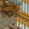
For a park that started in 1975, I would love to see some large, mature trees (maybe even custom) in planters breaking up some of that path/providing shade to people waiting outside the entrance for the park to open. Some signage would be nice as well. I really like the structure itself; it has a sort of antique quality but appears to have been renovated once or twice during the park's history. I would see what the darker brown or tan looks like on the structure if I were you.
And for Nessie's brother, I would like to see you attempt to recreate the old arrow loop support structure. Everything else is so refined with that coaster that I'm confident you'll pull it off. -
Welshcraft
Offline
Your entrance Looks great but I like the way you put the slides as a Scenery peice it just look like the old days.
-
![][ntamin22%s's Photo](https://www.nedesigns.com/uploads/profile/photo-thumb-221.png?_r=1520300638) ][ntamin22
Offline
Very classic buildings, makes me think of cedar point. I do think it could use some added greenery.
][ntamin22
Offline
Very classic buildings, makes me think of cedar point. I do think it could use some added greenery. -
 CedarPoint6
Offline
Phatage is right with the large trees. There's a pretty big expanse of path right now for (what I expect is) a small park. Trees inside the octagons of that existing planter would be great.. tall trunk with a wide canopy for shade. I'd attempt to minimize path and instead have some larger treed areas-- maybe a few single path sections that could be like a nature walk or just a waiting area.
CedarPoint6
Offline
Phatage is right with the large trees. There's a pretty big expanse of path right now for (what I expect is) a small park. Trees inside the octagons of that existing planter would be great.. tall trunk with a wide canopy for shade. I'd attempt to minimize path and instead have some larger treed areas-- maybe a few single path sections that could be like a nature walk or just a waiting area.
The buildings themselves have a really nice character to them, especially with the slides. I do think you could benefit from a more varied height-- maybe make the strip in the back a little taller (if that's possible). You could probably do with a color or two on the actual architecture so you're not stuck with gray, brown, and white. That trim could look great with some accent colors.
A pretty solid screen already, but I think you can make it even better. Good luck! -
 Louis!
Offline
Whilst the idea with the spiral slides is great, I think the execution isn't. I just don't think it is that effective.
Louis!
Offline
Whilst the idea with the spiral slides is great, I think the execution isn't. I just don't think it is that effective. -
 Austin55
Offline
The slides are nice but there is just to much, the one in the middle of the main building could be done nicely is you put something else in that spot.
Austin55
Offline
The slides are nice but there is just to much, the one in the middle of the main building could be done nicely is you put something else in that spot. -
Welshcraft
Offline
Too much? There is nothing to change for Prodigy atm I am happy with everything though.The slides are nice but there is just to much, the one in the middle of the main building could be done nicely is you put something else in that spot.


Tags
- No Tags