(Archive) Advertising District / Disney's Worlds of Adventure
-
 27-January 11
-
 Fizzix
Offline
I personally think that the coaster is a Schwarzkopf launched looper, like California Screamin'. The screens look nice, if a little bare. Can't wait to see more complete, and larger screen. Keep at it, looks 100% better than WoAB already!
Fizzix
Offline
I personally think that the coaster is a Schwarzkopf launched looper, like California Screamin'. The screens look nice, if a little bare. Can't wait to see more complete, and larger screen. Keep at it, looks 100% better than WoAB already! -
 Casimir
Offline
nin: Smooth transition from the entrance path texture
Casimir
Offline
nin: Smooth transition from the entrance path texture The grey is the sidewalk texture. Do you like the rest? ^^
Pacificoaster: Thanks =)
Fizzix: It's not a coaster at all. There are no coasters in this park right now. -
 Louis!
Offline
This is looking a lot more promising now. You had me worried with the previous screen, but this is really quite something. I agree with nin about the path textures though.
Louis!
Offline
This is looking a lot more promising now. You had me worried with the previous screen, but this is really quite something. I agree with nin about the path textures though. -
 That Guy
Offline
That Guy
Offline
I hope this means you removed the crazy paving and curved stone, and just replaced it with brick.nin: Smooth transition from the entrance path texture
The grey is the sidewalk texture. Do you like the rest? ^^
Other than that, this is seriously awesome work, I love the use of the diagonals, modern objects, planters and posts. This screen is modern parkbuilding at it's best. -
Casimir
Offline
Louis!: Thank you =) I know, the one before really was bare ^^
That Guy: Thanks, glad you like it I didn't decide anything on the path layouts yet.
http://www.nedesigns...t-0#entry539320 -
 highroll3r
Offline
Aside from the pathing, The architecture looks solid, good.Im loving the park map rack, the flowerbed and the signs. Its little details like this that gain my interest. I would remove the gliched, tanned steel fence, the glitch overpoweres the detail. Another little thing is, put the awning end piece under the awning. Great work otherwise.
highroll3r
Offline
Aside from the pathing, The architecture looks solid, good.Im loving the park map rack, the flowerbed and the signs. Its little details like this that gain my interest. I would remove the gliched, tanned steel fence, the glitch overpoweres the detail. Another little thing is, put the awning end piece under the awning. Great work otherwise. -
Casimir
Offline
highroll3r: Thank you =) I'm gonna think about how to solve the glitching fence, yeah. Which awning piece do you mean?
As I'm done for today and I won't have much time until Thursday, here's a bigger screen for you guys!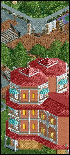
-
highroll3r
Offline
Its the rounded end piece. As for the new screen i have a few bits to crit. firstly at the top part, i dont like the fence seperating steps and sloped path. seems unecessary if you think that peeps walking down the steps, would want to grasp the rail, but there isnt a rail its just spikes. this is very deep detail though. Secondly, I dont like the pillars on the corner of the path. Theire to short to reach the top of the wall. unless you continue the flower arrangement diagonally. Lastly, Its the windows. Ive never liked non transparent windows but the building has a great shape. If you were to make custom windows for it itll look so much better. Im not liking the first floor of the building either because of the interaction between grass and tan. A simple solution imo is to have one layer of texture or colour change at the very base. I hope my post is understandable in all aspects, because after all im only tryin to give you advice. BTW, are there any coasters in this project?
-
 Cocoa
Offline
Put some crown moulding below the top round roof bit, or maybe even elevate them so you have two balcony things (or get rid of the top floor in favor of balconies). Then make the straight roof bits taller (as in use a steeper roof and put some crown moulding below it), and it will be perfect. I'm not a terribly big fan of the arch windows on the main straight wall either.
Cocoa
Offline
Put some crown moulding below the top round roof bit, or maybe even elevate them so you have two balcony things (or get rid of the top floor in favor of balconies). Then make the straight roof bits taller (as in use a steeper roof and put some crown moulding below it), and it will be perfect. I'm not a terribly big fan of the arch windows on the main straight wall either. -
 Croustibapt
Offline
The architecture is really great. Are you gonna make a recreation of Disneyland Paris' Disneyland Hotel, or is this just inspired by this amazing building? Moreover, will you recreate the Fantasia Gardens?
Croustibapt
Offline
The architecture is really great. Are you gonna make a recreation of Disneyland Paris' Disneyland Hotel, or is this just inspired by this amazing building? Moreover, will you recreate the Fantasia Gardens?
-
 Turtle
Offline
This is all looking really good man. Nice details. I hope the atmosphere comes together.
Turtle
Offline
This is all looking really good man. Nice details. I hope the atmosphere comes together. -
Casimir
Offline
Don't want this to get to page 2, so - update time
highroll3r: Thanks dude, there'll be no too deep details here The hotel is nowhere near finished, I just wanted to show a bigger screen for once. I've checked all your points with my Hotel-To-Do-List and they've all been there already. Yes, this will involve coasters.
Coca: Steeper roofs will be dimported once I've figured out 3 objects I don't REALLY need. Object choice is a tough one this time, though.
Croustibapt: Thanks. This will not be a recreation. However, I'm using RL pictures as reference for details. If you mean the Fantasia Gardens Golf Course, then no, it won't be included.
chorkiel: The wall color actually is pretty much determined, I'm afraid. And this will be my diagonal wall treatment (not the final version):
Turtle: Thanks a lot =) I'm pretty positive it will, actually. At least it does in all the planning work
New screen for today:
Yes, that's a queue ;P -
highroll3r
Offline
With the first screen Id still say make custom glass windows. Im not really keen on the diagonal, grey blocks either.
The second screen is great. Love everything but the park maps stacked like that. -
 BelgianGuy
Offline
Only thing I don't like is the path textures in the second screen, it clashes for me, sorry.
BelgianGuy
Offline
Only thing I don't like is the path textures in the second screen, it clashes for me, sorry. -
Croustibapt
Offline
I didn't mean the Golf Course, but the gardens you wander through before entering the Disneyland Hotel at Disneyland Paris (with Mickey Mouse's head recreated with flowers, fountains, and a lot of other small stuff like that).
It's really good anyway! I'm looking forward to it.
-
Casimir
Offline
highroll3r: I'm thinking about it. Tried the glass windows today, not satisfied with them, though.
chorkiel: Thanks ^^ I've got to give credit to MidwestBoyInLA, though. He made it for the Disneyland Project.
tub96: Thank you =) It's quite hard to make diagonals look interesting if you've only got so many different objects..
Luigi: Thanks, I appreciate it. When are we gonna see something new from you, btw? ;P
BelgianGuy: Mmmmh, yeah, the path textures... That's gonna be a tricky thing. I think they look quite interesting there (real pattern outside of the image section) =/ I did notice the many critic voices concerning the paths. I'll see what I can/will do about them.
Croustibapt: Yeah, I figured that ;P Expect some gardens, that's all I'm gonna say ^^
Last screen for this week, gotta study over the weekend ,_,

Tags
- No Tags